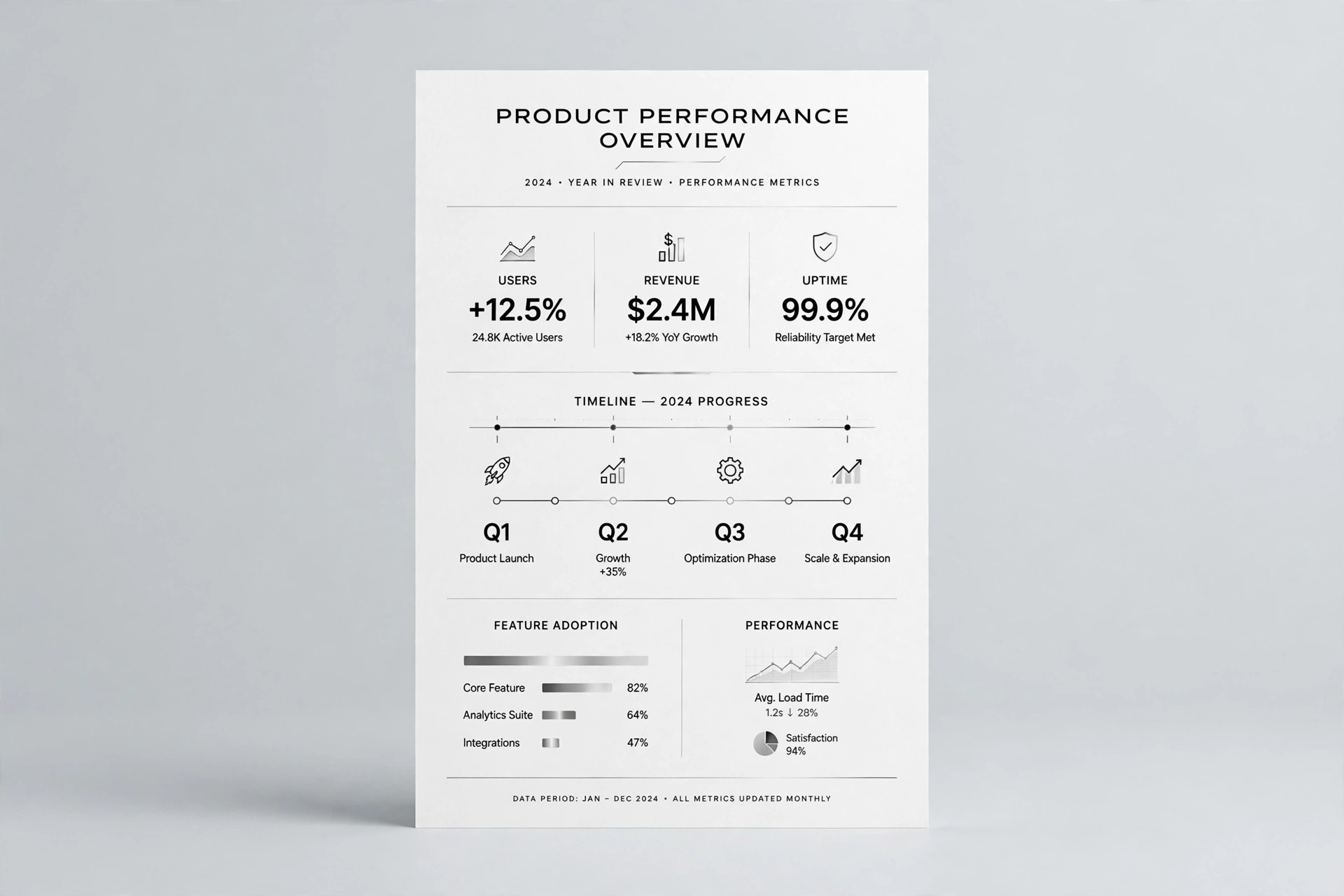
Stacked Column Chart
Totals and mix, readable in one glance.
Turns your AI into a chart designer — turns a small table of grouped numbers into a clean stacked column chart where every segment is labeled, totals are easy to compare, and the chart stays readable at slide and thumbnail size.
Install it in 3 steps
No sign-up. No CLI tools. Pick your AI, copy one line, paste it over.
Prefer doing it yourself? Buy the skill ($4.99), download the ZIP from your checkout confirmation, unzip it into the directory shown above, restart your AI session — same result. Already bought it? Your AI assistant can download it for you.
What’s inside
One SKILL.md (the playbook) + one starter template. A preview:
Stacked Column Chart
When to use
- You have numbers broken into parts — sales by channel per quarter, hours by project per week, budget by category per month — and a plain table hides which totals moved and why
- A slide, report, or post needs one chart that shows both the whole (how tall each column is) and the mix (what each column is made of) at a glance
- A spreadsheet's default stacked chart came out with a rainbow palette, a legend nobody can match to the segments, and labels too small to read
- You need to compare a handful of groups (say, 3–8 columns) across a handful of categories (say, 2–6 segments each) without resorting to a wall of pie charts
- An audience needs to see one story in the data — which segment grew, which shrank, which total changed — rather than raw numbers to decode themselves
Workflow
- Shape the table (input: raw numbers → output: a tidy chart table)
Lay the data out as one row per column and one column per segment, with every cell a number in the same unit — no blanks, no mixed units, no percentages mixed with counts. Put the segments in a meaningful order: largest-to-smallest, or the order the story needs (for example, a baseline segment at the bottom so its changes are easy to track). If a segment is zero or near-zero in every column, fold it into an "Other" row or drop it — a sliver nobody can see adds noise, not information. Check that every column's segments add up to its total before drawing anything. - Choose the segment order and palette (input: tidy table → output: segment order + colors)
Stack the segments so the one the reader should compare first sits on the baseline (the bottom), because only the bottom segment shares a common starting line across columns. Order the rest by size or by story, and keep the same order in every column. Give each segment one flat, distinct color — silvers and greys with one accent color for the segment that matters most, never a rainbow — and make sure neighboring segments differ in lightness as well as hue so the chart survives greyscale printing and color-blind readers. Write the palette down as a legend table (segment → color) before drawing.
Template preview
Stacked Column Chart — Data + Layout Template
One dataset = one chart. Fill in the table first, then draw.
Chart title (states the finding): {e.g. Online overtook in-store in Q3}
Unit: {e.g. units sold} | Period: {e.g. Jan–Dec} | Source: {e.g. company records}
Tidy data table (one unit, no blanks, totals verified)
Check: [ ] every row's segments add up to its total [ ] segments in story order, same in every column
Segment order + palette (bottom segment first = the one to compare)
Palette check: [ ] flat colors, no rainbow [ ] neighbors differ in lightness [ ] survives greyscale