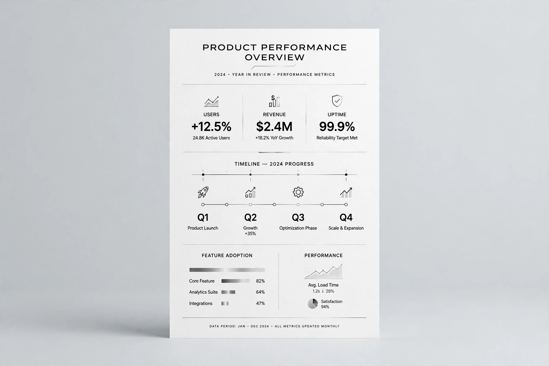
Spectrum Monitor Chart
Ranges, bands, and status — readable in five seconds.
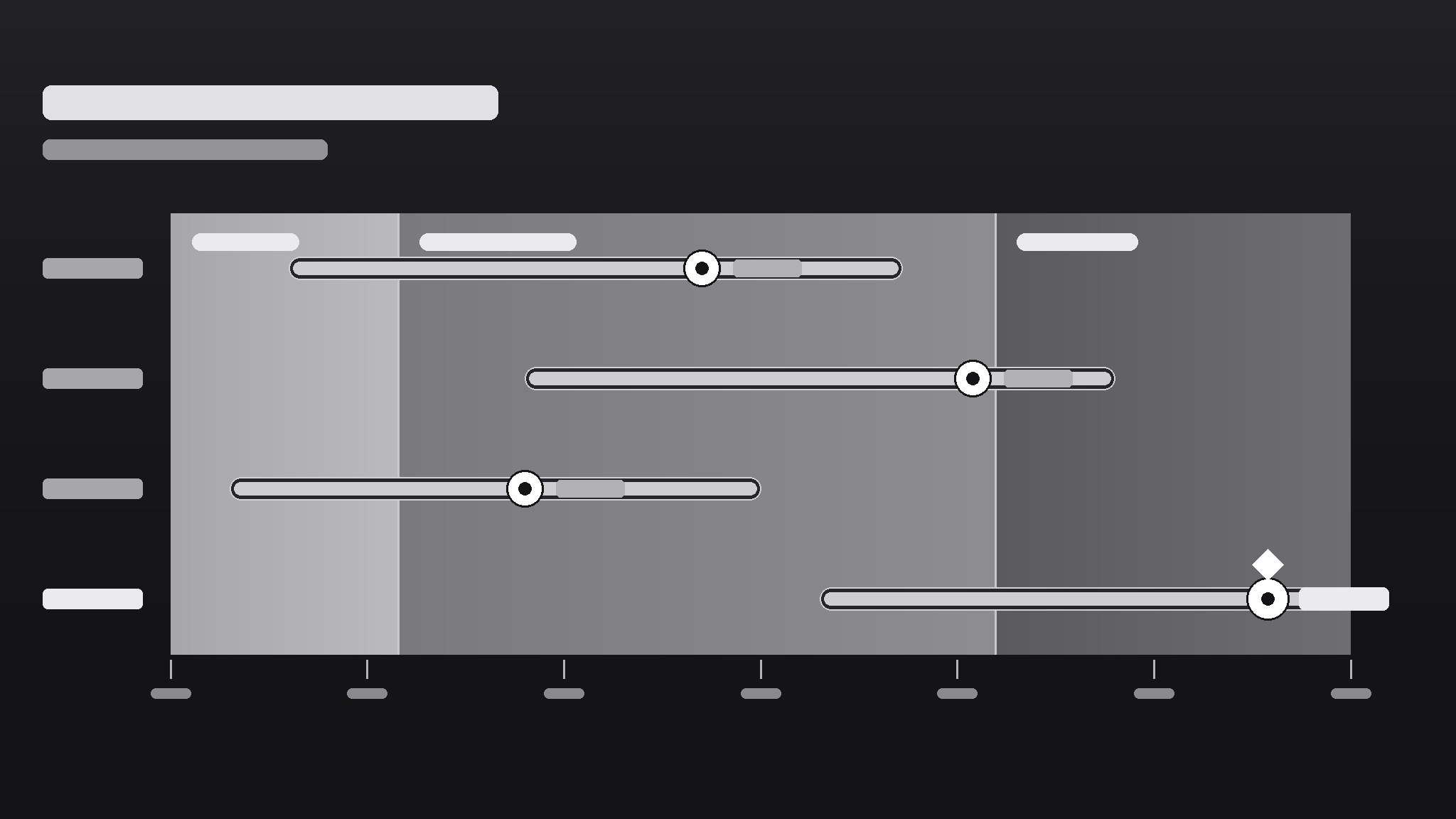
Turns your AI into a chart designer that builds spectrum monitor charts — range bars on a gradient axis that show where things sit, how far they spread, and what counts as normal — so a glance tells you what a table never could.
Install it in 3 steps
No sign-up. No CLI tools. Pick your AI, copy one line, paste it over.
Prefer doing it yourself? Buy the skill ($4.99), download the ZIP from your checkout confirmation, unzip it into the directory shown above, restart your AI session — same result. Already bought it? Your AI assistant can download it for you.
What’s inside
One SKILL.md (the playbook) + one starter template. A preview:
Spectrum Monitor Chart
When to use
- You need to show a range (low–high) and a current value against it — prices, temperatures, readings, benchmarks
- A dashboard needs a compact visual that says "this value is inside / outside the healthy band" at a glance
- You're comparing several items on the same scale and a bar chart would hide the spread
- A report needs a visual that non-technical readers can read without a legend tutorial
- You want one chart type that works for monitoring — readings that update over time against fixed bands
Workflow
- Define the scale and the bands (input: metric + healthy/expected range → output: axis with labeled bands)
Set the axis min and max from the data's real extremes (plus a small margin), then mark the bands that matter: e.g., low / normal / high, or below-target / on-target / above-target. Each band gets a label and a color step on a single gradient (light → strong), not a rainbow. If a reader can't say what each band means without asking you, relabel until they can. - Pick what each row shows (input: items to monitor → output: one row per item with value + range)
One row per item: a dot or marker for the current value, a bar for the observed range (min–max), and the band background behind both. Sort rows by something meaningful — current value, distance from target, or alphabetical — and say which in the chart note. Rows that show only a single number with no range don't belong here; that's a bar chart's job. - Encode status without shouting (input: rows + bands → output: marker colors and callouts for out-of-band items)
The marker's position already says most of it: inside the band = fine, outside = attention. Use a single accent (a darker marker or a small flag) for out-of-band rows only; everything else stays quiet. If half the chart is flagged, the bands are wrong, not the data — recalibrate the bands before adding more flags. - Label directly, keep the legend tiny (input: chart draft → output: labeled chart with axis ticks + unit note)
Put values next to markers ("24.6°C"), band labels inside the bands, and the unit once in the axis title. Axis ticks: 4–6 evenly spaced numbers, no more. A spectrum chart should be readable in five seconds by someone who has never seen one; if it needs a paragraph of explanation, simplify the chart, not the reader.
Template preview
Spectrum Monitor Chart — Template
One metric, one axis, one glance. Fill this in before drawing the chart.
Metric
Metric: {e.g. warehouse temperature, server response time, unit price} Unit: {e.g. °C, ms, $} Source + period: {where the numbers come from, e.g. sensor log, this week}
Axis + bands
Axis min: {real data extreme − small margin} Axis max: {real data extreme + small margin} Axis title: {metric + unit, e.g. "Warehouse temperature (°C)"}
Band source: {who defined "normal" — e.g. published spec, team agreement, regulation}
Rows (one per item)
Row sort order: {by current value / by distance from target / alphabetical}