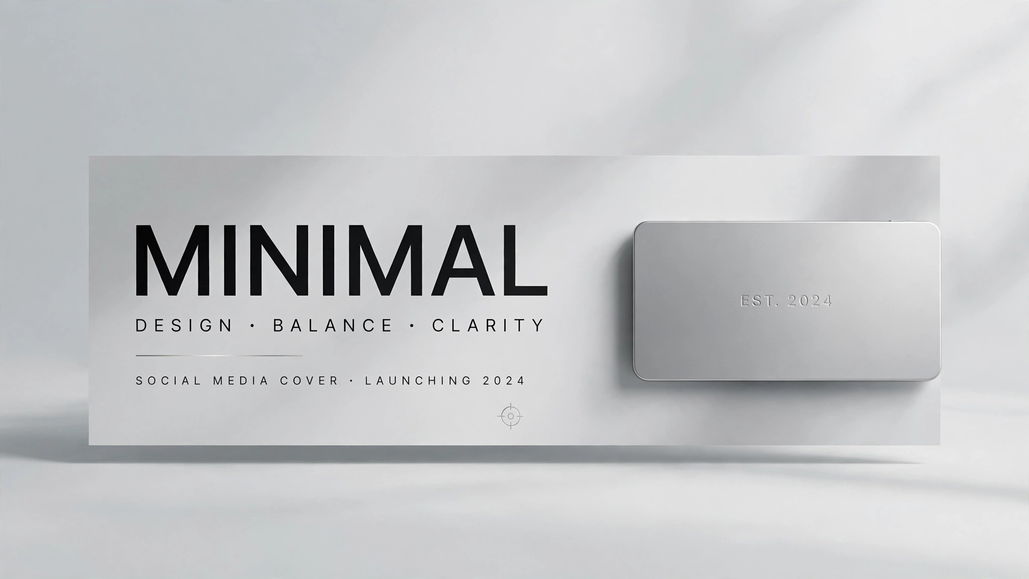
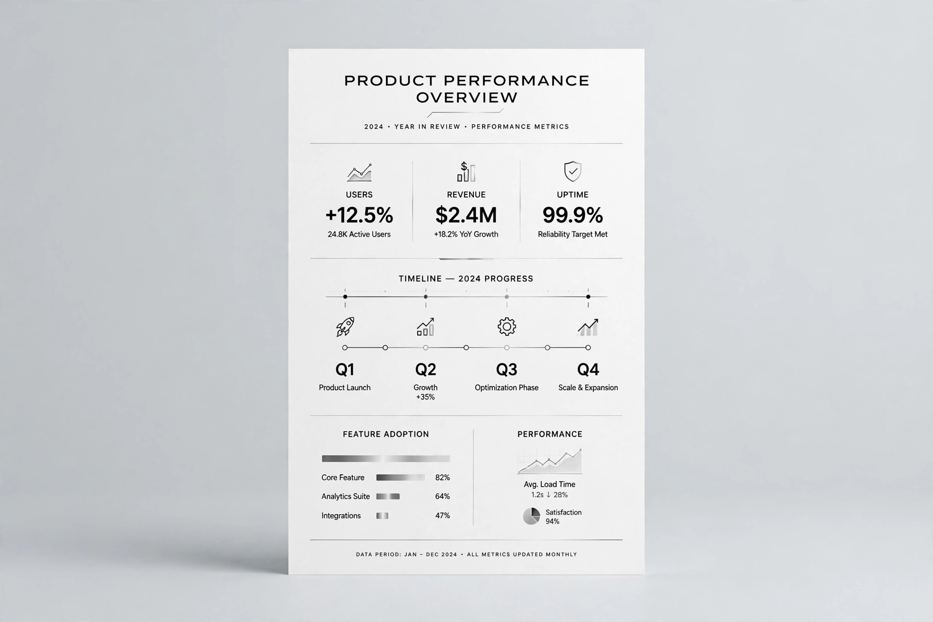
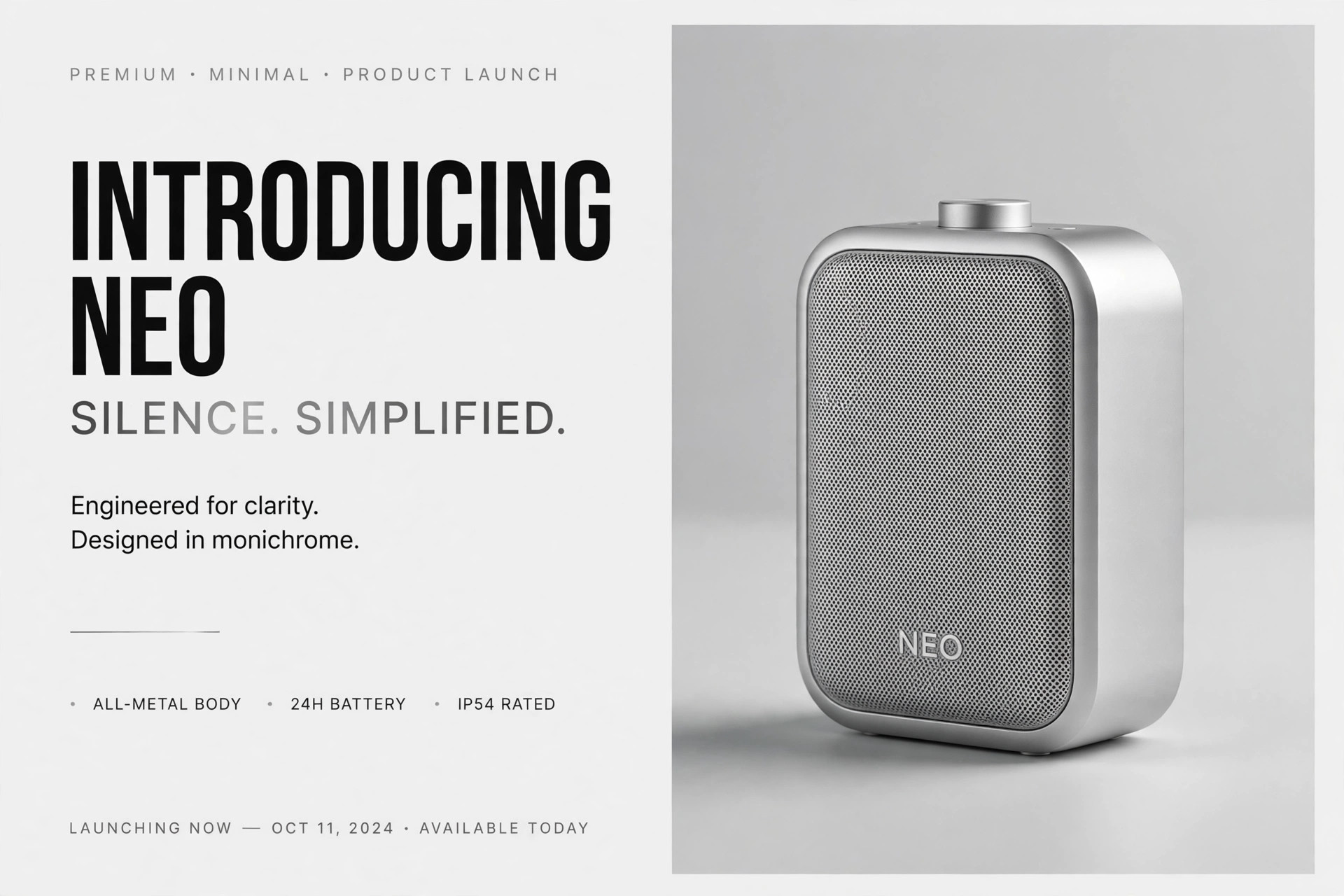
Minimal Product OG Image
One product. One line. Nothing else.
Design a social preview image with a minimal product-shot layout: one product, one short line, and lots of whitespace, so the share card reads instantly at any size.
Install it in 3 steps
No sign-up. No CLI tools. Pick your AI, copy one line, paste it over.
Prefer doing it yourself? Buy the skill ($4.99), download the ZIP from your checkout confirmation, unzip it into the directory shown above, restart your AI session — same result. Already bought it? Your AI assistant can download it for you.
What’s inside
One SKILL.md (the playbook) + one starter template. A preview:
Minimal Product OG Image
When to use
- You are launching or sharing a physical or digital product and the link preview is currently a busy screenshot or a blank box
- Your existing OG image is crowded — headline, subhead, badge, logo, URL — and at thumbnail size it reads as a grey smear
- The product itself is the selling point: one object, one shape, one color story, and you want the preview to get out of its way
- You need a share card that looks at home in a quiet, premium feed — a design-tool aesthetic, a skincare line, a single-app launch
- You want one image that works for a product page, a launch post, and a press link without redesigning it three times
Workflow
- Choose the one product (input: product range → output: single hero product)
Minimal means one. Pick the single product — or the single variant — that the link is about. If the page sells a range, pick the hero of the range; if it sells a set, show the set as one composed object, not five separate items. Everything else (other colors, accessories, bundles) belongs on the page, not in the preview. If you cannot pick one, the page's focus is the problem, not the image. - Shoot or render the shot (input: hero product → output: clean product shot)
Get one clean shot: the product centered or placed on a simple grid, straight-on or at a slight three-quarter angle, with soft even light and a real or seamless background. Remove distractions — stray props, reflections, busy surfaces, extra hands. The background should be one quiet tone (white, off-white, or the brand's lightest neutral) with no gradient drama. A product shot with one small imperfection (a crooked label, a harsh shadow) reads louder in a minimal layout than in a busy one, so retouch honestly: clean the shot, do not redesign the product. - Write the one line (input: product positioning → output: single line of copy)
Write one line of at most six words: the product name plus its plainest benefit, or the name alone if the name carries it. "Aria — the quiet desk lamp" works; "Aria: revolutionary illumination for the modern workspace, designed for focus" is four lines pretending to be one. Set the line in the brand's typeface at a size that survives the thumbnail test (readable at 400px wide), and place it where it has room — below the product, or to one side with generous margin. If the line needs explaining, it is the wrong line.
Template preview
Minimal Product OG Image — Brief Template
Fill this in before any layout work. One product, one line, lots of air.
Product: {name} | Variant shown: {one variant only}
Page this links to: {URL}
The one product
Hero product: {name + variant}
Why this one: {it is the page's subject / the hero of the range}
Shot: {straight-on / slight three-quarter} — background: {one quiet tone — white / off-white / brand's lightest neutral}
Shot check: [ ] no stray props · [ ] no harsh reflections · [ ] label straight · [ ] actual product, actual color and shape
The one line
Line (≤6 words): {e.g. "Halo — the bottle that keeps up."}