AI Services Market › Skills factory › Images › Link-in-Bio OG Image
$4.99 · No sign-inv1.0.0– views
Link-in-Bio OG Image
A share card that earns the one tap that matters.
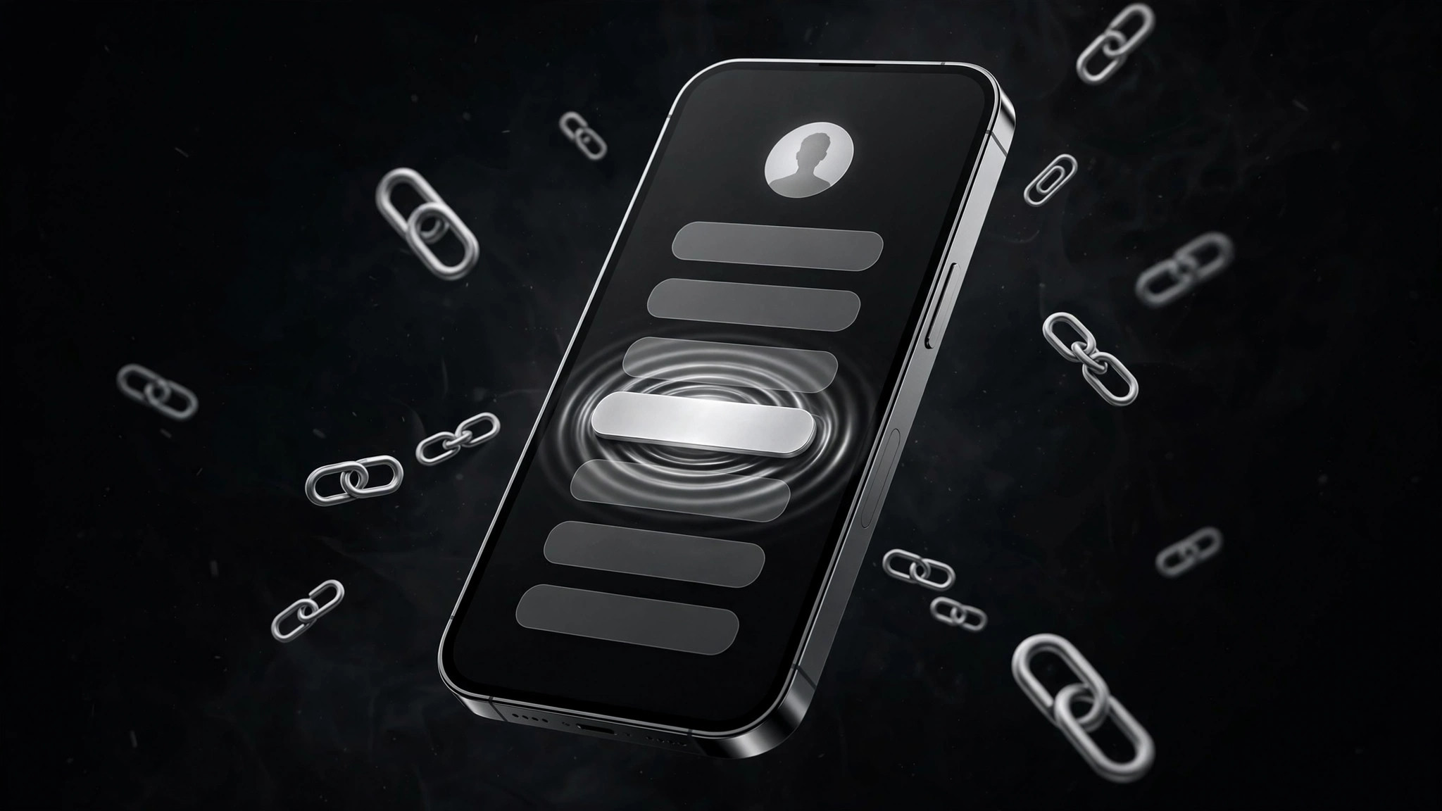
Turns your AI into a social-preview designer for a link-in-bio page — builds a 1200×630 OG image with a stacked-link motif, one avatar, and one tap promise, so the share card looks like the page it links to.
Best for
Creators, shops, musicians, and local businesses whose bio link is the front door
Time needed
~20 min per card
Level
Beginner-friendly
Install it in 3 steps
No sign-up. No CLI tools. Pick your AI, copy one line, paste it over.
Prefer doing it yourself? Buy the skill ($4.99), download the ZIP from your checkout confirmation, unzip it into the directory shown above, restart your AI session — same result. Already bought it? Your AI assistant can download it for you.
What’s inside
One SKILL.md (the playbook) + one starter template. A preview:
Link-in-Bio OG Image
When to use
- Your link-in-bio page gets shared (in bios, DMs, posts, QR codes) and the preview is a grey box or a generic screenshot
- You are a creator, shop, musician, or local business whose bio link is the front door — the card has to say what waits behind it
- You just added a new offer, drop, video, or booking link and want a share card that points at it
- You run multiple link-in-bio pages (per campaign, per platform) and want them to look like one family
- You want a repeatable OG recipe you can update in minutes when the top link changes
Workflow
- Name the one tap (input: your link-in-bio page → output: tap promise)
A link-in-bio page holds many links; the OG card can only promise one. Pick the link that matters most right now — the drop, the booking, the new video, the shop — and write the card's promise around it: "New single out now — tap to listen" or "Book a table in 30 seconds." If the top link changes next week, the card changes with it. A card that promises "all my links" promises nothing. - Sketch the stacked-link motif (input: tap promise → output: three-zone layout)
Lay out the 1200×630 canvas in three zones: left — a round avatar (yours, or your brand mark) plus your name/handle in large type; middle — the stacked-link motif: three or four rounded link buttons in a vertical stack, the top one highlighted as the featured link with a short label; right or bottom — the tap promise in one line. The buttons are a motif, not a screenshot: simplified pills, no readable small text inside them except the featured link's short label. The highlighted button uses your accent color; the rest stay neutral. - Set the thumbnail rules (input: layout sketch → output: type + contrast spec)
Fix legibility before generating: name/handle at least 80 px tall, tap promise at least 44 px, no text under 40 px anywhere, no more than 12 words total on the card. The avatar must still read as a face or mark at 120 px wide — if your avatar is a busy photo, crop tighter or use the mark instead. Test contrast on light and dark chat backgrounds: the stacked buttons must stay visible on both, which usually means a card background that is neither pure white nor pure black. - Generate and thumbnail-test (input: layout + spec → output: candidate cards)
Generate the card, then shrink it to 240 px (phone feed) and 120 px (chat sidebar) and view it on light and dark backgrounds. Ask: can I read the name? Do I see stacked links? Do I know what the tap gives me? If any answer is no, fix that zone and regenerate. Keep the winning layout as the family template — when the featured link changes, only the highlighted button's label and the promise line change.
Template preview
Link-in-Bio OG Image — Template
1200×630. One featured link. ≤12 words total. Test at 240 px and 120 px, on light AND dark backgrounds.
Copy (fill before designing)
- Name / handle (as people know you): {e.g. @mara.sings}
- Featured link (the one tap that matters now): {e.g. "New single — listen"}
- Tap promise (one line): {e.g. "Tap for the new single."}
- Avatar: {same avatar as the page itself — face or mark, must read at 120 px wide}
Layout — three zones
Legibility spec
- Name ≥ 80 px · Promise ≥ 44 px · Nothing under 40 px
- Card background neither pure white nor pure black (must hold on both)