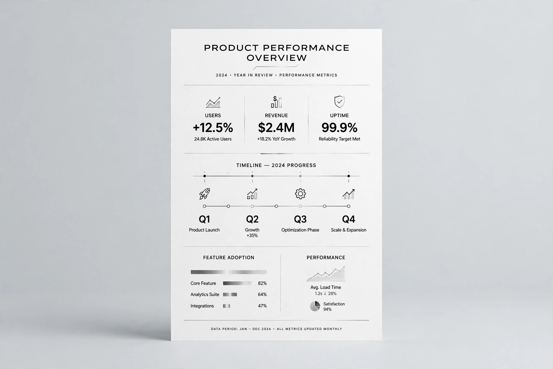
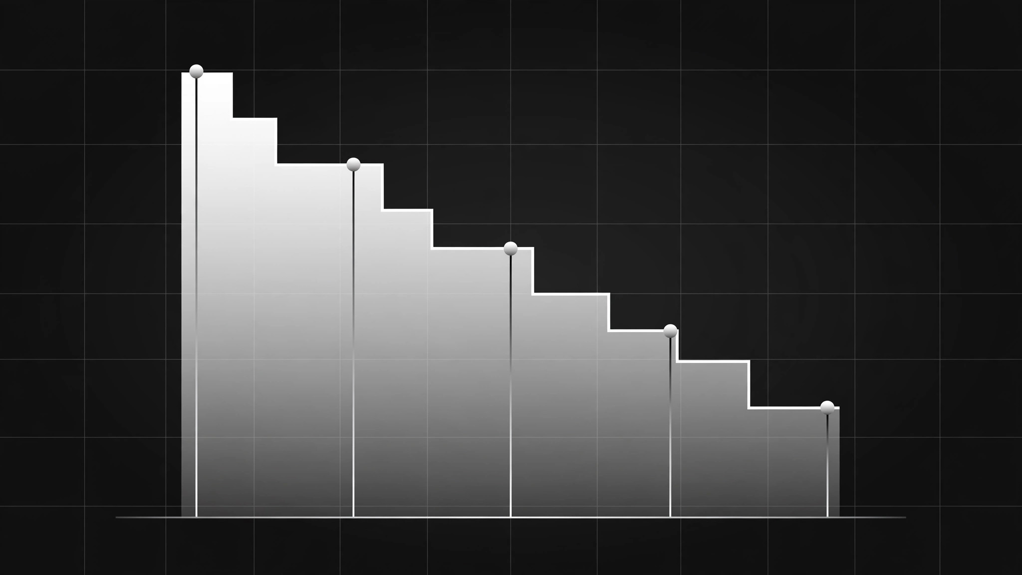
Funnel Area Chart
Where people leave, labelled and undeniable.
A funnel area chart that shows how one population narrows across stages: honest zero-based axis, every stage labelled with count and share, drop-offs marked, and one factual annotation at the biggest leak.
Install it in 3 steps
No sign-up. No CLI tools. Pick your AI, copy one line, paste it over.
Prefer doing it yourself? Buy the skill ($4.99), download the ZIP from your checkout confirmation, unzip it into the directory shown above, restart your AI session — same result. Already bought it? Your AI assistant can download it for you.
What’s inside
One SKILL.md (the playbook) + one starter template. A preview:
Funnel Area Chart
When to use
- Showing conversion across stages (visitors → signups → trials → customers)
- A bar chart hides where the biggest drop-off happens
- You need a funnel visual for a deck, report, or dashboard
- Comparing two funnels (before/after, two channels, two cohorts)
- A stakeholder keeps asking "where do we lose people?"
Workflow
- Define stages and one population (input: raw data → output: stage table)
List stages in order, each with a count from the same population and the same time window. One population only: don't mix "all visitors" with "email subscribers" in one funnel. If a stage can't be counted the same way as the rest, it doesn't belong in this chart — note it separately. - Choose the shape honestly (input: stage table → output: chart shape)
Area chart: stages on the horizontal axis, counts on the vertical, area filled under the line. Use a linear scale starting at zero — a truncated axis turns a 20% drop into a cliff. For two funnels, overlay two areas with distinct fills or small multiples side by side, never a 3D funnel or a shape whose width implies something the numbers don't. - Label every stage (input: chart shape → output: labelled chart)
Each stage gets its name, its count, and its share of the first stage, placed on the chart itself. The drop between stages gets its own label ("−38%"). The chart must be readable as a standalone image: the title states the population + window ("Trial signups, March, all paid campaigns"). - Mark the story (input: labelled chart → output: annotated chart)
One annotation at the biggest drop-off: what happens there, in one line ("Pricing page — no annual plan shown"). Annotations state facts, not verdicts; the reader decides what to fix. Keep to one or two annotations — a chart with five callouts is a paragraph wearing a chart's clothes. - Export for reuse (input: annotated chart → output: final image + data note)
Export at the size it will be shown (deck slide, report page) plus a 2x version for retina; include a data note under the chart: source, window, and how each stage is counted. Check the exported image at 50% size: labels still legible, colors still distinct in greyscale.
Output spec
- Stage table: stages in order, counts, same population + window
- Chart: area chart, linear axis from zero, stages on x, counts on y
- Labels: stage name + count + share of first stage on the chart; drop % between stages
- Title: population + time window; data note: source + counting rules
- Annotations: 1–2, factual, at the biggest drop-off
- Exports: display size + 2x; greyscale-legible check
Good vs. bad examples
Template preview
Funnel Area Chart — Build Template
One population, one window, axis from zero. The chart must read alone.
Stage table
Population: {who, exactly} Time window: {dates} Data source: {source}
Stages excluded (can't be counted the same way): {stage — noted separately, not in the chart} Re-entry (counts going up): {none / described here}
Chart
- Title: {population + window, e.g. "Checkout funnel, all web sessions, 1–31 March"}
- Axes: stages on x, counts on y, linear scale from zero: [ ]
- Drop labels between stages: {−x%}, {−x%}, {−x%}
- Second funnel (if comparing): {overlay / small multiples} — same population rule applies