Expense Card OG Image
A share image for your expense card that reads at thumbnail size.
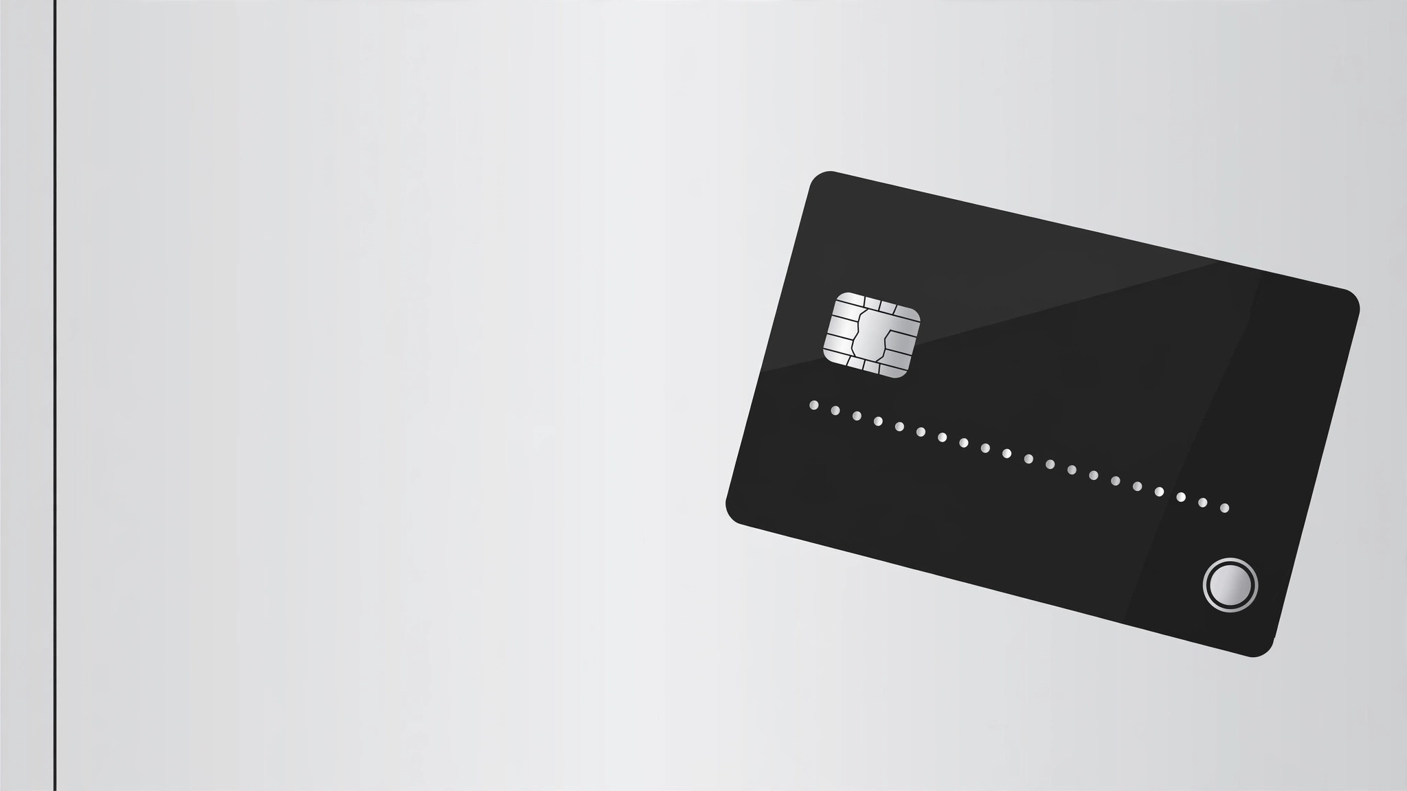
Turns your AI into a social-preview designer that builds a 1200×630 OG image for an expense-card product — a card mockup, a one-line promise, and a brand mark, all readable at thumbnail size.
Install it in 3 steps
No sign-up. No CLI tools. Pick your AI, copy one line, paste it over.
Prefer doing it yourself? Buy the skill ($4.99), download the ZIP from your checkout confirmation, unzip it into the directory shown above, restart your AI session — same result. Already bought it? Your AI assistant can download it for you.
What’s inside
One SKILL.md (the playbook) + one starter template. A preview:
Expense Card OG Image
When to use
- Your expense-card or corporate-card product gets shared on social media, chat, or Slack and the link preview is blank or auto-generated
- You're launching a card product and need a share image that reads instantly at thumbnail size, not just at full size
- Your existing OG image is a cropped logo on a gradient that nobody can read when it's 120 pixels wide
- You need matching preview images for a landing page, a blog post, and a product announcement — same system, different headlines
- A card redesign shipped and the old preview image still shows the old card
Workflow
- Lock the message (input: product facts → output: one-line promise)
An OG image carries exactly one message: the product name plus one promise of under 8 words ("Business spending, finally under control"). Write the promise first and design around it — if it needs a second sentence to make sense, it's the wrong promise. Everything else on the image (card, brand, background) exists to make that one line land. No feature lists, no fine print, no URLs: at thumbnail size, every extra word is noise. - Compose the card mockup (input: card design → output: card render)
Draw the card at a slight angle (10–15 degrees) on the right two-thirds of the canvas, large enough that the chip, the card number pattern, and the brand mark are visible at 120 pixels wide. Use the real card design — real colors, real logo placement, real card name — or a clearly generic placeholder card if the design isn't final. Never render a card that looks like a real bank's issued card: no real card numbers, no real cardholder names, no copied bank branding. A generic "●●●● 0000" pattern and your own brand mark keep it honest and safe. - Set the type hierarchy (input: promise + product name → output: placed headline)
Two text elements, no more: the product or brand name (small, top-left, in the brand font) and the promise (large, left-aligned, two lines maximum, set in a heavy weight). The promise must be legible at 240 pixels wide — test it by shrinking the image, not by squinting at full size. If any word wraps awkwardly or gets cut, shorten the promise rather than shrinking the type. Contrast: dark text on light ground or light text on dark ground, never mid-tone on mid-tone.
Template preview
Expense Card OG Image — Build Template
One promise, one card, one image. Fill this in before composing.
Message
Product / brand name: {name}
One-line promise (≤8 words): {e.g. Business spending, finally under control.}
Card name (as printed on the card): {name on card}
Card mockup
- Card angle: {10–15°}
- Card colors: {real card colors}
- Chip: [ ] shown
- Number pattern: ●●●● 0000 _(never a real-looking full number)_
- Cardholder line: {generic, e.g. YOUR COMPANY} _(never a real person's name)_
- Brand mark on card: {your own mark, placed as on the real card}
Composition
- Canvas: 1200 × 630 px