Event Bar Chart
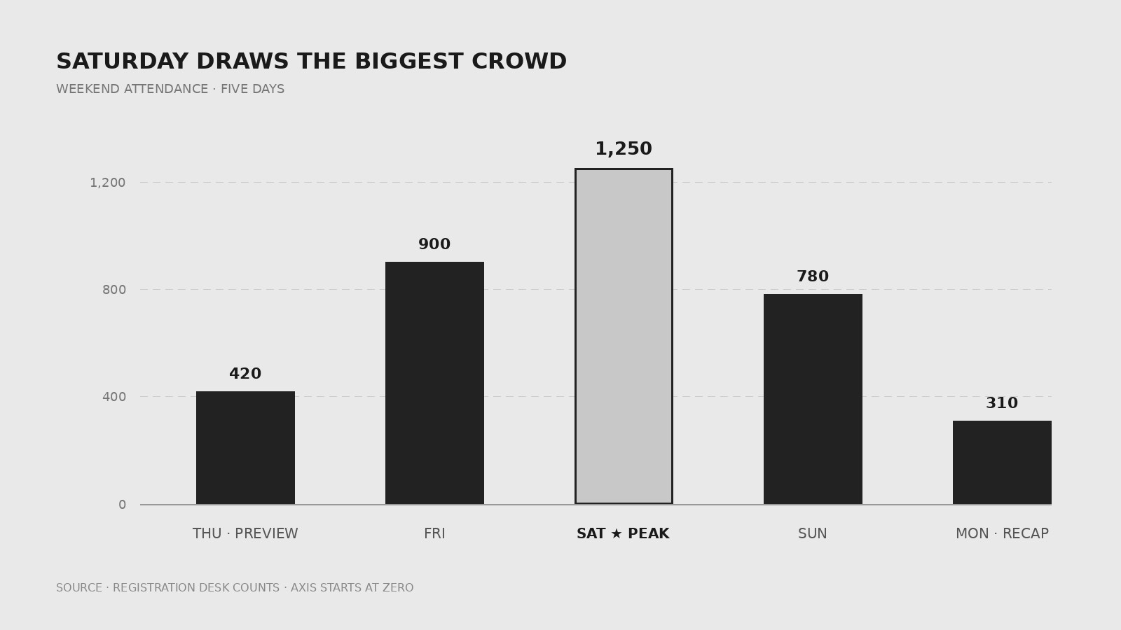
Event numbers as one honest bar chart — zero baseline, labeled values
Turns your AI into a chart designer that turns event numbers into a clean, honest bar chart with labeled values, a zero baseline, and a title that states the finding.
Install it in 3 steps
No sign-up. No CLI tools. Pick your AI, copy one line, paste it over.
Prefer doing it yourself? Buy the skill ($4.99), download the ZIP from your checkout confirmation, unzip it into the directory shown above, restart your AI session — same result. Already bought it? Your AI assistant can download it for you.
What’s inside
One SKILL.md (the playbook) + one starter template. A preview:
Event Bar Chart
When to use
- You need to show attendance, ticket sales, or session turnout for an event in a report or recap deck
- A sponsor update needs one chart proving how this year's event compared with last year's
- Your team is comparing sessions, stages, or ticket tiers and a table of numbers is not landing
- A post-event blog post needs a chart readers can grasp in five seconds
- You are presenting survey answers (for example, "how did you hear about us?") and bars beat a paragraph
Workflow
- Pick one message (input: event data → output: chart title sentence)
A bar chart answers one question: "Which session drew the biggest crowd?" or "Did ticket sales beat last year?" Write the answer as the chart's title before drawing anything. If you cannot state the message in one sentence, you have a data table, not a chart — split it. - Build the data table (input: raw numbers → output: clean category/value table)
List each category with exactly one value, using the same unit throughout (all attendees, all revenue, never mixed). Sort the bars deliberately: biggest-to-smallest for rankings, chronological for time series, and keep "Other" last. Drop categories with no data rather than plotting zeros as if they were real. - Choose orientation and scale (input: data table → output: chart geometry)
Short category names → vertical bars; long names → horizontal bars so labels stay readable. Start the value axis at zero — a truncated axis makes small differences look dramatic. If the range forces a break, say so on the chart, in words, next to the axis. - Label everything (input: chart geometry → output: labeled chart)
Put the exact value at the end of every bar so nobody has to estimate from the axis. Label the axis with its unit ("Attendees", "Tickets sold"), give the chart a source line ("Source: registration desk counts, 12 Oct"), and keep gridlines faint or drop them entirely. One highlight color for the bar the title refers to; everything else neutral. - Check honesty and legibility (input: labeled chart → output: approved file)
Read the chart as a skeptic: does the visual size of each bar match its number? Could anyone mistake a ranking for a time trend? View it at the size it will be published at — every label must still be readable. If the chart misleads at a glance, it fails no matter how pretty it is.
Output spec
- One bar chart (vertical or horizontal) with 2–12 categories, one value each
- Value axis starting at zero; unit labeled; source line included
- Exact value labeled on every bar; title states the finding in one sentence
- One highlight color maximum; neutral bars, faint or no gridlines
- Delivered with alt-text stating the chart's finding and its source
Template preview
Event Bar Chart — Template
One chart = one message. Fill in the message before drawing anything.
Chart title (states the finding in one sentence)
{Title: e.g. Saturday drew the biggest crowd of the weekend}
Question this chart answers: {e.g. Which day drew the biggest crowd?}
Data table (one value per category, same unit throughout)
Sort order: {biggest-to-smallest / chronological / other — and why} Estimates (if any): {which values are estimates — label them on the chart}
Geometry
Orientation: {vertical (short names) / horizontal (long names)} Value axis: starts at zero [ ] | Unit label: {e.g. Attendees}