Digital Bank OG Image
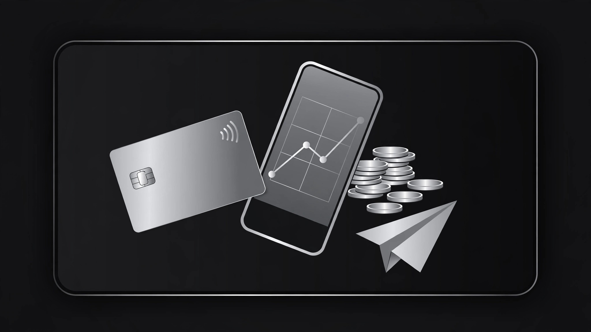
A polished 1200×630 share card for a banking app, card launch, or feature page.
Turns your AI into a social preview designer for digital banks — builds a polished 1200×630 OG image for a banking app, card launch, or feature page that earns the click without looking like an ad.
Install it in 3 steps
No sign-up. No CLI tools. Pick your AI, copy one line, paste it over.
Prefer doing it yourself? Buy the skill ($4.99), download the ZIP from your checkout confirmation, unzip it into the directory shown above, restart your AI session — same result. Already bought it? Your AI assistant can download it for you.
What’s inside
One SKILL.md (the playbook) + one starter template. A preview:
Digital Bank OG Image
When to use
- Your digital bank, neobank, or fintech product is launching a card, feature, or landing page and the link preview is the first thing people see
- A press article, blog post, or App Store page links to your product and shows a broken or generic preview
- You're announcing a new feature (savings pots, instant transfers, virtual cards) and want the share card to explain it in one glance
- Your marketing site has ten pages and they all share the same preview image — each page needs its own
- You're a designer or founder who needs a preview card that looks trustworthy, because a bank that looks sloppy doesn't get signups
Workflow
- Define the page's one message (input: page URL + goal → output: message brief)
Every OG image sells one thing: the page it points to. Write the page's single message in under 10 words — "A card that rounds up your spare change" or "Send money home in seconds." If the page has three messages, pick the one that earns the click; the other two live on the page itself. Also note the compliance boundaries up front: no interest rates, fees, or guarantees in the image unless they're on the page and approved, and never a claim the product can't back. - Design the 1200×630 composition (input: message brief → output: layout spec)
Lay out the standard anatomy for a banking preview: brand mark + name, the one-message headline in large type, and one visual — a card, a phone showing the app, or a simple graphic motif. Keep the background premium and restrained: a solid brand color, a subtle gradient, or a dark field with a metallic card. Respect the safe zones — keep text clear of edges and center, since platforms crop previews differently. A bank's OG image should look calm and expensive, not loud: one accent, generous spacing, no stock-photo people. - Build the image (input: layout spec → output: draft OG image)
Produce the image at exactly 1200×630 pixels. Headline type around 64–80px at full size so it stays legible in a chat sidebar at ~300px wide. Total word count under 12, including the brand name. If a card appears, show a clean card mock with no real card number, no real name, and no chip/expiry that could be mistaken for a real card. Export as JPG or PNG under 300KB. Check the draft at three sizes — full, chat-width, and notification-tiny — and confirm the message survives at each.
Template preview
Digital Bank OG Image — Template
One page = one OG image. Fill this in before designing.
Message brief
Page URL: {url} | Locale: {language} One message (under 10 words): {e.g. "Round up spare change. Save without thinking."} Compliance boundaries: {no rates/fees/guarantees in image unless approved — list what is NOT allowed: …}
Layout spec (1200×630)
- Background: {brand color / subtle gradient / dark field}
- Brand mark + name: {position, size}
- Headline: {one message, 64–80px}
- Visual on the right: {card mock / phone showing app / graphic motif}
- Safe zones: text clear of edges and center
- Total words: ≤12