Developer-Tool OG Image
A link preview developers actually read.
A social-preview image playbook for a developer tool: dark background, a real code snippet as the motif, and a name-plus-promise layout that stays legible at thumbnail size across X, LinkedIn, Slack, and Discord.
Install it in 3 steps
No sign-up. No CLI tools. Pick your AI, copy one line, paste it over.
Prefer doing it yourself? Buy the skill ($4.99), download the ZIP from your checkout confirmation, unzip it into the directory shown above, restart your AI session — same result. Already bought it? Your AI assistant can download it for you.
What’s inside
One SKILL.md (the playbook) + one starter template. A preview:
Developer-Tool OG Image
When to use
- You're shipping a docs page, launch post, or repo and the link preview is a blank gray box or an auto-cropped screenshot
- Your tool's announcement post gets reshared and the preview is unreadable at timeline size
- You need one OG image that works across X, LinkedIn, Slack, and Discord unfurls without re-cropping
- Your tool has a CLI, API, or config-file workflow and the image should signal "developer tool" in under a second
- You're launching on Product Hunt, Hacker News, or a changelog and want the preview to carry the tool's name and one-line promise
Workflow
- Lock the one message (input: tool name + one-line promise → output: message brief)
Name plus a promise of ≤8 words. "Deploy previews in one command" works; "The next-generation developer experience platform for modern engineering teams" doesn't. If the promise doesn't fit in one breath, shorten the promise — never shrink the type to fit a long promise. - Compose for the thumbnail (input: message brief → output: layout)
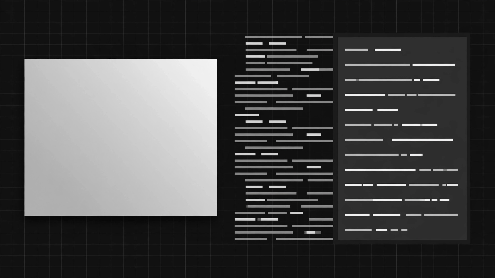
Work on a 1200×630 canvas. Tool name large, top-left or left; promise below it; code motif as a background texture or side panel. Keep all text at least 60px from every edge — some platforms center-crop previews. Test the layout at 240px wide: if the name isn't legible there, the layout is wrong. - Build the code motif (input: real usage snippet → output: code panel)
Use a real, short snippet from your docs: a real command, a real config line, real output. Three to six lines maximum, syntax-colored in two to three tones. Never invent flags, commands, or APIs your tool doesn't have. Fade or blur the code behind the text — never place body text on top of live code lines. - Set dark-background type (input: layout → output: finished composition)
Near-black background (roughly #0a0a0c to #141416), off-white text, one accent color reserved for the tool name or one keyword. One typeface family, two weights maximum. No drop shadows on body text, no glowing effects — crisp edges are the whole point at thumbnail size. - Export and verify (input: composition → output: verified OG image)
Export 1200×630 PNG or JPG at a reasonable file size. Preview it in at least two unfurl renderers (post the link privately, or use a preview tool) and confirm the tool name reads at 240px wide. Keep the editable source file so the next launch reuses the layout instead of starting over.
Output spec
Template preview
Developer-Tool OG Image — Image Brief Template
One image = one brief. Fill this in before composing anything.
Tool: {tool name}
One-line promise (≤8 words): {…} Where it will be shared: {X / LinkedIn / Slack / Discord / …}
Message
- Tool name (as it must appear): {…}
- Promise (≤8 words): {…}
- One thing a viewer should learn in 1 second: {…}
Layout (1200×630)
- Name placement: {top-left / left / …} | Name size: {…px}
- Promise placement: {…} | Promise size: {…px}
- Code motif placement: {background texture / side panel / …}
- Margins: no text within 60px of any edge — verified: [ ]