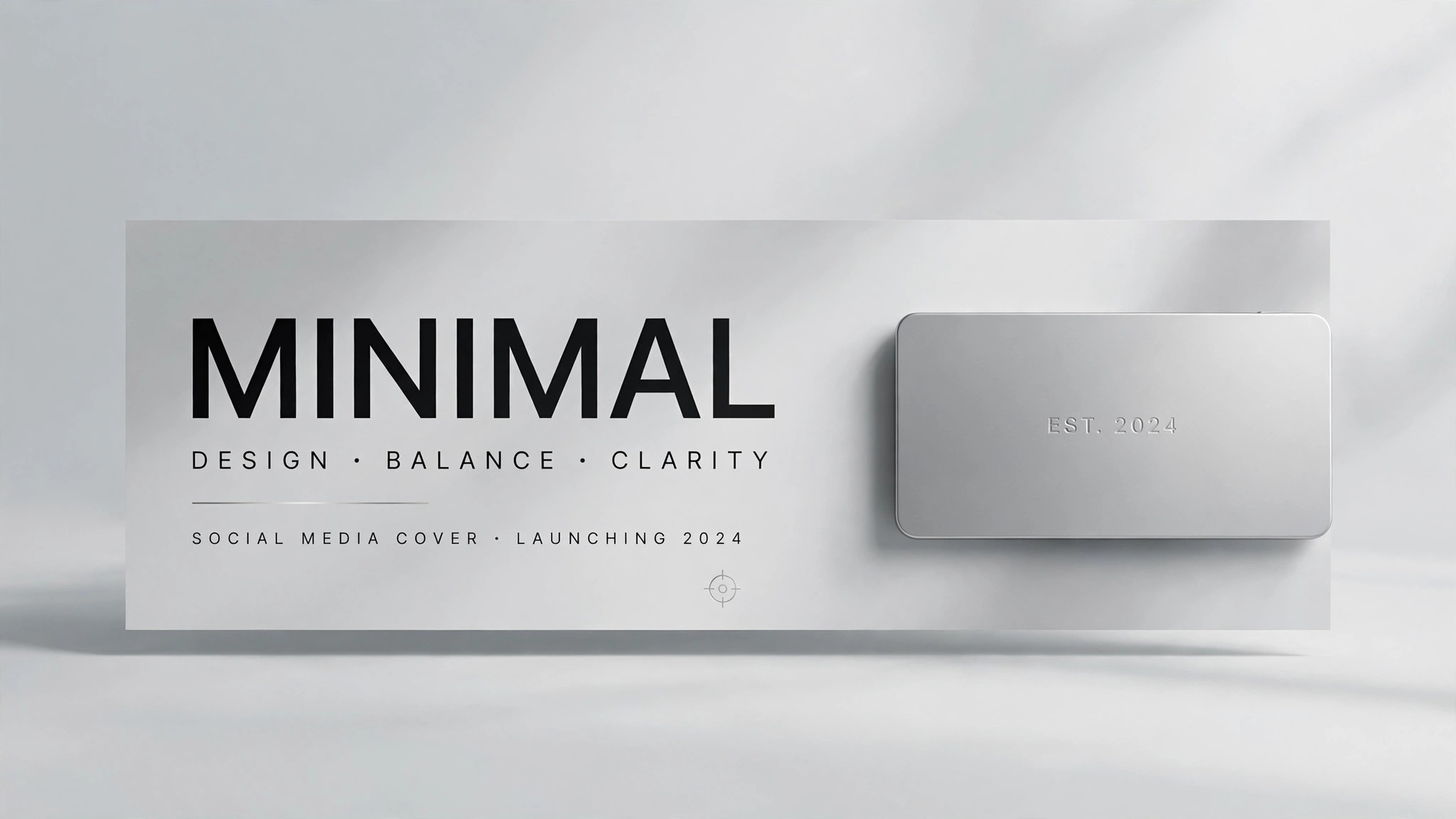
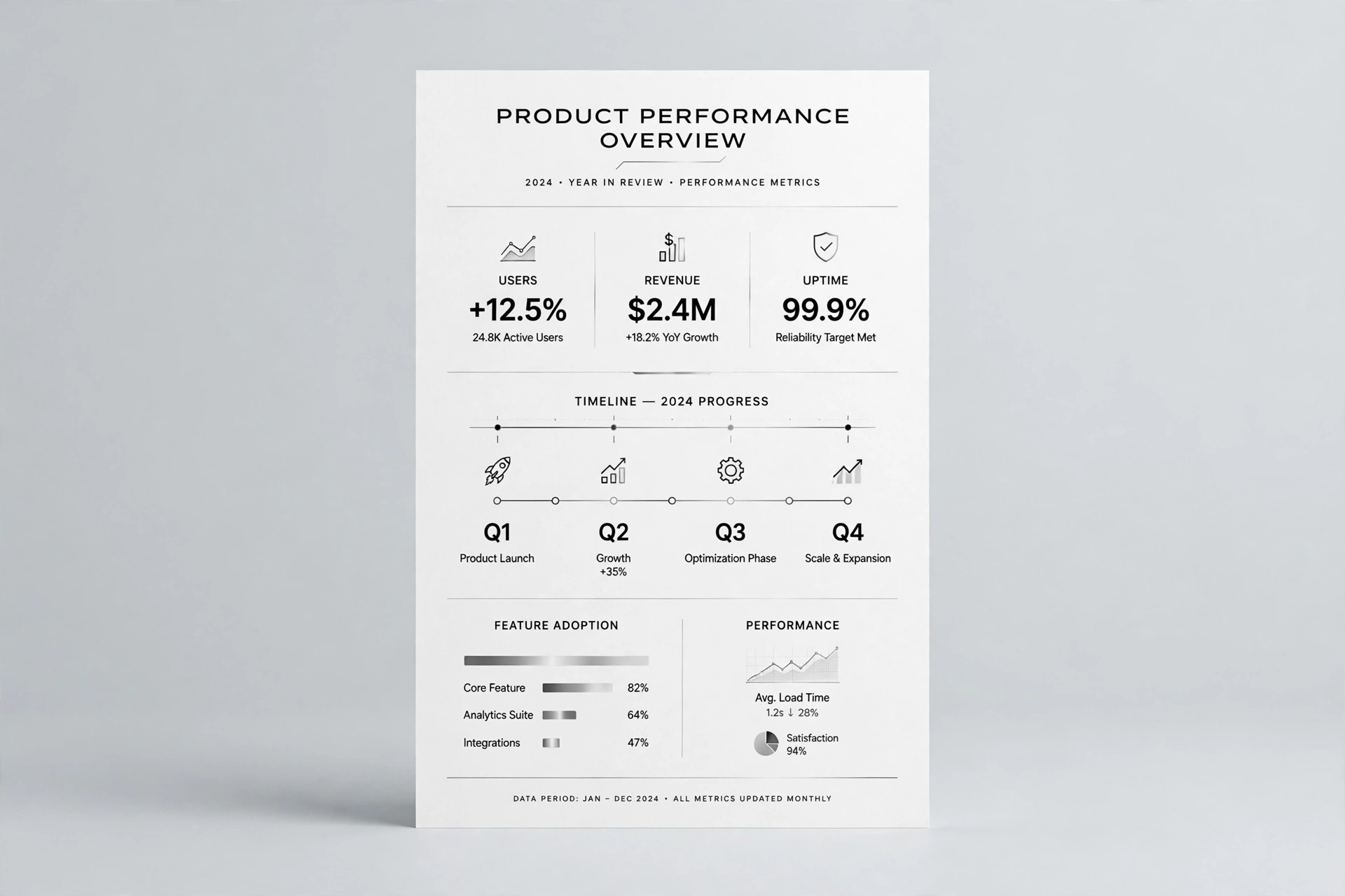
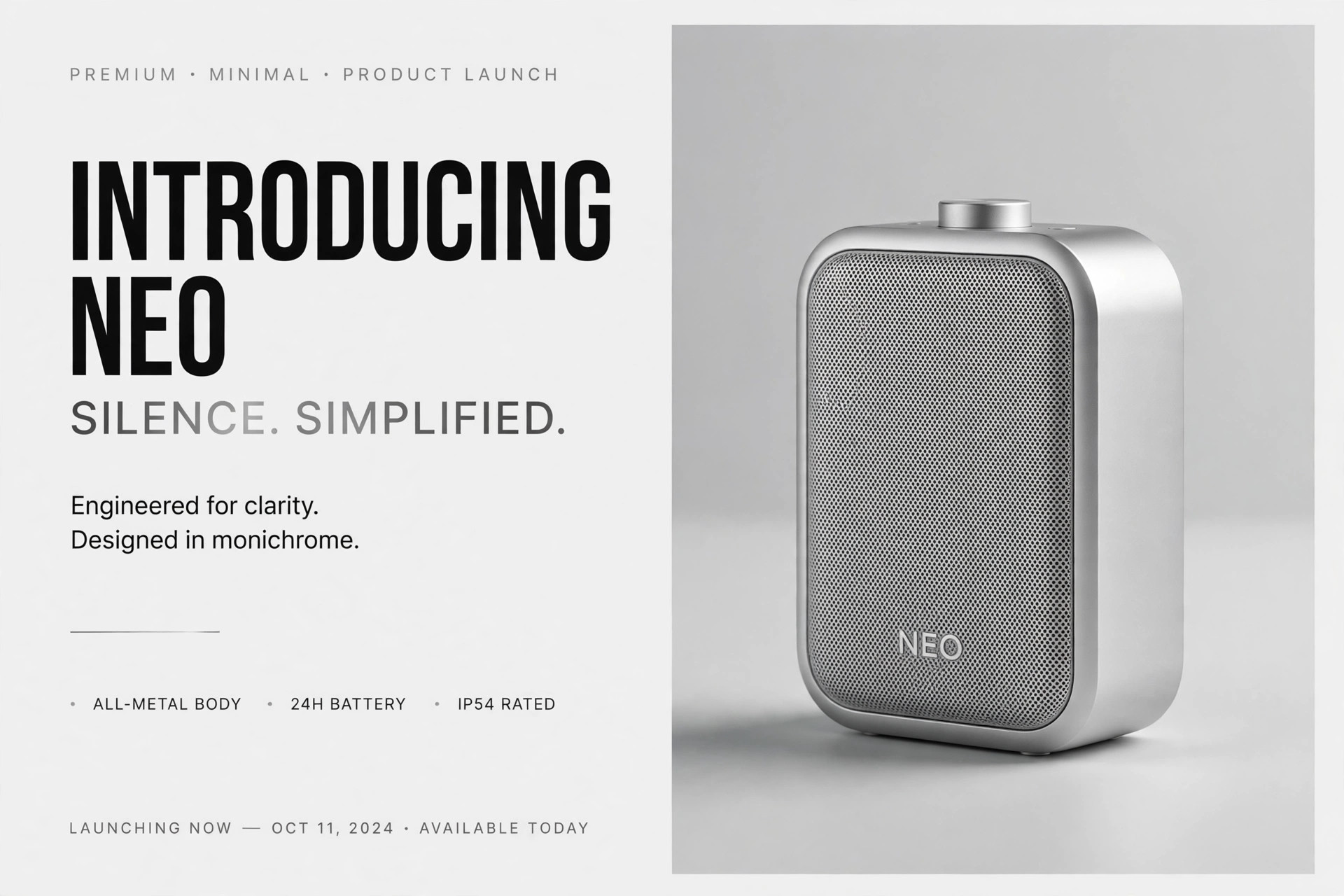
Design Tool OG Image
A 1200×630 preview that says what your design tool does in one glance
Turns your AI into a social preview designer that composes a 1200×630 OG image for a design tool: a glimpse of the product UI, one clear promise, and a brand mark that reads at thumbnail size.
Install it in 3 steps
No sign-up. No CLI tools. Pick your AI, copy one line, paste it over.
Prefer doing it yourself? Buy the skill ($4.99), download the ZIP from your checkout confirmation, unzip it into the directory shown above, restart your AI session — same result. Already bought it? Your AI assistant can download it for you.
What’s inside
One SKILL.md (the playbook) + one starter template. A preview:
Design Tool OG Image
When to use
- You are launching or updating a design tool and the link preview is a blank logo or an auto-cropped screenshot
- A product page, changelog, or launch post needs a preview image that says what the tool does in one glance
- Your tool's homepage looks great at full size but illegible as a small card in a feed or chat app
- You want a consistent preview style across launch posts, feature announcements, and docs pages
- A product launch, social post, or newsletter announcement needs a share image that earns the click
Workflow
- Lock the one-line promise (input: product page → output: headline + subline)
Distill what the tool does into a headline of 3–7 words a stranger would understand, written in your product's own words. Add an optional subline under 10 words. If the promise needs jargon to make sense, rewrite it — the preview is read by people who have never used the tool. - Choose the UI glimpse (input: product → output: UI crop description)
Pick one real screen of the tool — the canvas, the layers panel, a collaboration moment — and crop to its most recognizable part: one artboard, one toolbar, one cursor cluster. Show real UI, not a mockup of a mockup; blur or replace any real user content in the screenshot. The UI is evidence the tool exists; the headline does the persuading. - Compose the frame (input: headline + UI glimpse → output: layout)
Place the UI glimpse on one side and the headline on the other, or layer the headline over a quiet area of the UI with a soft gradient behind the type. Keep the brand mark small in a corner. Type occupies at most a third of the frame; the UI gets the rest. Leave breathing room at the edges — some platforms crop previews slightly. - Set type and color (input: layout → output: styled image)
Use the product's own typeface and colors so the preview matches the page it links to. Headline in a heavy weight, subline in a plain weight, both high-contrast against their background. One accent color at most; no gradients-for-decoration, no stock illustration. If the UI is busy, mute it slightly so the headline stays the loudest thing in the frame. - Test at real sizes (input: styled image → output: approved 1200×630 file)
Check at three sizes: full 1200×630, a ~500px feed card, and a ~240px chat thumbnail. At every size the headline must be readable and the image must read as "a design tool" in under a second. If the UI turns to mush at small size, simplify the crop or enlarge the headline — never ship a preview you cannot read in a chat window.
Output spec
Template preview
Design Tool OG Image — Template
One promise + one UI glimpse. Fill in the promise before touching any screenshot.
Page this preview links to
URL: {page URL} | Page type: {product page / changelog / launch post / docs}
Promise
Headline (3–7 words, plain language): {e.g. Design together, in real time} Subline (optional, under 10 words): {e.g. One canvas for your whole team} Brand mark placement: {e.g. bottom-left corner, small}
UI glimpse
Screen chosen: {e.g. Main canvas with two cursors} | Crop: {e.g. One artboard + toolbar} Real user content in shot? {none / blurred / replaced with sample content}