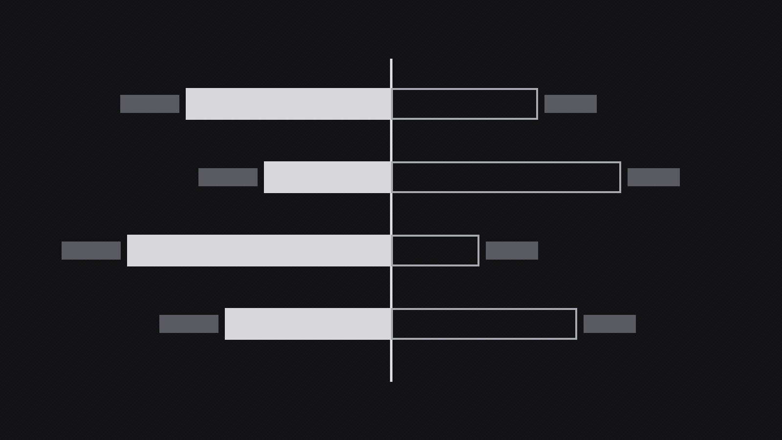
Dark Balance Chart
Two-sided comparisons that stay readable on dark backgrounds.
A chart pattern for balance and comparison diagrams on dark themes: sides distinguished by weight and pattern first and color second, values labeled directly, and the balance point marked explicitly.
Install it in 3 steps
No sign-up. No CLI tools. Pick your AI, copy one line, paste it over.
Prefer doing it yourself? Buy the skill ($4.99), download the ZIP from your checkout confirmation, unzip it into the directory shown above, restart your AI session — same result. Already bought it? Your AI assistant can download it for you.
What’s inside
One SKILL.md (the playbook) + one starter template. A preview:
Dark Balance Chart
When to use
- A report, dashboard, or deck uses a dark theme and a balance or comparison chart must stay legible on it
- You need to show two sides of something — income vs. spending, pros vs. cons, plan A vs. plan B, before vs. after
- A chart that looked fine on white turns muddy, low-contrast, or unreadable on a dark slide
- Stakeholders need to read exact values, not just the overall shape, from a dark-background chart
- An infographic or social graphic needs a dark, premium feel without sacrificing accessibility
Workflow
- Define the comparison (input: message and data → output: comparison brief)
Write the one sentence the chart must prove before drawing anything: "Spending exceeded income in four of six months," "Plan B costs more upfront but less over three years." Then list the two sides being compared and the exact values behind them — a balance chart with vague values is decoration, and decoration on a dark background looks like a mistake. Decide the chart form from the comparison type: a two-pan balance or diverging bar for two-sided totals, paired bars for item-by-item comparison, a slope or dumbbell for before-and-after. If the comparison has more than two sides or more than about eight items per side, split it into two charts; a crowded dark chart becomes unreadable faster than a crowded light one. - Set the dark canvas (input: comparison brief → output: canvas spec)
Pick the background deliberately: a near-black with a hint of warmth or coolness (not pure black, which makes thin lines vibrate, and not mid-gray, which kills contrast). Fix the text colors in two tiers — primary text near-white for values and labels, secondary text in a muted gray for axes, units, and footnotes — and verify the contrast of each tier against the background (secondary text must still clear accessibility contrast for its size). Set the grid: faint, thin, and sparse — gridlines are scaffolding, and on dark backgrounds heavy grids shout. Decide the export context now (slide, dashboard, print, social) because a chart built for a bright projector needs bolder strokes than one built for a phone screen in a dark room.
Template preview
Dark Balance Chart — Production Template
Fill this in before drawing. Weight and spacing carry the comparison; color only assists.
Comparison brief
One-sentence message: "{e.g. Spending exceeded income in four of six months.}" Side A: {name} — Side B: {name} Chart form: {two-pan balance / diverging bars / paired bars / slope-dumbbell}
Data (exact values — no vague values)
Source + date: {source, date} · Units: {unit, stated once near title} · Rounding: {precision the decision needs}
Canvas spec
- Background: {near-black with a hint of warm/cool — never pure black}