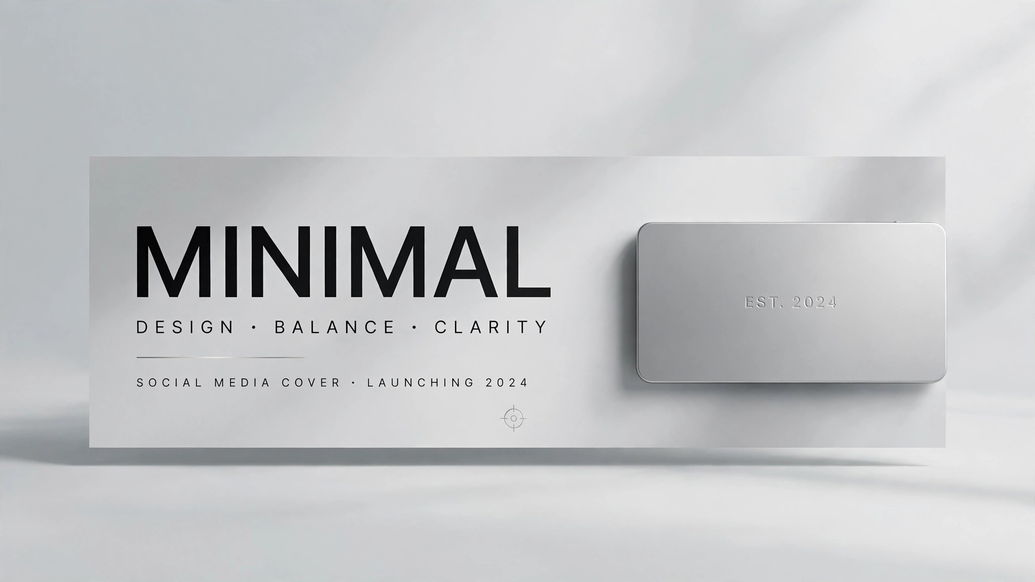
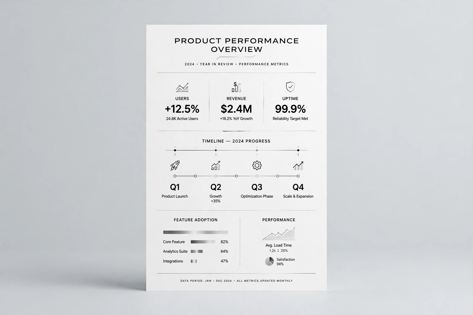
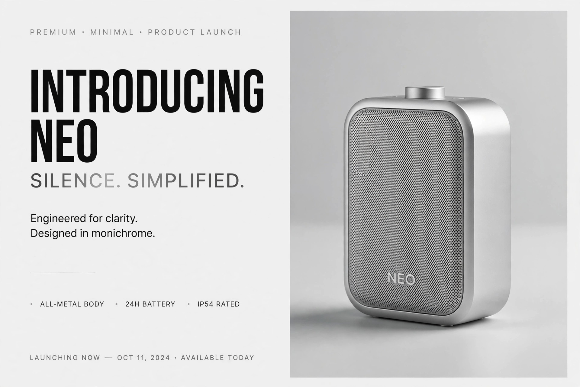
Clean SaaS OG Image
A link preview that carries the pitch at thumbnail size.
Designs a clean social preview (OG) image for a SaaS product — calm colors, a hint of the product UI, and a headline readable at thumbnail size.
Install it in 3 steps
No sign-up. No CLI tools. Pick your AI, copy one line, paste it over.
Prefer doing it yourself? Buy the skill ($4.99), download the ZIP from your checkout confirmation, unzip it into the directory shown above, restart your AI session — same result. Already bought it? Your AI assistant can download it for you.
What’s inside
One SKILL.md (the playbook) + one starter template. A preview:
Clean SaaS OG Image
When to use
- Your SaaS product's links look blank or messy when shared on social media, chat apps, or in docs
- You are launching a product, feature, or pricing page and want the shared link to carry the pitch
- A landing page needs a preview image that matches its design instead of an auto-cropped screenshot
- You are refreshing a product's brand and the old preview image no longer matches
- You need one preview image that works across link unfurls, not a different graphic per platform
Workflow
- Define the one message (input: page + product → output: message line)
Decide the single thing the image must say: the product name plus a short value line (under 8 words) or the page's core promise. An OG image is seen at thumbnail size in a fast-scrolling feed — it gets one message, not a feature list. If you cannot state it in one line, the page's message needs clarifying before the image gets designed. - Choose the layout (input: message line → output: layout sketch)
Pick one of the proven clean layouts: left-aligned headline with a small product UI panel on the right, centered headline over a calm background with a small UI strip below, or headline plus logo lockup with a large soft color field. Keep generous margins — link previews crop unpredictably, so nothing important sits within 10% of any edge. Sketch the layout as boxes before adding any color or detail. - Set the calm palette (input: layout sketch → output: color system)
Use the product's own colors, restrained: a light neutral or soft brand-tinted background, one brand color for the headline accent or UI hint, and dark neutral text. Calm means low contrast between background elements and high contrast for the words — the headline must read instantly at 200 pixels wide. Avoid gradients, stock-photo backgrounds, and more than two accent colors; they turn muddy at thumbnail size. - Build the UI hint (input: color system → output: composed image)
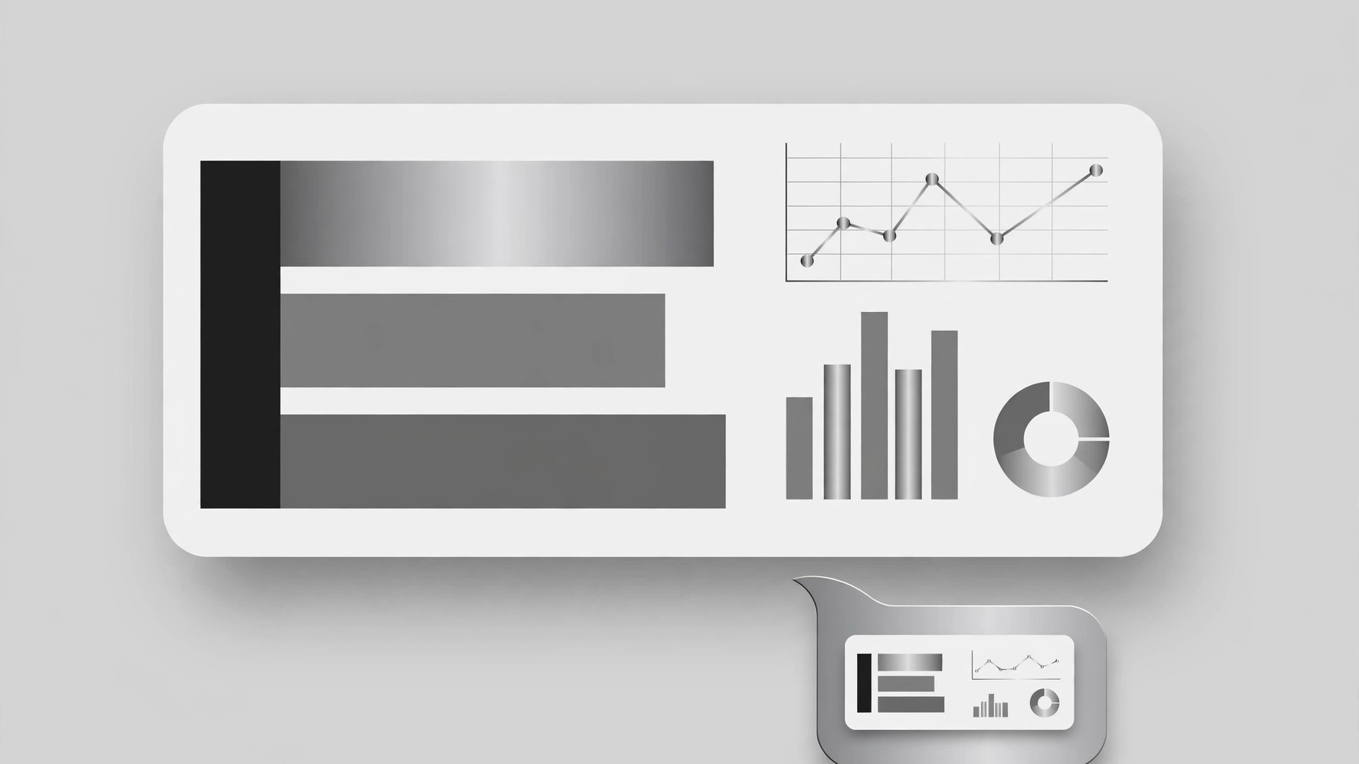
Show a hint of the product UI, not a full screenshot: a simplified card, a dashboard panel with abstract shapes for charts, or a single recognizable screen element, rendered in the product's style with placeholder shapes instead of real data. The UI hint proves "this is a real product" at a glance; a full screenshot proves nothing because nobody can read it at thumbnail size. Keep the UI hint to one-third of the canvas at most — the headline is the star.
Template preview
Clean SaaS OG Image — Build Template
One page = one OG image. One message, one accent, thumbnail-readable.
Page: {page title} — {URL}
Product: {name} One message (product name + value line, under 8 words): {e.g., "Acme — Invoicing without the busywork"} Audience seeing this link: {who shares / clicks it}
Layout (pick one, sketch as boxes first)
- [ ] Left headline + small UI panel on the right
- [ ] Centered headline + small UI strip below
- [ ] Headline + logo lockup + large soft color field
Safe margins: nothing important within 10% of any edge — checked: [ ]