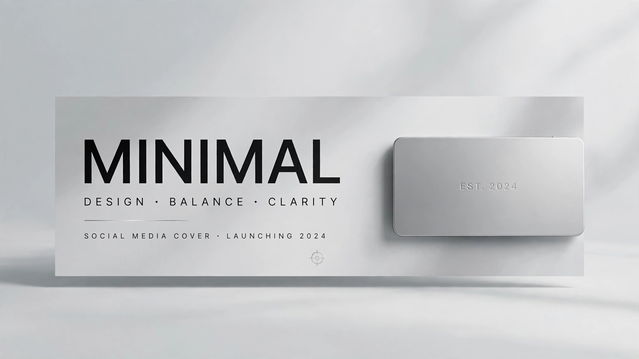
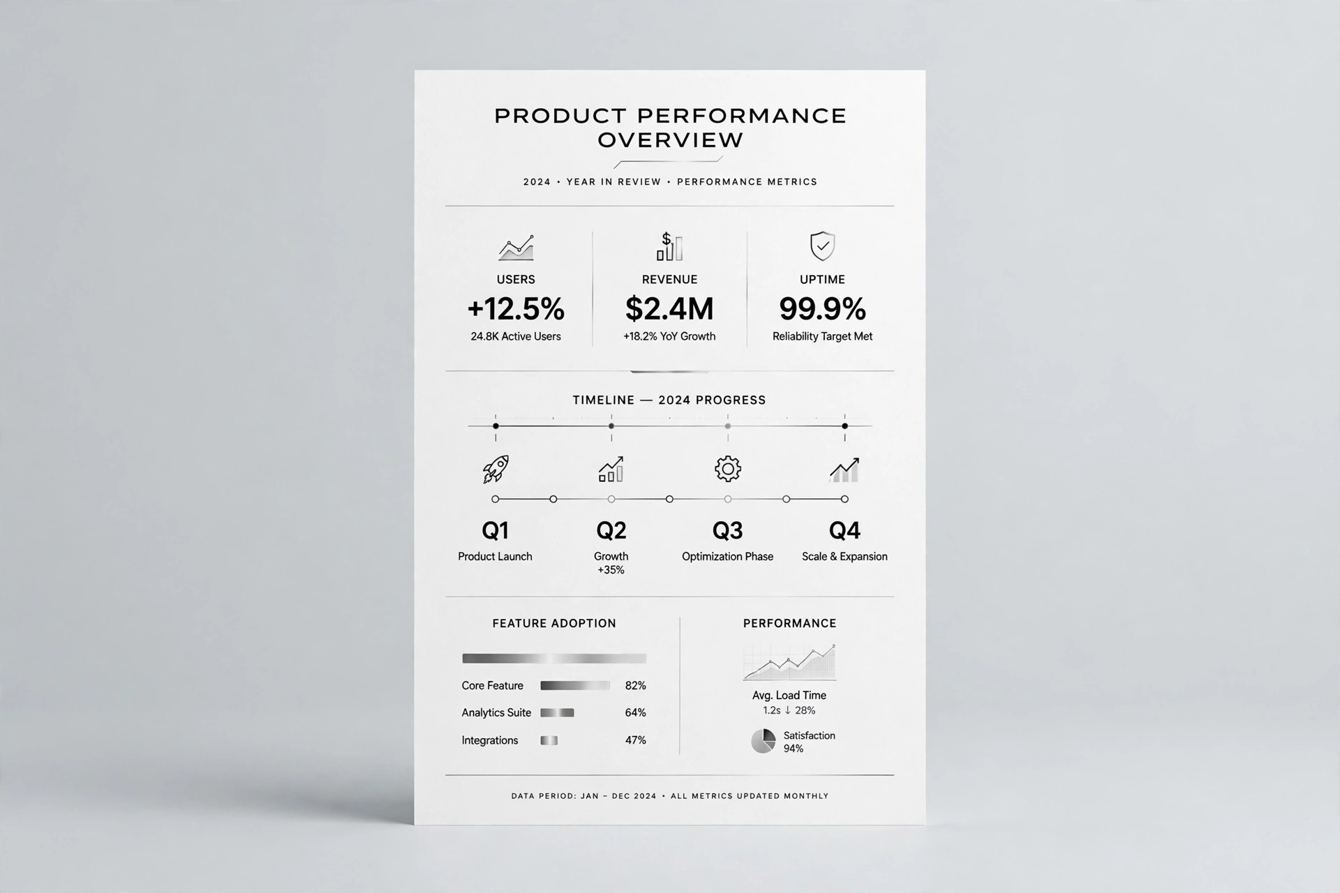
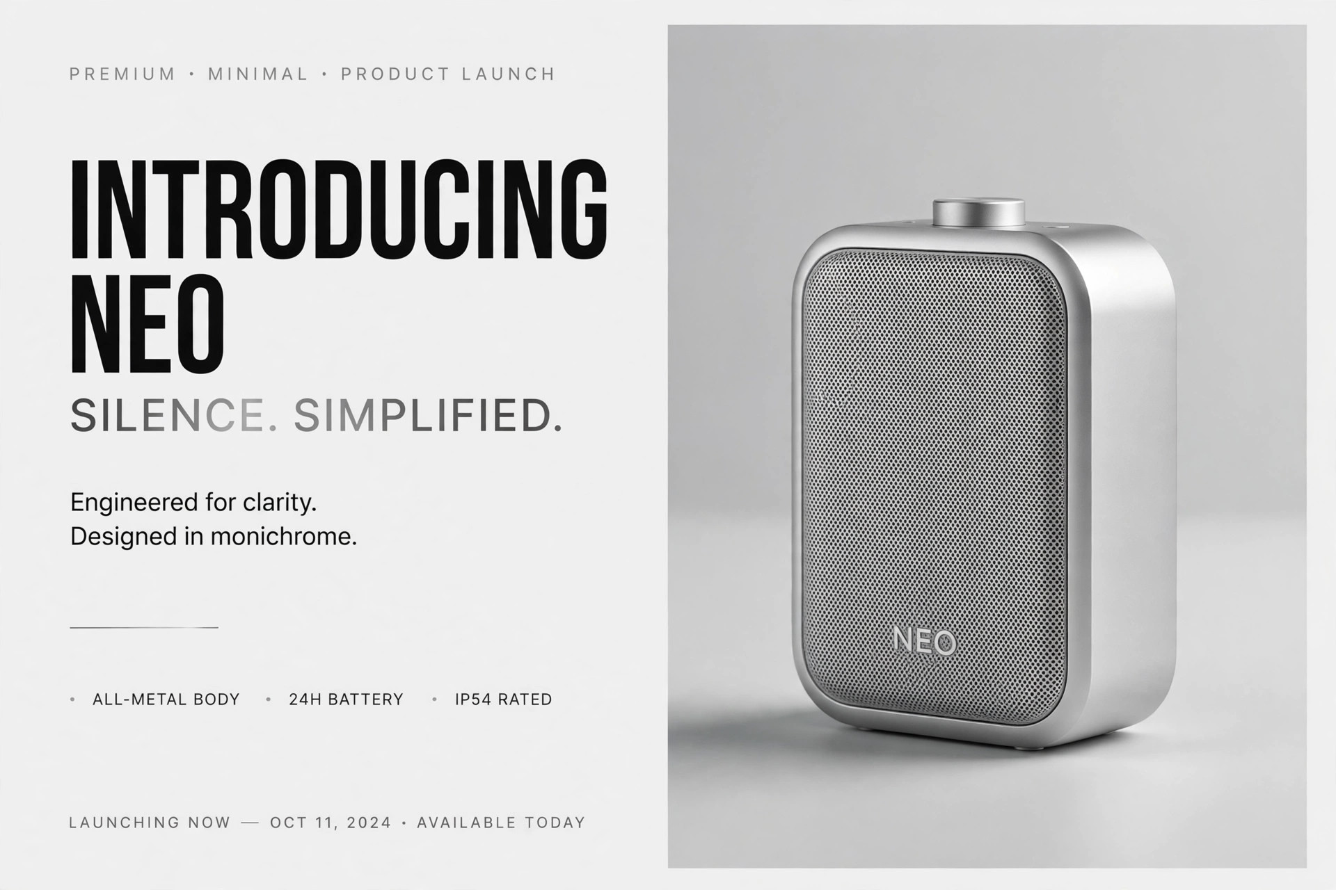
Cinematic OG Image
Link previews with the mood of a movie still.
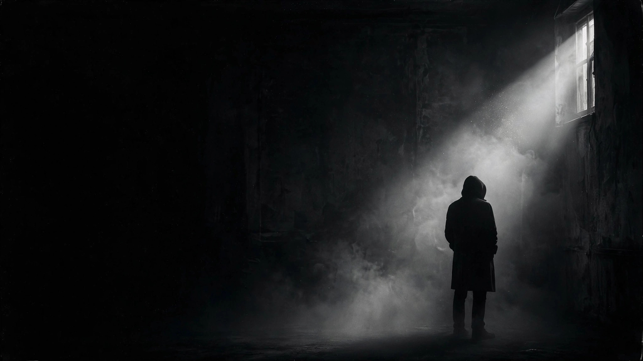
Designs a 1200×630 social preview image with an arthouse-cinema look: one moody still, strong typography, and a fine film-grain finish that stays readable at thumbnail size.
Install it in 3 steps
No sign-up. No CLI tools. Pick your AI, copy one line, paste it over.
Prefer doing it yourself? Buy the skill ($4.99), download the ZIP from your checkout confirmation, unzip it into the directory shown above, restart your AI session — same result. Already bought it? Your AI assistant can download it for you.
What’s inside
One SKILL.md (the playbook) + one starter template. A preview:
Cinematic OG Image
When to use
- You are publishing an essay, film review, or long-form piece and the default link preview looks flat and forgettable
- Your article, podcast episode, or video deserves a preview image with the mood of a film still, not a stock-photo banner
- You need a social preview that still reads clearly when it is shrunk to a small card in a feed or chat app
- You want a consistent cinematic look across a series of posts — same grain, same type treatment, different stills
- You are launching a creative project and want the first impression on social feeds to feel like a movie poster frame
Workflow
- Lock the one-line promise (input: your page content → output: headline + subline)
Read the page the image will preview and distill it to one headline of 3–7 words and an optional subline of under 10 words. The headline must make sense to someone who has never seen the page. If you cannot summarize the page in one line, the page's message is not ready — fix the copy before designing the image. - Choose the still (input: headline + page mood → output: scene description)
Describe a single cinematic scene that carries the headline's mood: one subject, one light source, one dominant tone. Prefer suggestion over literal illustration — a lone figure in fog says more than a collage of everything the article mentions. Write the scene as a concrete prompt: subject, setting, lighting direction, color temperature, depth of field. - Set the type system (input: headline + subline → output: type layout)
Pick one strong typeface pairing at most: a bold condensed or serif display face for the headline, a plain grotesque for the subline. Place the headline in one of three zones — lower third, left third, or centered with generous negative space — and keep it off the subject's face. Reserve a quiet corner for a small site or author mark. Type must occupy no more than roughly a third of the frame. - Apply the film treatment (input: composed image → output: graded image)
Grade for cinema: crush the blacks slightly, pull down the highlights, add a subtle warm or cool cast, and layer fine film grain over the whole frame. Add a faint vignette to hold the eye toward the center. Grain should be visible at full size and invisible as noise at thumbnail size — if it looks dirty when small, pull it back.
Template preview
Cinematic OG Image — Brief Template
One page = one image. Fill this in before any image gets generated.
Page: {page title} — {page URL}
One-line promise (the click reason): {what the reader gets, in one sentence}
Headline + subline
Headline (3–7 words): {headline} Subline (optional, under 10 words): {subline} Site / author mark: {small mark for the corner}
The still
Scene description (one paragraph, concrete): {subject, setting, lighting, tone}
Type layout
Headline zone: {lower third / left third / centered} Display typeface: {one bold condensed or serif face} Subline typeface: {one plain face} Type share of frame: {≤ ~1/3}