Checkout App OG Image
A checkout share card with the honest price up front.
Turns your AI into a social-preview designer — builds a 1200×630 share image for a checkout or payments app: the offer and exact price up front, one trust line, and a composition that holds up at thumbnail size.
Install it in 3 steps
No sign-up. No CLI tools. Pick your AI, copy one line, paste it over.
Prefer doing it yourself? Buy the skill ($4.99), download the ZIP from your checkout confirmation, unzip it into the directory shown above, restart your AI session — same result. Already bought it? Your AI assistant can download it for you.
What’s inside
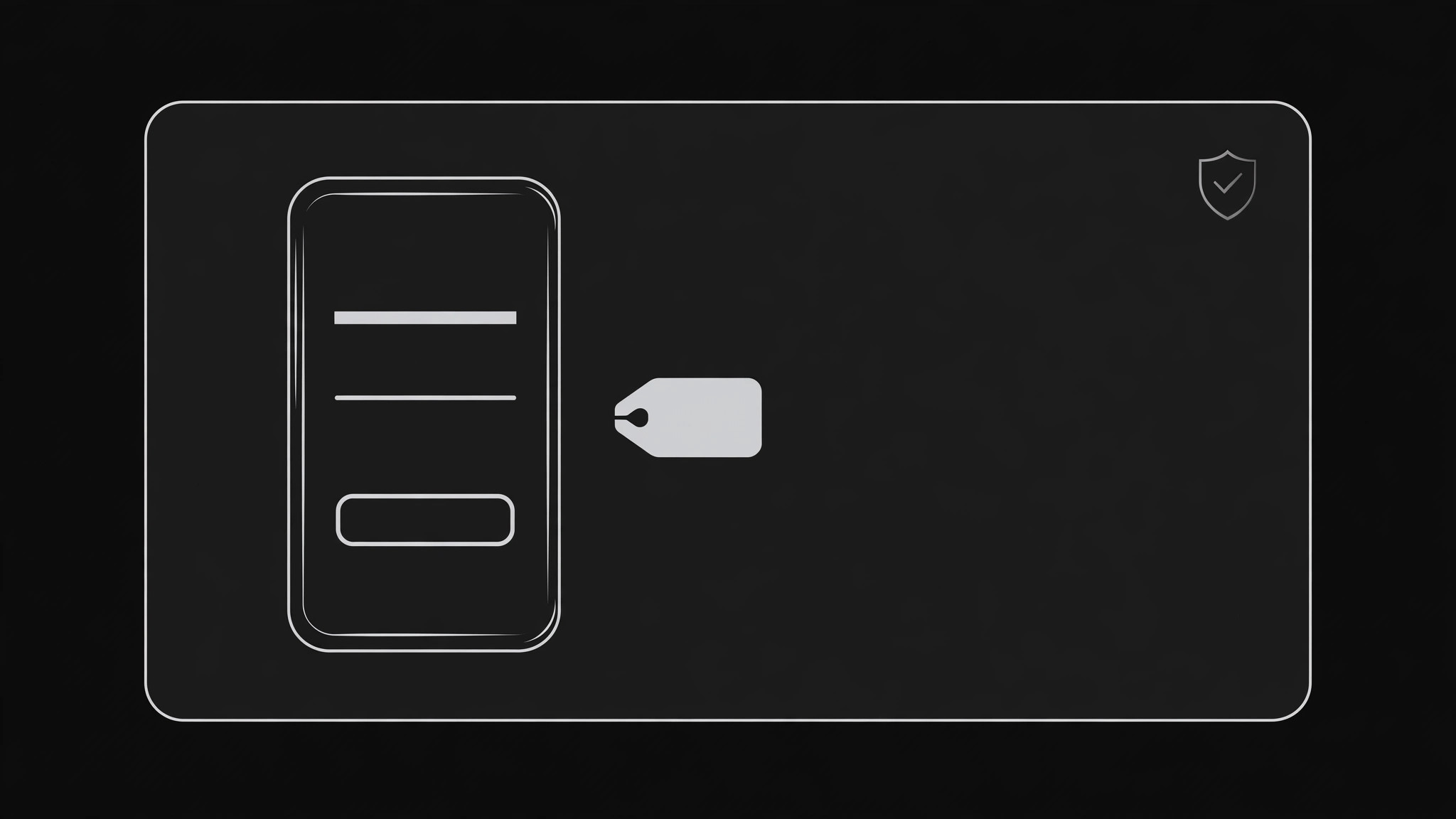
One SKILL.md (the playbook) + one starter template. A preview:
Checkout App OG Image
When to use
- Your checkout, payments, or store app gets shared on X, LinkedIn, Slack, or Discord and the preview is a grey box or a cropped dashboard screenshot
- A pricing or checkout page needs a share card that states the offer and price honestly before the click
- A launch post for a payment product needs one consistent preview image across platforms
- A product page for a single item gets shared by customers and the preview should carry the price and the promise, not just the logo
- An email or social campaign links to a checkout flow and the preview is the first trust signal the reader sees
Workflow
- State the offer in one line (input: your product + price → output: offer line + trust line)
Write the offer exactly as it will be charged: product or plan, price, and billing basis ("$19, one-time" or "$9/month"). Then write one trust line you can prove on the linked page — a refund window, a security practice, or a plain "No account needed to check out." No fine-print tricks: if the price needs an asterisk to be true, the asterisk belongs in the offer line itself. A checkout card that hides the real price is a chargeback story in waiting. - Choose one product motif (input: offer line → output: single visual motif)
Pick exactly one motif: a phone or card mockup showing a clean checkout screen, a price tag or receipt, or a simple product shot. The motif shows the thing being bought or the act of paying — not a dashboard, not a feature grid, not a stock photo of a smiling shopper. If you show a checkout screen, keep it to three lines: item, price, button. The motif supports the offer; it never competes with it. - Lay out the 1200×630 card (input: offer + motif → output: card layout)
Use the standard 1200×630 canvas. Put the offer line in the largest type, the trust line beneath it, and the motif on the opposite side. Keep every important element inside the center safe area, away from the edges where platforms crop. Place your product name or mark once, small, in a corner. Check the layout at 240 pixels wide: if the price is unreadable there, the type is too small or the layout is too busy. - Set color and contrast (input: layout → output: finished color pass)
Use your brand's colors, but guarantee contrast: dark text on a light card, or light text on a dark card, with the price passing a basic contrast check against its background. Keep the palette to two or three colors. Test the card on both a light chat background and a dark one, since the same image appears in both. Money visuals demand extra care: green for "go" and red for warnings should never be the only signal — pair color with words.
Template preview
Checkout App OG Image — Build Template
One card, one motif, one honest price. The price on the card is a commitment.
Offer (exactly as it will be charged)
Offer line: {product / plan — price, billing basis, e.g. "Pro plan — $19, one-time"}
Trust line (one provable fact): {e.g. "30-day refund, no questions asked"}
Product name / mark: {once, small, in a corner}
Product motif (pick ONE)
- [ ] Phone or card mockup showing a clean checkout screen (3 lines max: item, price, button)
- [ ] Price tag or receipt
- [ ] Simple product shot
Checkout screen shown (if used): > Item: {item} > Price: {price} > Button: {button label}