Banking App OG Image
A link preview that looks trustworthy at thumbnail size.
Turns your AI into a social preview designer for a banking app — composes a 1200×630 image that reads at thumbnail size, keeps sensitive details out, and ships in variants for every channel.
Install it in 3 steps
No sign-up. No CLI tools. Pick your AI, copy one line, paste it over.
Prefer doing it yourself? Buy the skill ($4.99), download the ZIP from your checkout confirmation, unzip it into the directory shown above, restart your AI session — same result. Already bought it? Your AI assistant can download it for you.
What’s inside
One SKILL.md (the playbook) + one starter template. A preview:
Banking App OG Image
When to use
- Someone shares a link to your banking app and the preview shows a blank box, a cropped logo, or a random screenshot
- You are launching a banking or finance feature and need the link preview to look trustworthy in chats, posts, and messages
- Your current preview image has tiny text that turns to mush at thumbnail size, or shows account balances and other details that should never appear in a share image
- You need one preview image that works across social platforms, messaging apps, and link embeds without redesigning it each time
- You are preparing a press page, a launch post, or an app-store-adjacent page and want the share image to match the brand
Workflow
- Decide the one message (input: page purpose → output: one-line message + audience)
A preview image gets a fraction of a second of attention, so it carries exactly one message: the app name plus one promise ("Banking that shows every fee" or "Save together, see it all"). Name the audience (new users, existing customers, press) and the action you want (tap the link, trust the brand). If the page already has a headline, the image should echo it, not introduce a second one. Write the message down first — every later layout decision is judged against it. - Set the safe layout (input: message → output: layout spec)
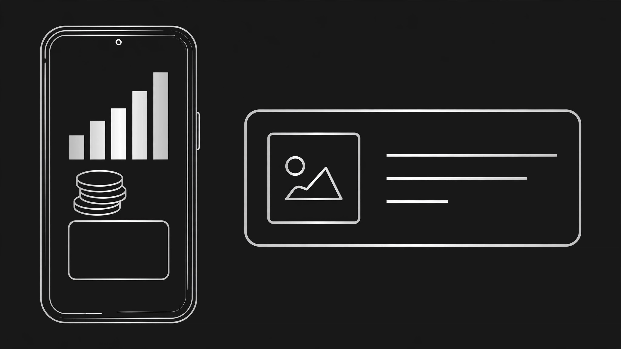
Design for 1200×630 with a safe zone: keep all text and the logo inside the center 1000×500 area, because platforms crop the edges differently. Choose one layout from three proven patterns: phone mockup right + text left, big wordmark + one icon row, or card stack + short headline. Specify the hierarchy: headline largest, supporting line smaller, logo or app name smallest but always present. Sketch the layout as boxes with sizes before any color or imagery — if the boxes do not read at thumbnail size, the finished art will not either. - Compose with generic, safe visuals (input: layout spec → output: full composition)
Fill the layout with visuals that signal "banking" without exposing anything real: a phone mockup with placeholder figures (never real balances, real names, or real transaction rows), abstract shapes for growth or saving (bars, coins, a card outline), and brand colors at full strength. Use invented placeholder numbers that are obviously illustrative (e.g. a chart with no axis labels) rather than realistic-looking figures that could be mistaken for a real account. Check the composition at 200 pixels wide — if the headline and the app identity are not readable there, simplify until they are.
Template preview
Banking App OG Image — Design Brief
One message, one image. Fill this in before composing anything.
The one message
Headline (5–8 words): {e.g. Banking that shows every fee.} Supporting line (≤10 words, optional): {…} App name / logo lockup: {…} Audience: {new users / existing customers / press} Action you want: {tap the link / trust the brand} Page headline it must echo: {…} — [ ] image and page agree
Layout spec
- Canvas: 1200×630
- Safe zone: all text + logo inside center 1000×500
- Pattern (pick one): [ ] Phone mockup right + text left | [ ] Big wordmark + icon row | [ ] Card stack + short headline