AI Services Market › Skills factory › Images › Backend Platform OG Image
$4.99 · No sign-inv1.0.0– views
Backend Platform OG Image
Data, API, app — the whole stack at a glance.
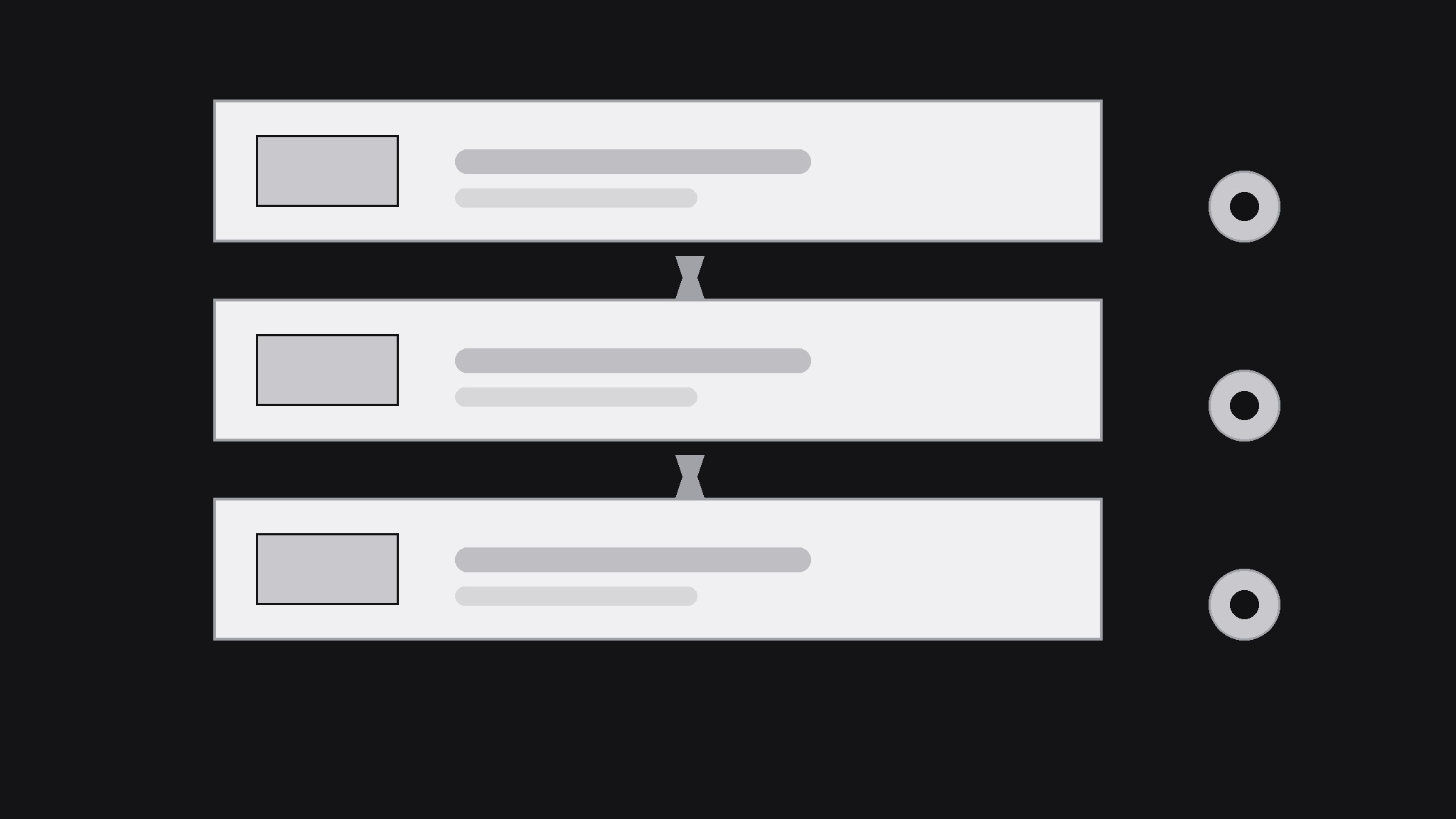
Turns your AI into a social-preview designer — builds a 1200×630 OG image for a backend or database platform that makes the platform's layers legible at thumbnail size: data, API, and the app on top.
Best for
Backend and database platform teams announcing a launch or feature
Time needed
~20 min
Level
Beginner-friendly
Install it in 3 steps
No sign-up. No CLI tools. Pick your AI, copy one line, paste it over.
Prefer doing it yourself? Buy the skill ($4.99), download the ZIP from your checkout confirmation, unzip it into the directory shown above, restart your AI session — same result. Already bought it? Your AI assistant can download it for you.
What’s inside
One SKILL.md (the playbook) + one starter template. A preview:
Backend Platform OG Image
When to use
- You're launching or announcing a backend, database, or developer platform and the share card needs to explain what the platform does at a glance
- A docs page, changelog, or blog post about a backend product shares with a blank or generic preview
- Your platform's current preview shows a logo on a flat background and says nothing about data, APIs, or hosting
- A developer audience will judge the card in half a second — it has to signal "this is infrastructure" without a paragraph
- You're posting the same platform link across feeds, chats, and docs and want one consistent card everywhere
Workflow
- Name the one capability (input: platform description → output: one-line promise)
Reduce the platform to the one thing a developer gets: "a database with an instant API," "hosted backend with auth built in," "real-time data sync for your app." If the platform does five things, pick the one the announcement is about — the card advertises the news, not the whole product. A card that lists every feature advertises none of them. - Stack the layers (input: one-line promise → output: layer diagram plan)
Draw the platform as a stack of at most three layers — data at the bottom, API or logic in the middle, the app on top — with one icon and one short label per layer. The stack is the card's visual argument: it says "this is infrastructure" faster than any sentence. Keep the layers as simple blocks; a realistic architecture diagram belongs in the docs, not in a 1200×630 card that will be seen at 240 pixels wide. - Design for the thumbnail (input: layer plan → output: 1200×630 draft)
Build at 1200×630 with all text inside the central 1000×500 safe area. Put the one-line promise in large type on one side and the three-layer stack on the other — never stack text on top of the diagram, or both become unreadable. Use at most two typefaces and three colors, and make the background dark or light enough that the stack reads as solid shapes, not outlines. Test at phone-feed size: the promise and the three layers must be distinguishable at arm's length. - Add one proof point (input: draft → output: finished card)
Add at most one proof point that is genuinely true of the platform: free tier, open-source, self-hosting option, or a latency or uptime figure you can stand behind. One proof point, small, below the promise. Never invent a user count, an uptime percentage, or a performance figure — developers check, and a caught exaggeration costs more credibility than a plain card ever would.
Template preview
Backend Platform OG Image — Template
One card per announcement. One capability per card.
Platform: {name} — {announcement: launch / feature / release}
Link: {URL}
One-line promise
- Capability (one thing): {e.g. a database with an instant API}
- Plain-language promise for the card: {…}
- Audience: {e.g. developers building mobile apps}
Layer stack (max 3 layers)
Card copy
- Headline (promise, ≤10 words): {…}
- Proof point (max 1, must be true): {e.g. Self-hostable · Open source}
- Colors (max 3): {1} {2} {3} | Typefaces (max 2): {1} {2}
- Layout: promise {left / right} · stack {right / left} — never overlapping