Scattered-Cards Magazine
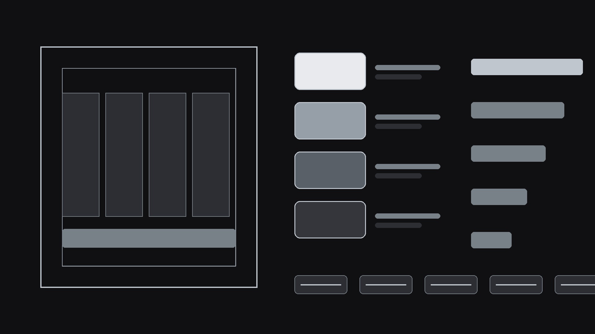
A desk full of story cards, with a grid underneath the mess.
Turns your AI into a magazine layout designer — arranges stories as casually scattered, overlapping cards that look spontaneous but stay readable, with a strict grid underneath the mess.

Install it in 3 steps
No sign-up. No CLI tools. Pick your AI, copy one line, paste it over.
Prefer doing it yourself? Buy the skill ($4.99), download the ZIP from your checkout confirmation, unzip it into the directory shown above, restart your AI session — same result. Already bought it? Your AI assistant can download it for you.
What’s inside
One SKILL.md (the playbook) + one starter template. A preview:
Scattered-Cards Magazine
When to use
- You are designing a magazine-style page or spread and a tidy uniform grid feels too stiff for the content
- You want a collage feel — cards slightly rotated, overlapping, varied in size — without the layout collapsing into clutter
- You have a mix of stories, photos, quotes, and side notes that deserve different weights on the page
- An editorial homepage or feature index needs to feel curated and human, like a desk covered in story cards
- A previous "scattered" attempt ended up unreadable on mobile or with headlines hidden behind other cards
Workflow
- Gather the stories (input: articles, photos, quotes, side notes → output: ranked story list)
List every piece of content with its type (feature, news, photo, quote, side note) and its importance: one hero story, two or three secondary stories, and the rest as small items. Write the headline, standfirst, and image credit for each before touching the layout — layout decisions made without real headlines end up designed for the wrong text lengths. Cut anything that does not earn its card: a scattered layout has less room for filler than a tidy grid, because every extra card adds visual noise. - Set the grid and the scatter rules (input: ranked story list → output: layout rules)
Start with a real grid — fixed columns and generous gutters — then define exactly how far cards may stray: rotation of no more than a few degrees, overlap of no more than a small strip of the card underneath, and a minimum gap so no two headlines ever touch. The hero card stays large and near the top; small cards fill around it. Write these limits down as rules, not vibes, so the layout stays consistent when new stories are added later. The scatter is a controlled deviation from the grid, not the absence of one. - Place the hero and the cards (input: layout rules + story list → output: full layout)
Place the hero card first, then the secondary stories, then the small items, working down the page in reading order — the eye should travel from the hero through the rest without jumping backwards. Vary card sizes by importance only: bigger means more important, never just more decorative. Overlap cards at their edges or corners, never across a headline, a face, or a caption. Every card keeps its own readable zone: a solid or lightly tinted background behind its text, even when the card sits on top of another card or a photo.
Template preview
Scattered-Cards Magazine — Layout Template
One issue = one filled-in copy of this template. Content first, scatter second.
Story list (ranked)
Cut list (did not earn a card): {…}
Scatter rules (write the limits, then obey them)
Max rotation: {e.g. 3°} · Max overlap: {e.g. a small strip of the card underneath} Minimum gap between headlines: {e.g. 24 px} Grid: {columns} columns · {gutter} gutters Overlap allowed only at: [ ] card edges · [ ] card corners — never across a headline, face, or caption
Placement (reading order)
- Hero card: {story} — {position}
- Secondary: {story} — {position}
- Secondary: {story} — {position}