AI Services Market › Skills factory › Other › Continuity Asset Set
$4.99 · No sign-inv1.0.0– views
Continuity Asset Set
One kit that keeps every deliverable looking like it belongs together.
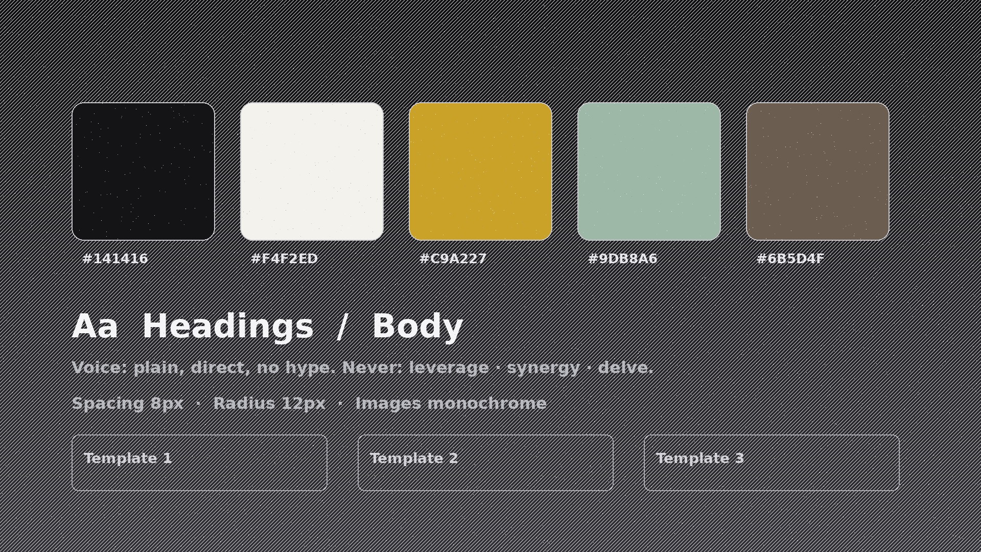
Builds a continuity kit — locked colour and type tokens, voice rules, reusable templates, and a one-page rule sheet — so the tenth deliverable in a project still matches the first, whoever makes it.
Best for
Designers, writers, and teams running multi-deliverable projects with several contributors
Time needed
~25 min for a first draft
Level
Beginner-friendly
Install it in 3 steps
No sign-up. No CLI tools. Pick your AI, copy one line, paste it over.
Prefer doing it yourself? Buy the skill ($4.99), download the ZIP from your checkout confirmation, unzip it into the directory shown above, restart your AI session — same result. Already bought it? Your AI assistant can download it for you.
What’s inside
One SKILL.md (the playbook) + one starter template. A preview:
Continuity Asset Set
When to use
- A project has five contributors and the outputs are starting to drift into five different styles
- You're handing a brand to a new designer or writer and need them to match the existing look on day one
- Your decks, docs, and social posts for one project look like they came from three different companies
- You're starting a multi-month project and want consistency locked in before the second deliverable
- A client keeps saying "this doesn't feel like us" but can't explain what's off
- You need to audit an existing project and find exactly where the visual and verbal drift happened
Workflow
- Collect the existing assets (input: current deliverables → output: asset inventory)
Gather everything already made for the project: pages, decks, posts, docs, logos, photos, illustrations. List what each one actually uses — colours sampled from the files (not from memory), typefaces, image treatments, logo variants, recurring phrases. The inventory is evidence, not aspiration: if the real files use four greys, the inventory says four greys, even if the brand guide says two. - Distil the tokens (input: asset inventory → output: design token sheet)
Reduce the inventory to a small locked set: 2–3 primary colours with hex values, 1–2 neutrals, 1 accent, 2 typefaces (headings + body) with sizes and weights, spacing unit, corner radius, and image treatment (e.g. "monochrome, high contrast, no colour photos"). Anything not on the token sheet is out. If two near-identical colours both appear, pick one and retire the other — near-duplicates are how drift starts. - Lock the voice rules (input: existing copy → output: voice sheet)
Write the verbal half of continuity: tone (e.g. "plain, direct, no hype"), banned words and phrases, preferred terms (e.g. always "sign up", never "register"), sentence-length guidance, and how numbers, dates, and CTAs are formatted. Pull examples from the project's own best copy — a rule illustrated with a real sentence from the project beats an abstract adjective every time. - Build the reusable templates (input: tokens + voice → output: template pack)
Create one template per recurring deliverable type: page header, slide layout, social card, doc cover, email header. Each template bakes in the tokens — fonts, colours, spacing, logo placement — so a contributor following the template cannot accidentally drift. A template with a blank where the headline goes is useful; a template that requires restyling before use is not.
Template preview
Continuity Asset Set — Starter Template
Fill in every {placeholder}. If a value is undecided, decide it here — "TBD" is drift waiting to happen.
Project
- Project name: {project_name}
- Kit version: {version} · Last updated: {date}
- Owner: {kit_owner}
Design tokens (locked)
- Primary: {hex_1} · Secondary: {hex_2} · Accent: {hex_3}
- Neutrals: {neutral_hex_1}, {neutral_hex_2}
- Headings: {typeface_headings} {weight} · Body: {typeface_body} {weight}
- Body sizes: {size_scale, e.g. 14 / 16 / 20 / 28 / 40px}
- Spacing unit: {spacing_px}px · Corner radius: {radius_px}px
- Image treatment: {image_treatment, e.g. monochrome, high contrast, no colour photos}