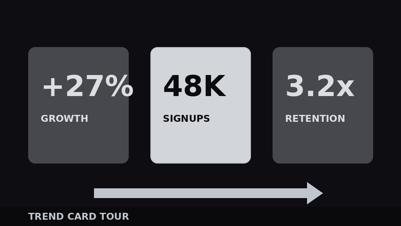
Trend Card Tour
One number per card, camera gliding between them — data that feels like a story.
Walks viewers through 3–7 trend cards, one statistic at a time, with a gliding camera, a landing beat per number, and a recap frame. Covers card design, camera choreography, number entrances, and closing the tour.
Install it in 3 steps
No sign-up. No CLI tools. Pick your AI, copy one line, paste it over.
Prefer doing it yourself? Buy the skill ($4.99), download the ZIP from your checkout confirmation, unzip it into the directory shown above, restart your AI session — same result. Already bought it? Your AI assistant can download it for you.
What’s inside
One SKILL.md (the playbook) + one starter template. A preview:
Trend Card Tour
When to use
- You have 3–7 trends or statistics to present and a wall of numbers on one slide would glaze every eye in the room
- The video is a market recap, a quarterly summary, a "what changed" explainer, or a data-driven argument where each number deserves its own moment
- You want viewers to remember the numbers, not just nod at them — one card at a time is the only pace memory works at
- The numbers need context: each card carries one number, one label, and one line of "so what"
- You are building a recurring segment ("this week's three numbers") where the same card tour can run every episode
Workflow
- Pick the tour stops (input: data + argument → output: 3–7 trend cards)
Choose 3–7 trends — fewer than 3 is not a tour, more than 7 is a lecture and viewers stop retaining. For each trend, write the card in this strict shape: one big number (the only number on the card), one label of 2–5 words naming the trend, and one "so what" line of 5–10 words saying why it matters. Cut ruthlessly: if a trend needs two numbers, it is two cards or it is cut. Order the cards for story, not for size: start with the most surprising number (the hook), put the most important number in the middle where attention peaks again, and end with the number that points at what to do next. Write the numbers exactly as you will say them — if the card says "38%" and you say "almost 40%", the viewer does a needless mental conversion. - Design one card (input: card content → output: reusable card layout)
Build one card and reuse it for every stop; the tour's rhythm comes from sameness, not variety. Layout: big number at 14–18% of frame height, heavy weight, centered or left-aligned; label directly under it at 4–5%; "so what" line under that at 3–3.5%, regular weight, muted color. One accent color for the number, one neutral for the rest — the number is the star and nothing else on the card competes with it. Card background: solid dark or light panel with a thin border, sized to occupy 60–75% of frame width so there is room for the camera to move. Test the card at phone size: if the "so what" line needs squinting, it is too small or too long. No charts on the card — a chart is a different segment. The card's job is one number, landed.
Template preview
Trend Card Tour — Build Template
One number per card. Fill in the tour stops before designing anything.
Tour: {title} | Stops: {3–7} | Narrator: {voiceover / on-camera}
Tour stops (story order: surprising → important → action-pointing)
Cut test: every trend has exactly one number? [ ] | Every "so what" says what to do, not a restated label? [ ]
Card design (identical for every stop)
Number: {14–18% frame height}, heavy weight, accent color {color} Label: {4–5%}, under the number "So what": {3–3.5%}, regular weight, muted color Card background: {solid panel + thin border} | Card width: {60–75% of frame}