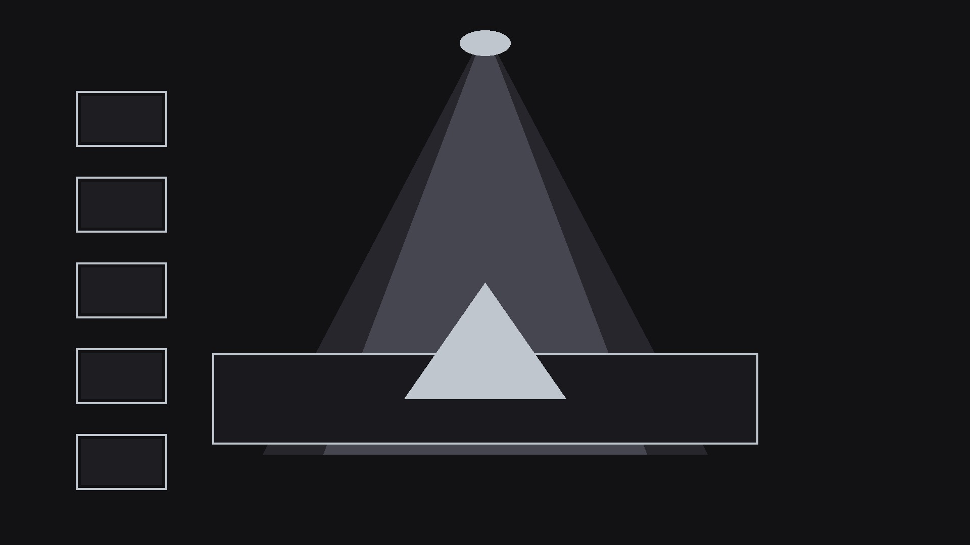
Status Focus Sidebar
One item in focus, the whole list always in view, nobody loses their place.
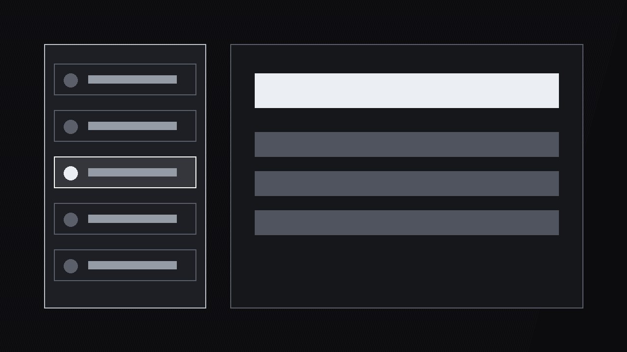
Turns a status list into a guided tour: a sidebar tracks every item's status while the main view zooms into one item at a time, so viewers always know where they are and what's left.
Install it in 3 steps
No sign-up. No CLI tools. Pick your AI, copy one line, paste it over.
Prefer doing it yourself? Buy the skill ($4.99), download the ZIP from your checkout confirmation, unzip it into the directory shown above, restart your AI session — same result. Already bought it? Your AI assistant can download it for you.
What’s inside
One SKILL.md (the playbook) + one starter template. A preview:
Status Focus Sidebar
When to use
- You're walking through a project update with 8–20 items — tasks, tickets, servers, orders — and a flat list makes viewers lose their place by item four
- You're presenting a dashboard where each row needs a moment of explanation, but the audience also needs the whole list in view to judge the overall health
- Your video reviews a queue (support tickets, bug backlog, shipments) and the story is "here's the one that matters, and here's where it sits among the rest"
- You're recording a standup-style update where each item has a status and an owner, and viewers need to follow along without rewinding
- You want a consistent status-review format across weekly updates so regular viewers can skim to the items that changed
Workflow
- Build the status list (input: items + statuses → output: sidebar list)
List every item with three fields: name, status (one of a fixed set — on track, at risk, blocked, done), and owner or next action. Fix the status vocabulary before building: four statuses maximum, each with a distinct shape (dot, triangle, square, check) as well as a distinct shade. Sort the list by the order you'll discuss it — usually blocked first, then at risk, then on track, then done — not by creation date. Cap the list at 20 items; beyond that, split the review into two videos or group items under headers. A sidebar with 47 rows is a spreadsheet, not a guide. - Lay out the sidebar (input: status list → output: sidebar layout)
The sidebar sits on one side (left for left-to-right audiences is the safe default) at 28–34% of frame width, full height, with rows tall enough to read at a glance (minimum 44 px row height at 1080p). Each row shows the status mark, the item name (one line, truncated with ellipsis if needed), and nothing else — owners and details live in the main view, not the sidebar. The sidebar stays on screen for the entire review: it is the map, and a map that disappears mid-journey is useless. Keep the sidebar background a flat dark panel with a 1 px divider from the main view so the two zones never bleed into each other.
Template preview
Status Focus Sidebar — Review Template
One list per review. Fill in the list before animating.
Review: {title} | Date: {date} | Previous review: {link / "first episode"}
Status vocabulary (frozen across episodes — max 4)
Rule: shape + shade together, never color alone.
Sidebar list (max 20, sorted: blocked → at risk → on track → done)
Sidebar layout: {left, 28–34% width, full height, flat dark panel + 1 px divider, rows ≥44 px}
Focus transitions (per item)
Rule: one item in focus at a time; highlight moves with the voiceover, never stale.