Neobank Landing
Trust first, fees in plain sight, one way in.
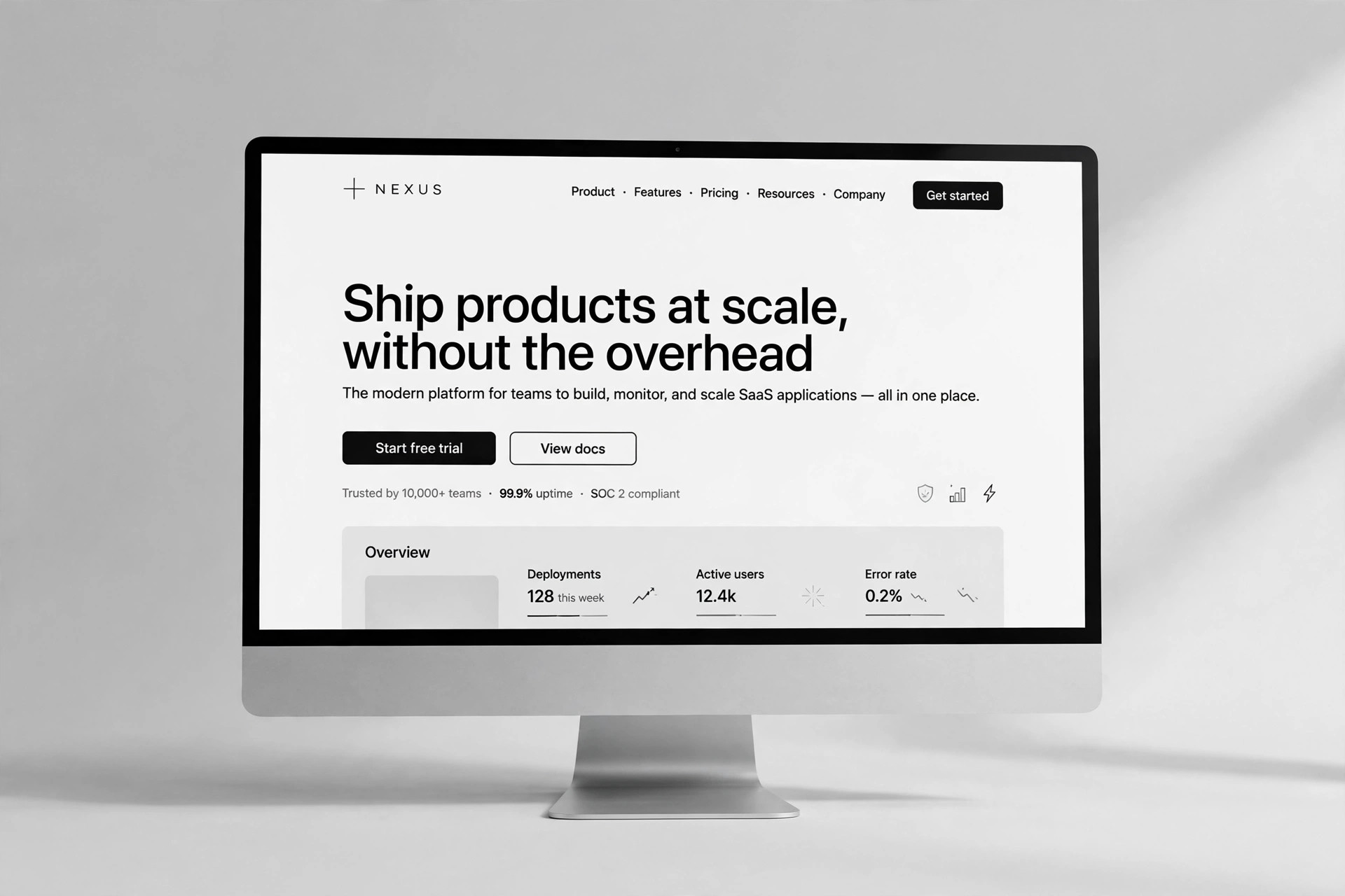
A landing page for a digital-only bank: trust-first structure with sourced deposit protection, a plain-fee table, a 3-step product story, objection-handling FAQ, and one repeated signup call to action.

Install it in 3 steps
No sign-up. No CLI tools. Pick your AI, copy one line, paste it over.
Prefer doing it yourself? Buy the skill ($4.99), download the ZIP from your checkout confirmation, unzip it into the directory shown above, restart your AI session — same result. Already bought it? Your AI assistant can download it for you.
What’s inside
One SKILL.md (the playbook) + one starter template. A preview:
Neobank Landing
When to use
- Launching a digital-only bank, neobank, or money app with no branches
- Your existing landing page leads with features while visitors keep asking "is my money safe?"
- You need a page that explains fees without fine print
- Preparing a waitlist or app-store launch page
- Redesigning a fintech page that converts poorly on mobile
Workflow
- Lead with trust (input: licences, protections, security facts → output: trust block)
State the facts visitors check first: who holds deposits, what protection scheme covers them and up to what amount, and what security the app uses. Use the exact scheme name and limit as published by the regulator or partner bank — never paraphrase coverage into a vaguer promise. If a fact can't be verified, leave it out rather than softening it. - Explain the money plainly (input: fee schedule + product facts → output: fees + features section)
One table for fees: what costs money, what is free, and under what conditions. Features get one line each with the concrete outcome ("freeze your card in two taps"). No jargon without a plain-language gloss beside it. - Show one day with the product (input: core flows → output: 3-step story)
Three steps, each a real action: sign up, get the card or account, use it. Use screenshots or mockups of the actual app, not generic phone renders. Each step names what the user does and what they get. - Answer the objections (input: support FAQs + comparison facts → output: FAQ + comparison)
FAQ answers the five questions support hears most (safety, fees, switching, joint accounts, support hours). Comparison table: your product vs a traditional bank on the rows that matter (monthly fee, foreign-spend fee, account opening time), with figures you can source. - Close with one path (input: page draft → output: shipped page)
One primary CTA repeated in the same words ("Open your account"); a secondary path for "compare plans" or "talk to us" kept visually quieter. Mobile-first check: headline, trust line, and CTA visible without scrolling; forms ask for the minimum.
Output spec
- Trust block: deposit holder, protection scheme + limit, security measures — all sourced
- Fee table: every fee or "free", with conditions
- Features: one line each, outcome-first
- 3-step story with real app visuals
- FAQ (5 questions) + sourced comparison table
- CTA: one primary wording, repeated; one quiet secondary
Good vs. bad examples
Template preview
Neobank Landing — Page Template
One product, one page, one signup path. Verify every trust fact before publishing.
Trust block (first screen)
Product name: {name} Deposits held by: {partner bank / licensed entity} Protection scheme: {exact scheme name} — covers up to {amount} per {person/account} Source for the scheme + limit: {regulator or scheme page URL} App security: {e.g. biometric login, device binding, card freeze} Compliance review done: [ ] by {reviewer} on {date}
Fees (one table, no fine print)
Features (one line each, outcome-first)
- {Feature} — {what the user gets}
- {Feature} — {what the user gets}
- {Feature} — {what the user gets}