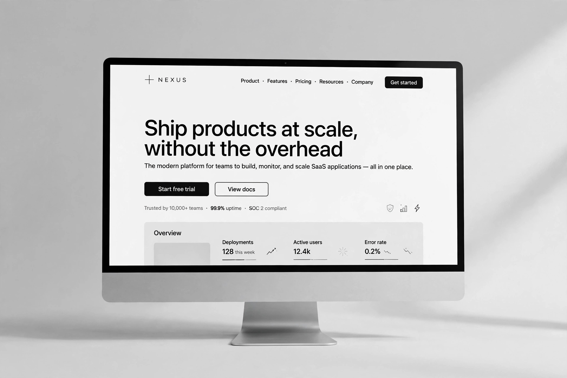
Chart Kit
Change one row of data — the chart draws itself
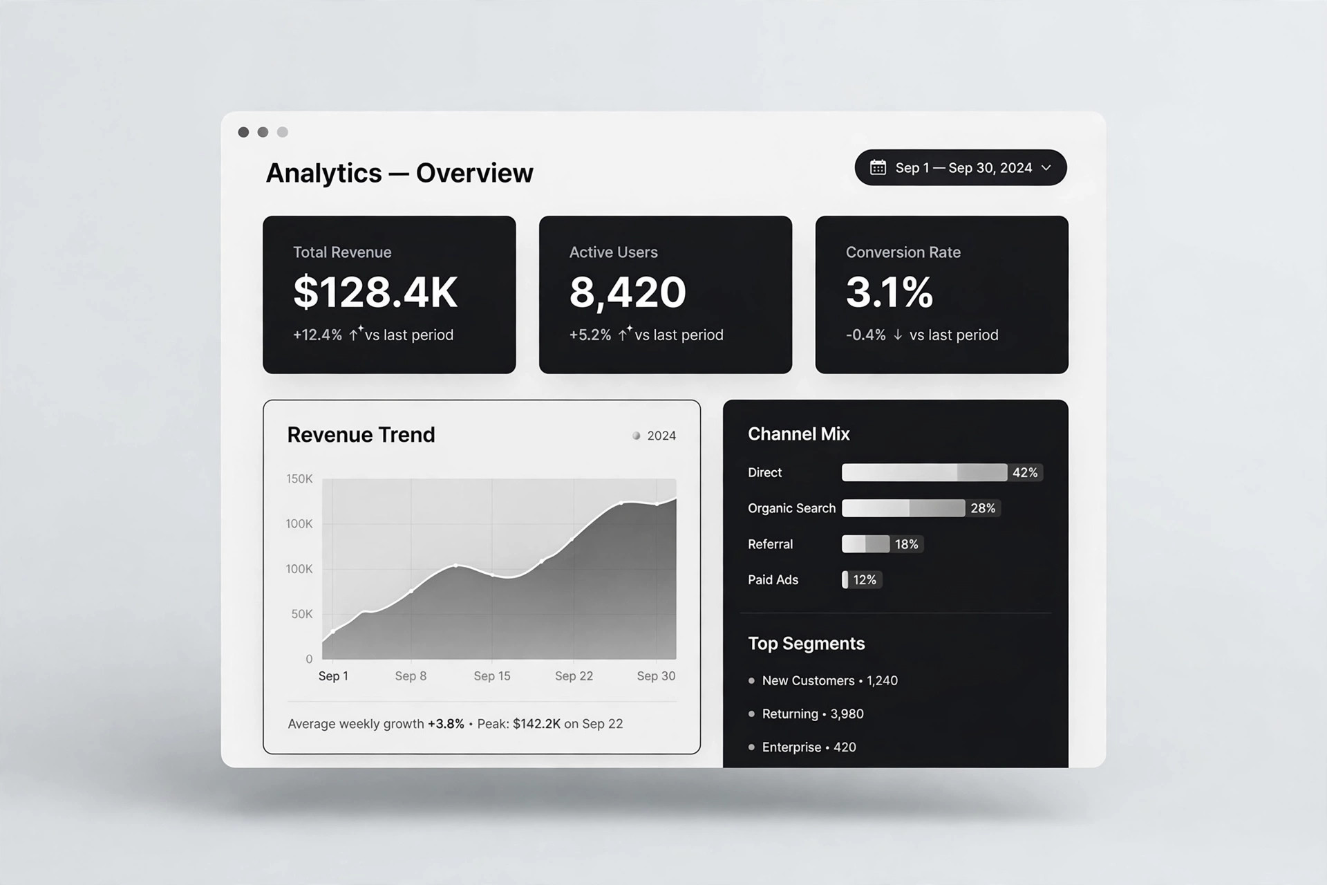
Drop-in single-file chart snippets: line, bar, pie. Hand-written canvas, zero dependencies — edit the JS data array and you're done.
Install it in 3 steps
No sign-up. No CLI tools. Pick your AI, copy one line, paste it over.
Prefer doing it yourself? Buy the skill ($4.99), download the ZIP from your checkout confirmation, unzip it into the directory shown above, restart your AI session — same result. Already bought it? Your AI assistant can download it for you.
Real-world proof
Real people did this exact job with AI agents.
Pull Substack post stats via computer use
Read case →Use caseRun company departments with persistent self-hosted agents
Read case →Use caseRun Monte Carlo simulations on a retirement portfolio
Read case →What’s inside
One SKILL.md (the playbook) + one starter template. A preview:
Chart Kit
When to use
- A report or slide deck needs a chart, but you don't want to install ECharts or wrestle with complex config
- A web page needs a simple data graphic: one file, copy-paste, done
- Data changes often and you want "edit the numbers in the array, the chart follows automatically"
- Data for a client or boss must be clean, clearly labeled, and non-misleading
- Offline or intranet environments where external chart CDNs are off-limits
Workflow
- Pick the chart type (input: data + what you want to say → output: chart recommendation)
Line for trends (time series), bar for comparisons (≤8 categories), pie for shares (≤6 slices, with an "Other" catch-all). Nail the one-sentence takeaway first (e.g. "Q3 sales up 40% MoM"), then pick the chart that tells it. - Prep the data (input: raw data → output: JS array)
Reformat into the template's array format: line/bar use{labels:[], values:[]}, pie uses a{name, value}list. Check: units consistent, missing values marked null (the line breaks — never invented), time labels continuous. - Apply the template (input: array → output: working HTML)
Copy the matching chart block from template.html, paste in your data array, update the title and units. Use the default 6-color palette (colorblind-friendly); never use red/green contrast to mean anything other than "bad vs. good". - Add annotations (input: chart → output: annotated chart)
Three required items: ① title (with time range) ② data source (one small line) ③ key-point annotations (e.g. dashed line + label at the peak). Axes must carry units; the Y-axis starts at zero by default. - Anti-misleading check (input: annotated chart → output: pass/fail)
Walk through each: does the Y-axis start at zero (if not, the reason must be stated on the chart), do pie slices add to 100%, are bar widths consistent, is anything using area/3D effects to exaggerate differences. Fix whatever fails. - Deliver (input: checked HTML → output: usage notes)
Tell the user three things: which lines hold the data, how to edit (change the array only), how to reuse (copy the whole chartblock). Include the line: "To change the data, you never touch the code."Output spec
Template preview
Data Chart Kit · Demo /* Page styles: demo only — each chart block can be copied out on its own */ body{font-family:-apple-system,"PingFang SC","Microsoft YaHei",sans-serif; max-width:720px;margin:0 auto;padding:24px 16px;color:#333;background:#fafafa} h1{font-size:24px;margin-bottom:8px} .chart{background:#fff;border:1px solid #e5e5e5;border-radius:12px; padding:16px;margin:20px 0} .chart h3{margin:0 0 4px;font-size:17px} .src{font-size:12px;color:#999;margin-top:8px} canvas{width:100%;height:260px;display:block;cursor:default} .tip{position:fixed;pointer-events:none;background:#333;color:#fff; font-size:12px;padding:4px 10px;border-radius:6px;display:none;z-index:99} Data Chart Kit
You may also like