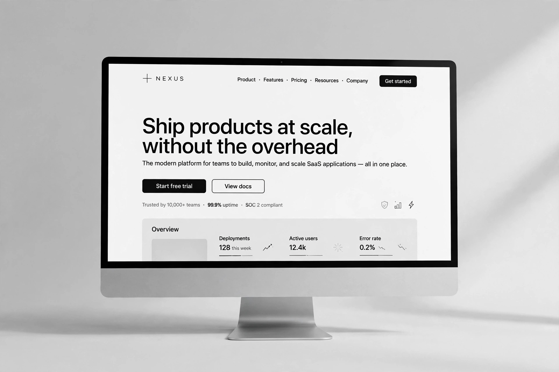
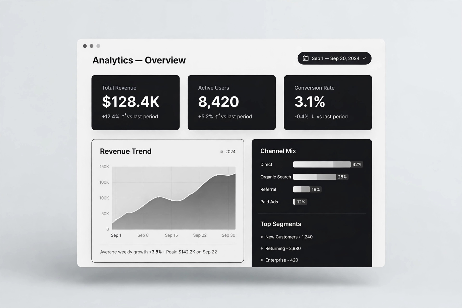
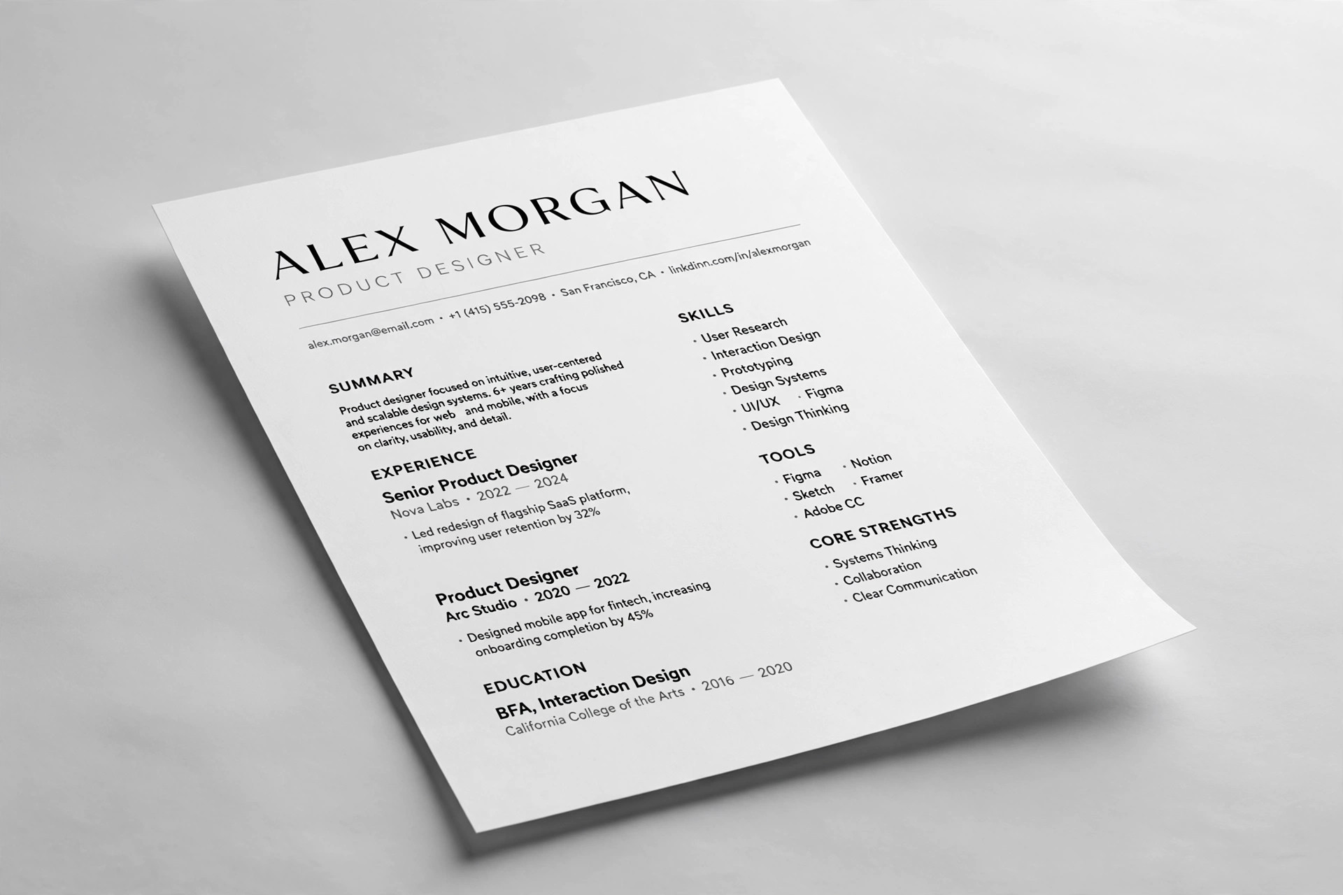
Liquid Glass Landing
A landing page in one glass material — blur, edge light, and readable text.
Turns your AI into a landing-page designer that builds a landing page in a liquid-glass material system — translucent panels, refraction highlights, and blur tokens, with contrast rules that keep text readable over glass.
Install it in 3 steps
No sign-up. No CLI tools. Pick your AI, copy one line, paste it over.
Prefer doing it yourself? Buy the skill ($4.99), download the ZIP from your checkout confirmation, unzip it into the directory shown above, restart your AI session — same result. Already bought it? Your AI assistant can download it for you.
What’s inside
One SKILL.md (the playbook) + one starter template. A preview:
Liquid Glass Landing
When to use
- Your product's interface is built on translucent panels, blur, and depth, and a flat landing page would misrepresent how it feels
- You are launching an OS feature, a design tool, a media app, or any product where "glass" is the signature material
- Your current landing page uses glass effects as decoration — random frosted cards with no system — and it looks cheap instead of premium
- You need a page that works in both light and dark mode, where the glass has to read clearly against two very different backgrounds
- Stakeholders keep asking for "more glass" and you need a disciplined system that says where glass belongs and where it doesn't
Workflow
- Define the glass material (input: product screenshots + brand palette → output: glass token set)
Start from the product, not from a mood board. Pick the panel background (a white or black tint at low opacity), the blur radius, the saturation boost, the border highlight (a 1px light edge, brighter on the top-left), and the inner shadow that gives depth. Write them as tokens —glass-fill,glass-blur,glass-edge,glass-shadow— so every panel on the page uses the same material. If the product has no glass yet, define the material from one reference screenshot and get it approved before building the page. - Map glass to hierarchy (input: token set + page outline → output: glass usage map)
Glass is a hierarchy signal, not a texture. Decide exactly three levels: hero panel (strongest glass, sits above the background), supporting cards (medium glass), and everything else (solid). The call-to-action button is never glass — it must be the most solid thing on the page, or the eye has nowhere to land. Write the map down: which section gets which level, and which sections stay solid for contrast and readability. - Build the background the glass needs (input: glass usage map → output: background layer spec)
Glass only reads as glass when there is something behind it to refract. Design a background with slow color movement — soft gradients, blurred blobs of brand color, or a subtle product render — that stays darker or lighter than the panels by a clear margin. The background must be calm enough that text over glass stays legible, and varied enough that the blur has something to show. Test the background at both extremes: full light mode and full dark mode.
Template preview
Liquid Glass Landing — Page Template
One page, one material system. Fill in the tokens first, then the sections — never invent glass per section.
Glass tokens
Glass usage map
Background layer
- Base: {gradient / color}
- Color washes: {two soft brand-color blobs, positions}
- Motion: {slow drift, or static} | Static fallback: {gradient}
- Contrast margin vs. panels: {panels darker/lighter by X}
Copy
Hero headline: {one line, names the outcome} One-line promise: {what the product does, for whom} CTA (solid, repeated): {e.g. "Start free"} → {destination} Value strip: 1. {point} 2. {point} 3. {point}