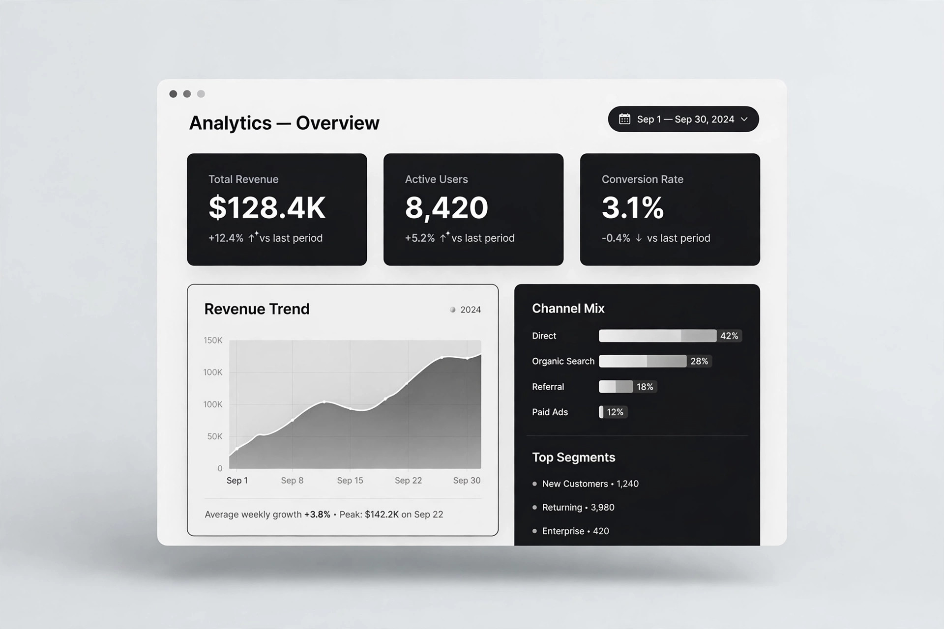
AI Services Market › Skills factory › Web › KPI Line Panel
$4.99 · No sign-inv1.0.0– views
KPI Line Panel
Every KPI with its own honest trend line — no chart junk.
Turns your AI into a dashboard designer — builds a KPI panel that pairs each key number with its own honest line chart: one metric, one line, one plain-language definition, no chart junk.
Best for
Teams whose dashboards show numbers nobody trusts or understands
Time needed
~25 min for a first draft
Level
Intermediate
Install it in 3 steps
No sign-up. No CLI tools. Pick your AI, copy one line, paste it over.
Prefer doing it yourself? Buy the skill ($4.99), download the ZIP from your checkout confirmation, unzip it into the directory shown above, restart your AI session — same result. Already bought it? Your AI assistant can download it for you.
What’s inside
One SKILL.md (the playbook) + one starter template. A preview:
KPI Line Panel
When to use
- Your dashboard, report, or status page shows KPI numbers with no trend context, so nobody can tell whether a number is good news or bad
- A team page needs a small panel of the metrics that actually matter — three to six, not thirty — each with its history visible
- A weekly or monthly review deck needs KPI slides where the chart and the number agree and the definition is printed on the slide
- A product or ops team keeps arguing about metrics because two dashboards define the same KPI differently
- A landing or status page wants to show live performance honestly, with the trend visible and the bad weeks not hidden
Workflow
- Choose the metrics that matter (input: your goals + available data → output: metric shortlist of 3–6)
Pick three to six metrics, each tied to a decision someone actually makes. For each, write the question it answers ("Are we growing?" "Are we breaking promises?") and who acts on it. Drop vanity metrics that move without changing any decision, and drop any metric you cannot compute the same way twice. A panel with four trusted metrics beats a wall of twenty decorative ones. - Define each metric in plain words (input: shortlist → output: definition card per metric)
For each metric, write: the exact formula or data source, the time window it covers, and what counts and what does not. ("Active users = accounts with at least one login in the last 28 days; trial accounts excluded.") Put the definition where the reader can find it — a tooltip, a footnote, or a definitions line under the panel. If two people compute the metric differently, you do not have a metric yet; settle the definition before drawing anything. - Draw one line per metric (input: definitions + history → output: line chart per metric)
Give each metric its own small line chart showing its history over a sensible window — weeks for fast-moving metrics, months for slow ones. One line per chart: no dual axes, no stacked lines pretending to be comparable. The vertical axis starts at a value that tells the truth about the change — never truncate an axis to exaggerate a small move, and never stretch one to hide a big move. Mark real events on the line (a launch, an outage, a price change) so readers can see why the line moved instead of guessing.
Template preview
KPI Line Panel — Build Template
Four trusted metrics beat twenty decorative ones. Define first, draw second.
Metrics (3–6, each tied to a decision)
Dropped as vanity: {metrics considered and cut, with why}
Definition cards (one per metric)
{Metric 1}
- Formula / source: {exact computation or data source}
- Time window: {e.g. last 28 days}
- Counts: {what counts} — Excludes: {what does not count}
{Metric 2}
- Formula / source: {exact computation or data source}
- Time window: {e.g. last 28 days}
- Counts: {what counts} — Excludes: {what does not count}