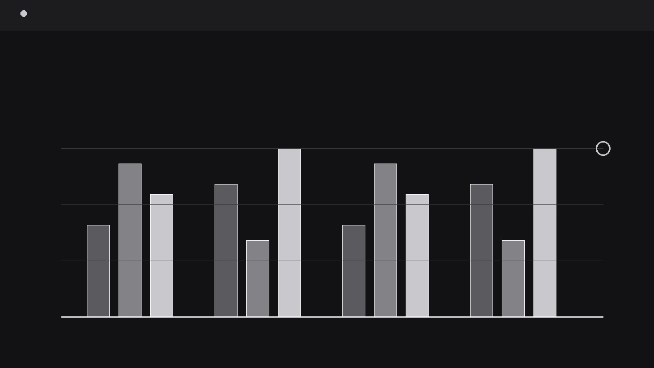
Grouped Metric Bars
Groups of bars rise together — comparisons land at a glance.
Turns your AI into a motion-graphics director for grouped bar charts — takes your grouped numbers, builds a clean bar layout with one colour per series, and animates each group rising in sequence with readable value labels and a clear comparison beat. For anyone who needs a chart to land in a video, not just sit in a slide.
Install it in 3 steps
No sign-up. No CLI tools. Pick your AI, copy one line, paste it over.
Prefer doing it yourself? Buy the skill ($4.99), download the ZIP from your checkout confirmation, unzip it into the directory shown above, restart your AI session — same result. Already bought it? Your AI assistant can download it for you.
What’s inside
One SKILL.md (the playbook) + one starter template. A preview:
Grouped Metric Bars
When to use
- A quarterly review video needs to compare two or three series side by side — say, this quarter vs. last quarter vs. target — across five or six categories
- A product demo has to show how three plans, tiers, or variants perform on the same set of metrics without cutting to a static screenshot
- A pitch video needs one chart that proves a gap: your numbers against two competitors, group by group, with the gap visible rather than narrated
- A tutorial walks through survey or test results where each question has several answer groups and the audience must compare within each question
- A social clip needs a chart that animates in under ten seconds and still reads on a phone screen at arm's length
Workflow
- Shape the data table (input: raw numbers → output: tidy grouped table)
Start with a table, not a timeline. One row per category (the groups on the horizontal axis), one column per series (the bars inside each group). Cap it at six groups and three series — beyond that the bars get too thin to read in motion and the audience stops comparing and starts squinting. Give every series a short label of one or two words ("Q1", "Target", "Plan B") and keep units identical across the whole table: never mix percentages and raw counts in one chart. Decide the axis maximum now — a single shared scale for all bars, with headroom of about 10% above the tallest value so the tallest bar never kisses the top edge. If one value is an extreme outlier, either break the axis visibly with a zigzag gap marker or split the chart into two; silently rescaling mid-animation destroys trust in the comparison. - Lay out the frame (input: tidy table → output: static chart layout)
Build the still frame before anything moves. Group width is the unit: inside each group, bars sit with a small gap between them and a larger gap between groups, so the eye reads "these bars belong together, those belong to the next group". One shade per series — in a black-silver palette, use black, mid-grey, and light silver with a thin white edge on the darkest bar so it separates from a dark background. Baseline, gridlines, and axis labels go in at low contrast: gridlines at roughly 15% opacity, labels large enough to read at 50% video scale. Place value labels above each bar in the layout, but keep them hidden until the reveal step; planning their positions now prevents label collisions later. Leave a title band at the top (one line, the comparison the chart proves, e.g. "Target beaten in 4 of 6 regions") and a legend row that never moves during the animation — a legend that jumps mid-motion forces the viewer to re-learn the mapping.
Template preview
Grouped Metric Bars — Starter Template
Fill in the table, then hand it to your AI with the instructions at the bottom.
The comparison this chart proves (one sentence)
{Example: "Plan B beats Plan A in 4 of 6 regions."}
Data table (max 6 groups × 3 series, one unit throughout)
Unit: {%, $, units, points — one only} | Axis max: {value, ~10% above tallest bar} | Outliers: {none / group + handling}
Series styling (one shade per series)
Animation settings
- Rise: {350–450 ms} per bar, ease-out cubic, from baseline
- Within-group stagger: {60–90 ms} | Group-to-group delay: {120–180 ms}