Grid with Priority Reveal
One tile leads — the grid fills in around it.
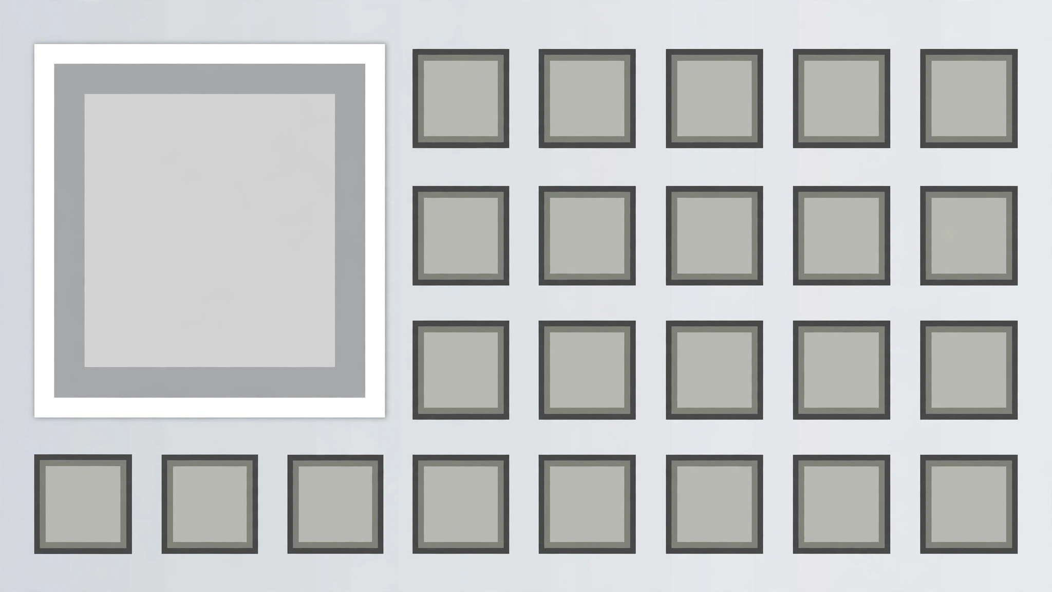
A grid of tiles where the priority tile reveals first at double size and holds alone, then the remaining tiles pop in around it in reading order, finishing with a single pulse that confirms the hierarchy. Built for dashboards, roundups, and galleries with one clear lead item.
Install it in 3 steps
No sign-up. No CLI tools. Pick your AI, copy one line, paste it over.
Prefer doing it yourself? Buy the skill ($4.99), download the ZIP from your checkout confirmation, unzip it into the directory shown above, restart your AI session — same result. Already bought it? Your AI assistant can download it for you.
What’s inside
One SKILL.md (the playbook) + one starter template. A preview:
Grid with Priority Reveal
When to use
- A dashboard, gallery, or roundup video opens on a grid where one item is the headline
- A feature roundup shows many features but one is the reason to watch
- A portfolio or product grid leads with the flagship item and supports it with the rest
- A news or recap video presents a set of stories with one lead story
- A pricing or plan grid highlights the recommended option inside a full grid
- You have 5–12 tiles of comparable items and one tile that must read as first among equals
Workflow
- Choose the grid and the priority tile (input: your items → output: grid plan)
List 5–12 tiles, each with a short title (≤5 words) and a thumbnail or icon. Pick exactly one priority tile — the headline, the flagship, the recommended option. The priority tile must earn the size: it is the item the narration leads with. Size the grid: 3 columns × 2–4 rows for 6–12 tiles, or 2 × 2 + priority span for 5 tiles. The priority tile occupies a 2 × 2 block (twice the width, twice the height of a standard tile) at the top-left or top-centre of the grid — never buried in the bottom row, never centred in a way that breaks the reading order. - Lay out the grid (input: grid plan → output: layout)
Standard tiles are equal squares or 4:3 rectangles with 12–16px gaps. The priority tile spans 2 × 2 standard cells with the same gap rhythm — measure it as two cells plus one gap, not a free-floating larger box, or the grid looks broken. All tiles share one card style (same radius, same border, same shadow); the priority tile differs only in size plus one accent: a 2px accent border or an accent "Featured" tag in its corner — not both, and never a different card style. Titles sit on or below each tile in the same type size; the priority tile's title may be one step larger, matching its 2 × 2 scale. - Reveal the priority tile first (input: layout → output: priority keyframes)
The priority tile reveals first, alone, over 500ms: it scales 0.9 → 1.0 with ease-out, fades 0 → 100% over the same 500ms, and its accent border draws in (stroke draw 300ms starting at +100ms) or its tag pops (scale 0 → 1.1 → 1 over 200ms at +200ms). Hold the priority tile alone for 400ms — the viewer must register "this one first" before anything else appears. Never reveal the priority tile at the same time as the rest; simultaneous reveal makes it just the biggest tile, not the first.
Template preview
Grid with Priority Reveal — Starter Template
Fill in every {placeholder}. Exactly one priority tile — two priorities is a split grid, not a hierarchy.
Grid plan
- Tiles (5–12):
- Why the priority tile earns it: {headline | flagship | recommended_option} — narration leads with it
- Grid size: {3_columns × 2–4_rows | 2 × 2 + priority span}
- Priority tile position: {top-left | top-centre} · Span: {exactly 2 × 2 standard cells}
- Priority tile size check: {2 cells + 1 gap} in each direction — not a free-floating box
Layout
- Standard tiles: {equal squares | 4:3 rectangles} · Gaps: {12–16px}
- Card style (same for all tiles): radius {…} · border {…} · shadow {…}