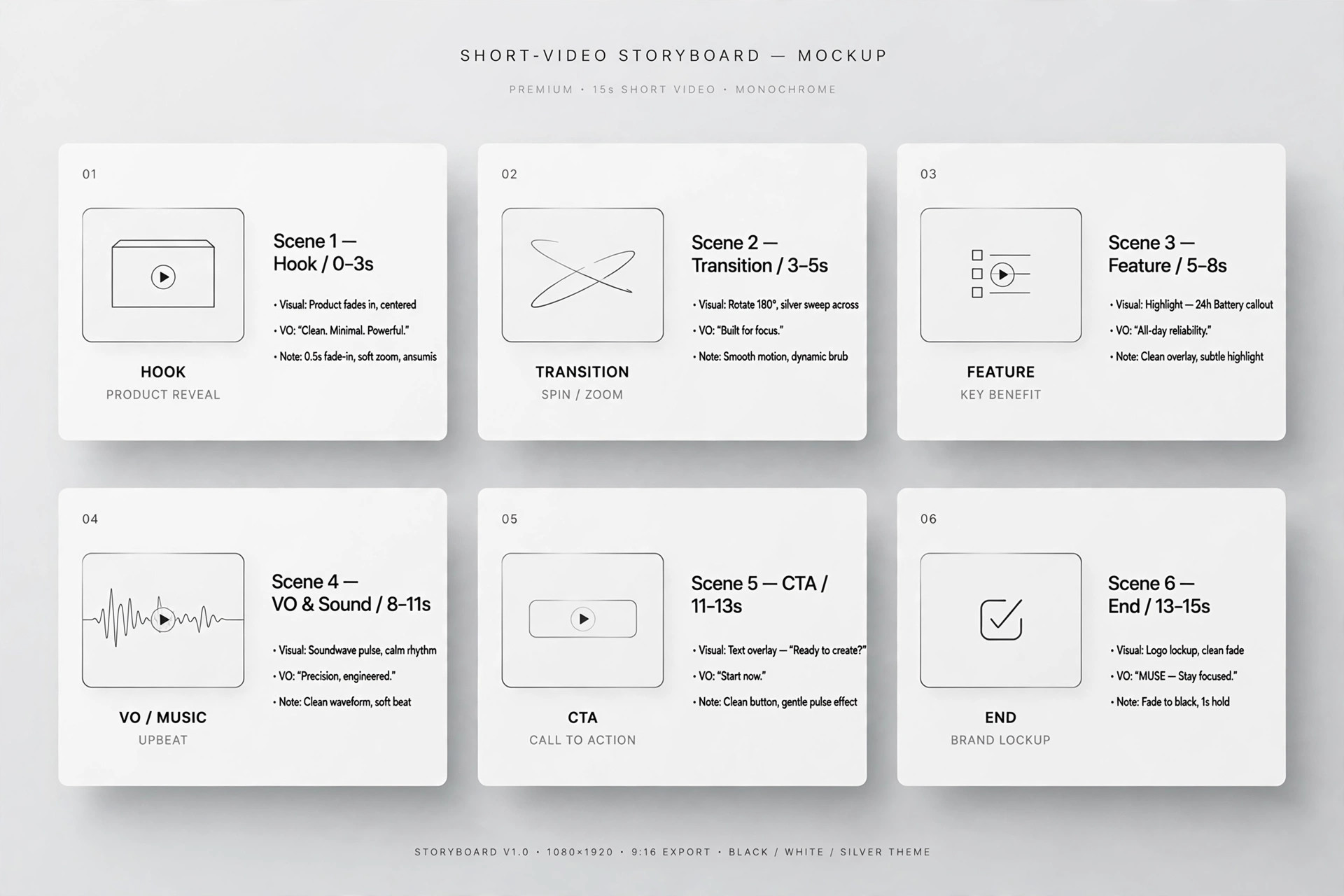
Feature Matrix Reveal
The comparison table, revealed one row at a time.
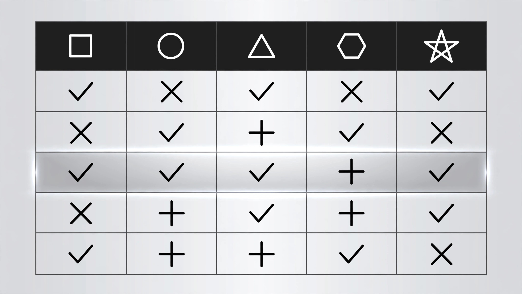
A feature-by-option matrix reveals its skeleton first, then one full row at a time with checkmarks popping left to right, ending on a takeaway strip naming the winner for a specific use case. Built for comparison videos, pricing explainers, and buyer's guides.
Install it in 3 steps
No sign-up. No CLI tools. Pick your AI, copy one line, paste it over.
Prefer doing it yourself? Buy the skill ($4.99), download the ZIP from your checkout confirmation, unzip it into the directory shown above, restart your AI session — same result. Already bought it? Your AI assistant can download it for you.
What’s inside
One SKILL.md (the playbook) + one starter template. A preview:
Feature Matrix Reveal
When to use
- A comparison video lines up 2–4 products, plans, or tools against the same set of features
- A pricing explainer must show what each tier includes without flashing a wall of checkmarks
- A buyer's guide compares options feature by feature and lands on a recommendation
- A product launch video shows how the new option stacks up against the old one and the rival
- A tutorial explains which plan a viewer needs by walking the feature rows that matter to them
- You have a table that is genuinely useful, and a static screenshot of it would get skipped
Workflow
- Build the matrix (input: your comparison → output: matrix data)
Columns: 2–4 options (products, plans, tiers). Rows: 5–8 features, each one a real decision factor — not filler ("Colour: yes"). Every cell holds exactly one of three values: a check (✓), a cross (✗), or a short value ("10 GB", "$29", "Unlimited"). No paragraphs in cells, no footnotes inside the grid. Order the rows by decision weight: the row that most often decides the purchase goes first. Name the columns with the option names, not "Option A" — the viewer must be able to read the verdict off the headers. - Lay out the grid (input: matrix data → output: layout)
Header row in bold with a tinted background; feature labels in the left column, left-aligned, in a smaller but readable size (≥16px at 1080p). Columns equal width; rows equal height. Cell contents centred. Use one accent colour for checks (green or the brand accent) and one muted colour for crosses (grey or soft red — never bright red, which reads as an error). Zebra-striping or hairline dividers separate rows; pick one, not both. The grid must fit the frame with ≥40px margins — if it does not fit, cut a row, not the font size. - Reveal the skeleton first (input: layout → output: frame keyframes)
The grid frame enters before any data: header row fades + slides down 8px over 250ms, then the feature labels fade in left-to-right staggered 40ms apart over ~300ms. The cells stay empty — the viewer sees the shape of the comparison before any verdict appears. This skeleton beat takes ≈550ms total. Never reveal a checkmark before its row label exists; a floating ✓ with no label is noise.
Template preview
Feature Matrix Reveal — Starter Template
Fill in every {placeholder}. Cells hold ✓ / ✗ / short value only — no paragraphs in cells.
Matrix data
- Options (columns, 2–4): {option_1} | {option_2} | {option_3} | {option_4}
- Rows (5–8, ordered by decision weight, most decisive first):
- Row where the favourite loses (include it): {feature_n — option_X loses here}
Layout
- Header: {bold}, tinted background {hex} · Feature labels left-aligned, ≥{16px}
- Columns: {equal width} · Rows: {equal height} · Cell contents: {centred}
- Check colour: {accent_hex} · Cross colour: {muted_grey_or_soft_red_hex}
- Row separators: {zebra_striping | hairline_dividers} — pick one