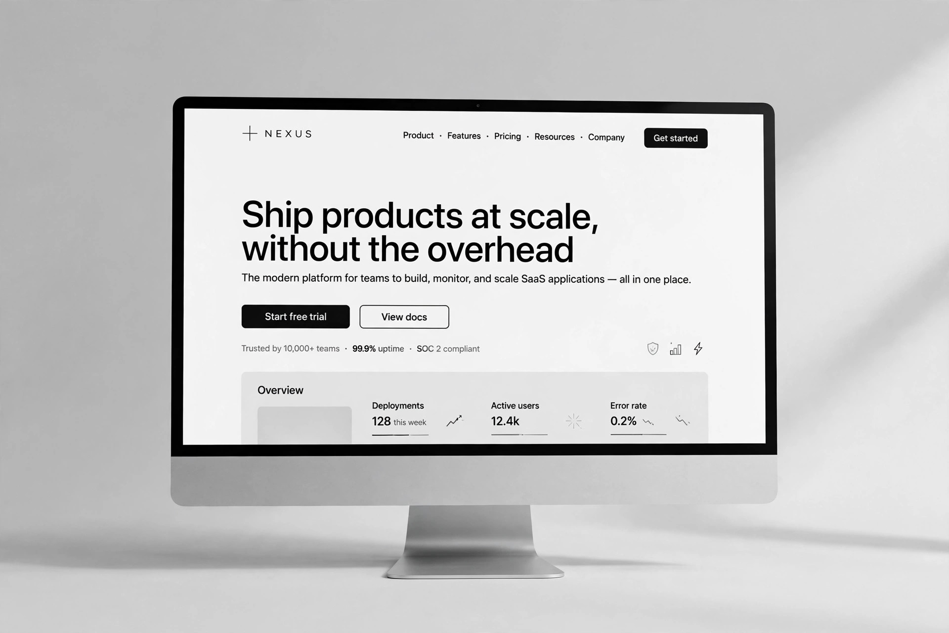
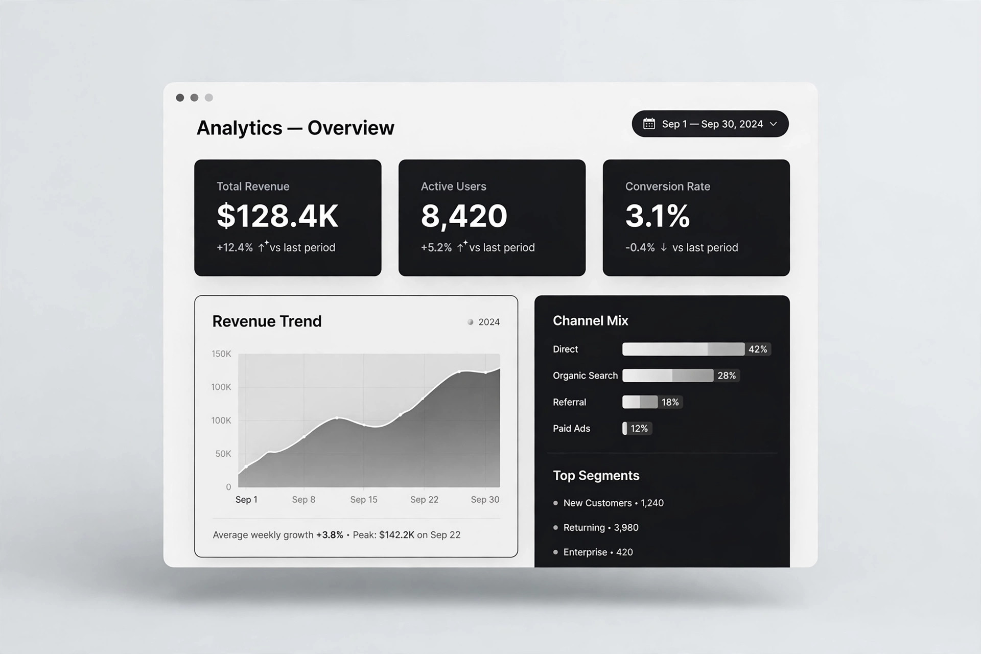
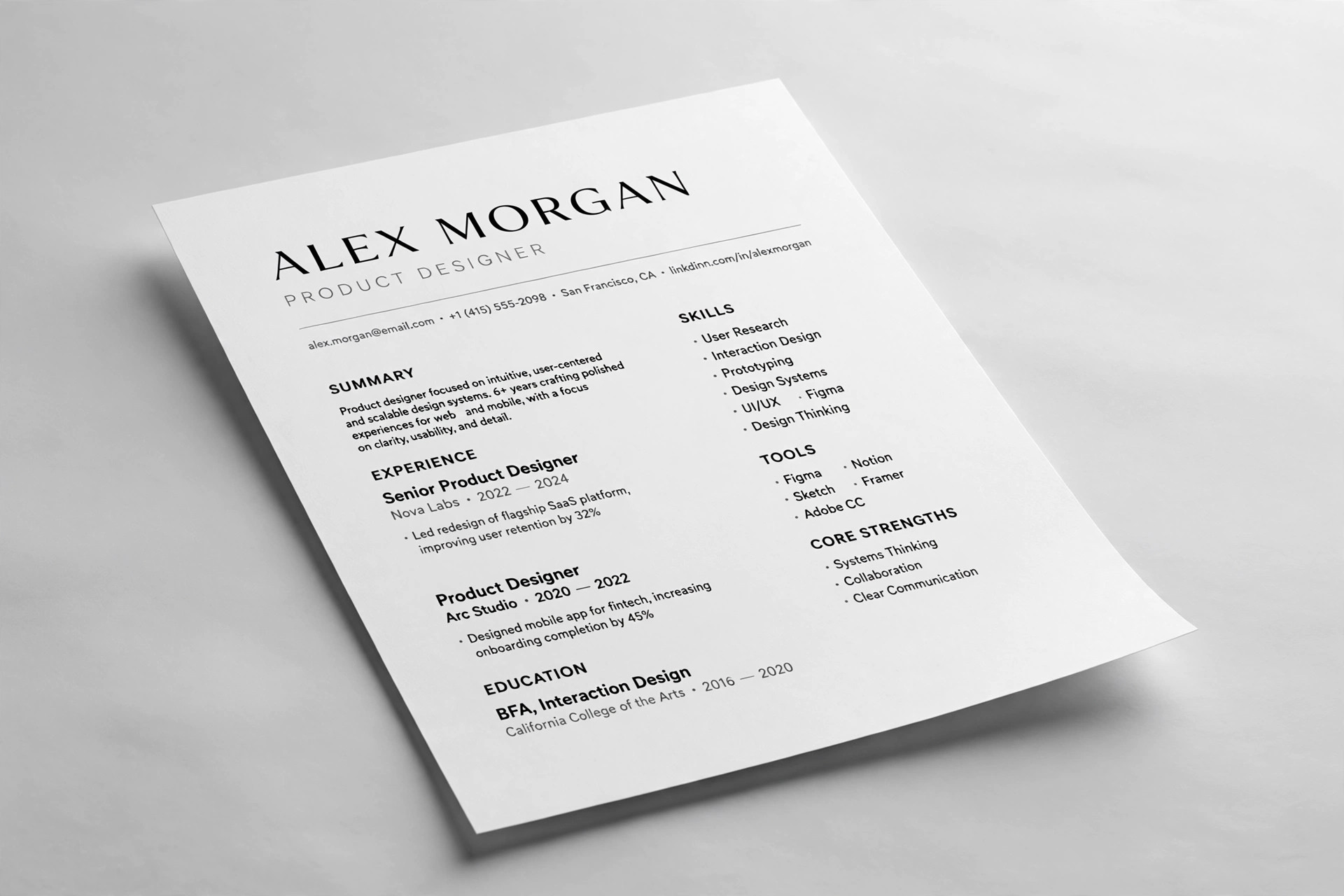
Editorial Ink Landing
One page, one promise, one action — print-inspired persuasion with ink-on-paper type
Builds a single editorial landing page: a masthead, a lede, a pull quote, the evidence, honest terms, and one call to action.
Install it in 3 steps
No sign-up. No CLI tools. Pick your AI, copy one line, paste it over.
Prefer doing it yourself? Buy the skill ($4.99), download the ZIP from your checkout confirmation, unzip it into the directory shown above, restart your AI session — same result. Already bought it? Your AI assistant can download it for you.
What’s inside
One SKILL.md (the playbook) + one starter template. A preview:
Editorial Ink Landing
When to use
- Your landing page is a stack of generic sections (hero, features, testimonials, pricing) that could belong to anyone
- You're launching a newsletter, journal, print product, course, or small tool with one thing to sell
- Your product has a point of view — craft, print, slow design, editorial quality — and your page looks like every SaaS template
- You want one page, one promise, one action, and everything else cut
- Your bounce rate is high because visitors can't tell in five seconds what the page is offering
Workflow
- Fix the one promise (input: product + audience → output: one-sentence promise)
A landing page sells one thing. Write the promise as a single sentence a stranger can repeat back: what the reader gets, and what changes for them. "A weekly letter about type design" is a description; "One essay a week that makes you see the letters around you" is a promise. If you can't state it in one sentence, the page isn't ready to be written — go back to the product until you can. - Draft the lede and nut graf (input: promise → output: opening two paragraphs)
Borrow the magazine structure: a lede that hooks with a concrete scene, detail, or tension — then a nut graf that states plainly what this is, who it's for, and what it costs. The lede earns the next ten seconds; the nut graf earns the next minute. Write three ledes and pick the one that is most specific. Specificity is the whole trick: a real detail ("printed on 120gsm uncoated stock") beats a grand claim ("a premium reading experience") every time. - Assemble the page in editorial order (input: lede + product facts → output: full page draft)
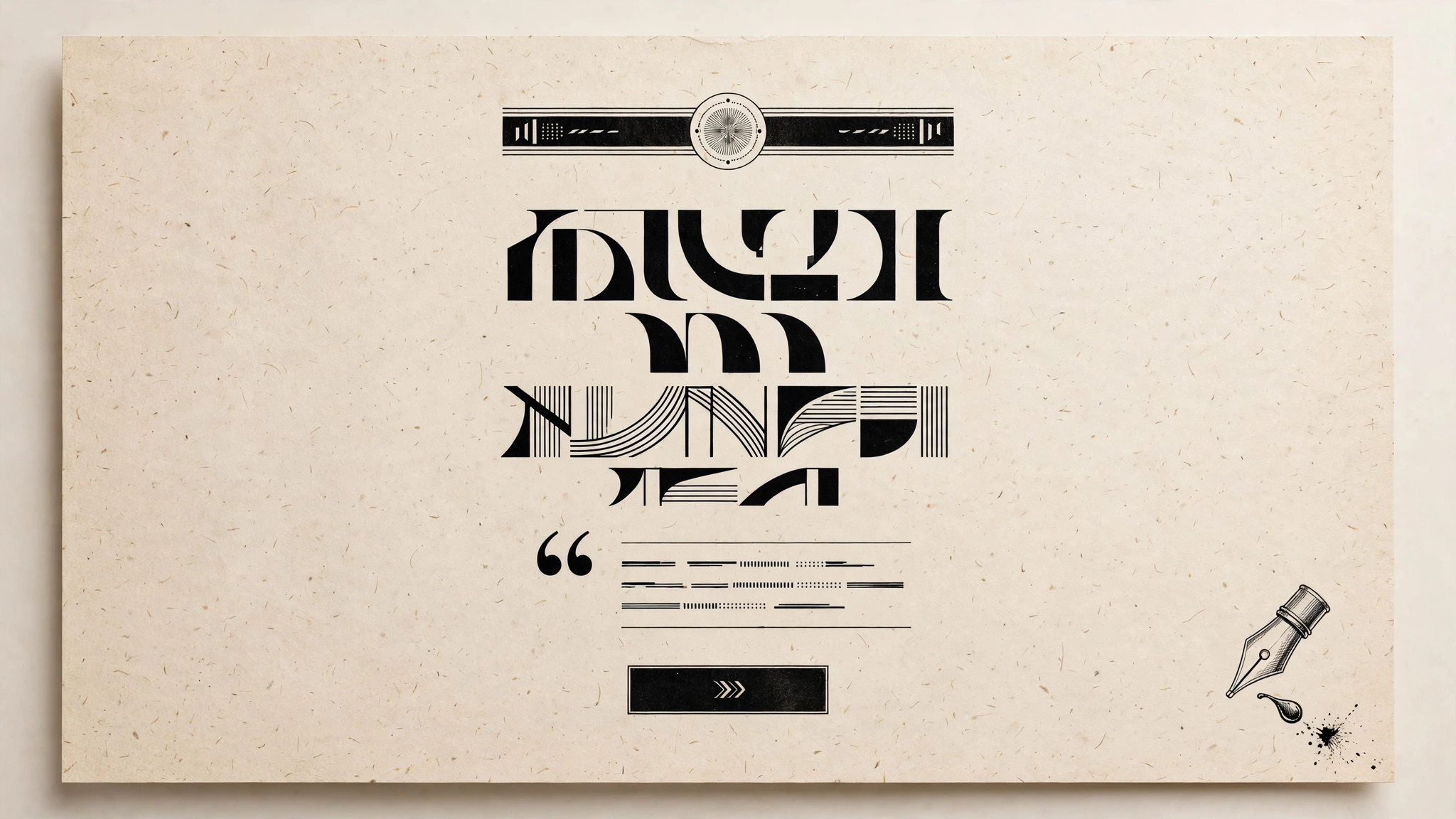
Structure the page like a magazine cover story, not a template: masthead (name + one-line description), lede + nut graf, the promise restated as a pull quote, the evidence (what's inside — a table of contents, a sample, a specimen), the terms (price, frequency, what you get, cancellation), and one call to action repeated exactly twice. No feature grid, no logo wall, no three-column benefit icons — the editorial form is the differentiation. - Set the typographic system (input: page draft → output: type and layout spec)
Ink-on-paper means the type is the design. Pick a serif with character for headlines and a highly readable serif or sans for body; set a clear scale (headline, deck, body, caption, footnote) and stick to it. One ink color for text, one paper tone for background, one accent used only for the call to action and key emphasis. Wide margins, a comfortable measure (roughly 60–75 characters per line), and captions under every image. Restraint is the aesthetic — if a decorative element doesn't help reading, it goes.
Template preview
Editorial Ink Landing — Template
One page. One promise. One action. Fill in order; cut anything that doesn't serve the promise.
Masthead
Name: {product / publication name} One-line description: {what it is, in under 10 words}
The one promise
{One sentence a stranger can repeat back: what the reader gets, and what changes for them}
Lede (hook paragraph)
{Open with a concrete scene, detail, or tension — specific, not grand}
Nut graf (what / who / cost)
{What this is} for {who it's for}. {What it costs, stated plainly.}
Pull quote
> {The promise restated as a single striking line}