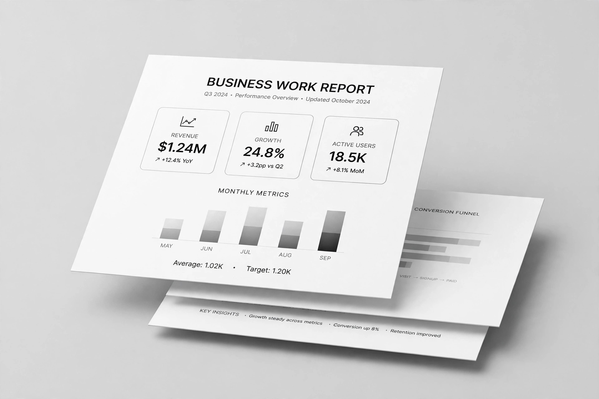
Yellow Balance Deck
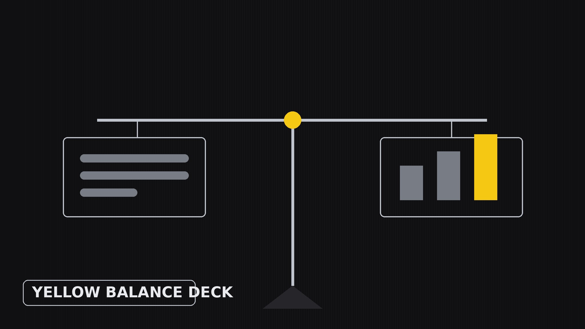
Every slide in balance, one yellow accent doing the pointing.
Turns your AI into a presentation designer — builds slide decks on a balance-layout system where every slide distributes visual weight evenly, uses yellow as a single deliberate accent, and keeps generous whitespace so the argument, not the decoration, does the persuading.
Install it in 3 steps
No sign-up. No CLI tools. Pick your AI, copy one line, paste it over.
Prefer doing it yourself? Buy the skill ($4.99), download the ZIP from your checkout confirmation, unzip it into the directory shown above, restart your AI session — same result. Already bought it? Your AI assistant can download it for you.
What’s inside
One SKILL.md (the playbook) + one starter template. A preview:
Yellow Balance Deck
When to use
- A pitch, proposal, or report deck where the argument matters more than the decoration
- Your slides currently feel lopsided — a wall of text on one side, a lonely chart on the other
- You want a deck with a recognizable identity (yellow accent, calm layout) without a loud theme
- You are presenting numbers and need the audience to compare two things without getting lost
- A team deck where several people edit slides and the layout system has to survive many hands
Workflow
- Define one idea per slide (input: your raw material → output: slide outline)
Boil the deck down to one claim per slide, written as a full sentence ("Our churn fell because onboarding got faster"), not a label ("Churn"). If a slide needs two claims, it is two slides. Order the claims into an argument — setup, evidence, turn, ask — and give each slide a number so the flow is visible before any design happens. - Sketch the weight map (input: slide outline → output: layout sketch per slide)
For each slide, decide where the visual weight goes before placing anything: text block on one side balanced by a visual on the other, or a centered claim with two equal columns beneath it. Think of each slide as a scale — a heavy chart on the right needs a strong headline and a short caption on the left to balance it. Sketch this as rough rectangles, not finished slides; the point is the balance, not the beauty. - Place yellow deliberately (input: layout sketch → output: accent plan)
Yellow is the only accent, so it must mean something: use it for exactly one job per slide — the key number, the winning bar, the arrow that shows the direction, the one word in the headline that carries the claim. Never use yellow for decoration (borders, backgrounds, bullet dots) and never let it appear in more than one place per slide. When everything is yellow, nothing is; when one thing is yellow, the eye goes there first. - Set the type hierarchy (input: accent plan → output: finished slide layouts)
Three type sizes, no more: a large claim headline (the sentence from step 1), a medium sub-point or caption, and small supporting text or labels. The headline carries the argument; the body never exceeds three short lines per block; chart labels stay large enough to read from the back of the room. Keep all text black or dark grey on white or near-white — yellow is for the accent, never for text, because yellow text on white is unreadable.
Template preview
Yellow Balance Deck — Deck Template
One claim per slide, one yellow accent per slide, three type sizes.
Deck brief
Audience: {who is in the room} Occasion: {pitch / proposal / report / update} Argument in one line: {what the deck must prove} Slides: {count}
Slide outline (one full-sentence claim per slide)
Weight map (per slide — sketch before designing)
Slide {n}: {text block left, visual right / centered claim, two equal columns / other} Left weight: {headline + caption} Right weight: {chart / image + label} Balance check: {does one side feel heavier? resize, don't decorate}