Primary Doodle Deck
Scarabocchi disegnati a mano, tre inchiostri primari, regole rigorose.
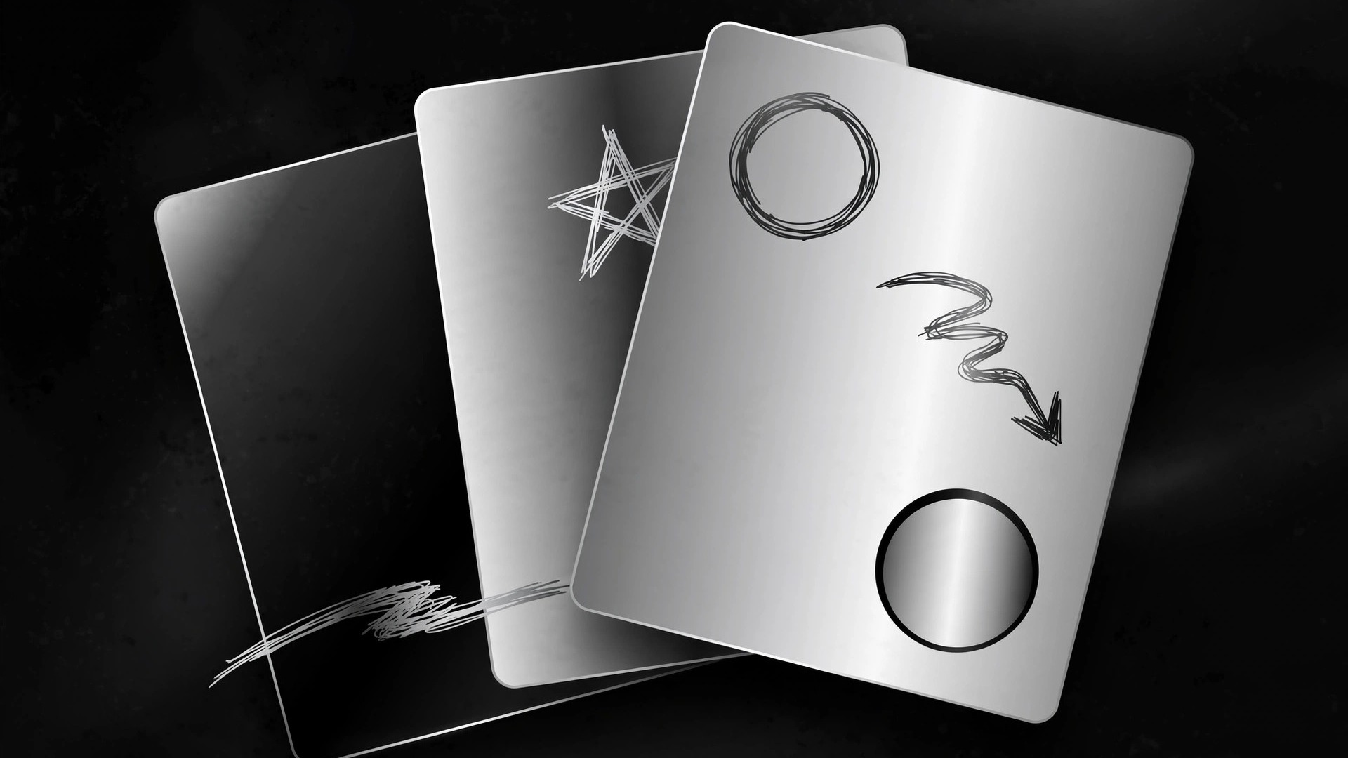
Trasforma la tua IA in un designer di presentazioni in stile primary-doodle — segni scarabocchiati a mano con inchiostro rosso, giallo e blu su nero su bianco, così una presentazione sembra giocosa e umana senza scivolare nel caos.
Installala in 3 passaggi
Nessuna registrazione. Nessuno strumento da riga di comando. Scegli la tua AI, copia una riga e incollala.
Preferisci fare da te? Acquista la skill ($4.99), scarica lo ZIP dalla conferma d'acquisto, decomprimilo nella cartella mostrata sopra e riavvia la sessione della tua AI — stesso risultato. L'hai già acquistata? Il tuo assistente AI può scaricarla per te.
Cosa contiene
Un file SKILL.md (la guida operativa) + un modello di partenza. Un'anteprima:
Primary Doodle Deck
When to use
- Your deck needs to feel human and approachable — a classroom, community, or creative pitch, not a boardroom
- You want a hand-drawn look with a strict color discipline: three primary inks, nothing else
- Your slides are idea-heavy and need doodles that explain, not decorate
- You need a deck a non-designer can extend: the doodle rules must be simple enough to follow by hand
- You want playful without childish — the doodles carry structure, the type stays grown-up
Workflow
- Set the palette and paper (input: deck topic → output: style rules)
Fix the palette before any slide exists: black ink for all lines and type, and three primary inks — red, yellow, blue — used as fills and highlights only. No gradients, no pastels, no fourth accent. Background is white or warm off-white, like paper. Type is one grotesque or humanist sans for headlines and body, set in black, with a single handwritten-style font reserved for annotations and labels — never for body text. Write these rules down as the deck's one-page style sheet; every slide gets checked against it. - Build the doodle vocabulary (input: deck content → output: doodle library)
Draw a small library of reusable doodles, each in black line with at most one primary fill: arrows, circles, stars, underlines, checkmarks, speech bubbles, stick figures, boxes, magnifiers, lightbulbs. Each doodle has one job — the arrow points, the circle highlights, the star marks the key number. Keep strokes rough but controlled: consistent line weight, no photorealism, no clip-art. If a doodle needs more than two strokes to be understood, it's too complicated — simplify it. The library stays small (12–18 marks) so the deck looks like one hand drew it. - Structure the slides (input: outline → output: slide plan)
Plan the deck slide by slide: title, agenda, one idea per content slide, one proof slide per claim, close. Every content slide gets exactly one job and one hero element — one diagram, one number, one comparison. Doodles sit in fixed roles: underline the headline's key word, circle the number that matters, arrow from cause to effect. A slide with more than three doodles is a slide with no hierarchy — remove doodles until the eye lands on the message first and the marks second. - Lay out each slide (input: slide plan + doodle library → output: finished slides)
Layout rules: generous white space, left-aligned headlines, one primary color per slide as the dominant accent (never all three competing at once), black for everything structural. Doodles are drawn at the same scale and stroke weight across slides so the deck feels hand-made by one person. Numbers get the red or blue treatment — a hand-drawn circle around the figure, a doodle star beside it. Keep body text to five lines or fewer per slide; anything longer belongs in speaker notes, not on the wall. - Check the deck (input: finished slides → output: verified deck)
Flip through the deck fast: does every slide read in three seconds? Is the primary color balanced across the deck (no five red slides in a row)? Are doodles explaining or just decorating — remove any mark whose deletion changes nothing. Check legibility: handwritten annotations at least 24pt equivalent, never the smallest text on the slide. Finally, hand the style sheet to someone who hasn't seen the deck and ask them to make one new slide — if they can't, the rules are too vague to survive contact with a real team.
Anteprima del modello
Primary Doodle Deck — Style Sheet + Slide Template
Hand-drawn doodles, three primary inks, strict rules. Fill in the style sheet first, then plan slides.
Style sheet (one page — the deck's law)
- Palette: black ink (all lines + type) + red + yellow + blue (fills + highlights only)
- Forbidden: gradients, pastels, a fourth accent color
- Background: {white / warm off-white} — like paper
- Headline + body type: {one grotesque or humanist sans}, black
- Annotation type: {one handwritten-style font} — annotations and labels ONLY, never body text
- Rule: one dominant primary color per slide; three primaries on one slide almost never
Il pacchetto della skill (SKILL.md + modello) è scritto in inglese.
Potrebbe piacerti anche
 Presentazioni
Pitch Deck
10 slide che raccontano una sola storia — gli investitori restano fino all'ultima pagina
 Presentazioni
Work Report
Settimanale, mensile, review — prima la conclusione, si capisce in 3 minuti
 Presentazioni
Academic Argument Deck
Una presentazione che argomenta — e risponde alle obiezioni.