AI Services Market › スキルファクトリー › 画像 › Paperline Content Illustrator
$4.99 · サインイン不要v1.0.0– 回表示
Paperline Content Illustrator
まるで一人の手で描かれたような、丸ごと一冊分のイラスト。
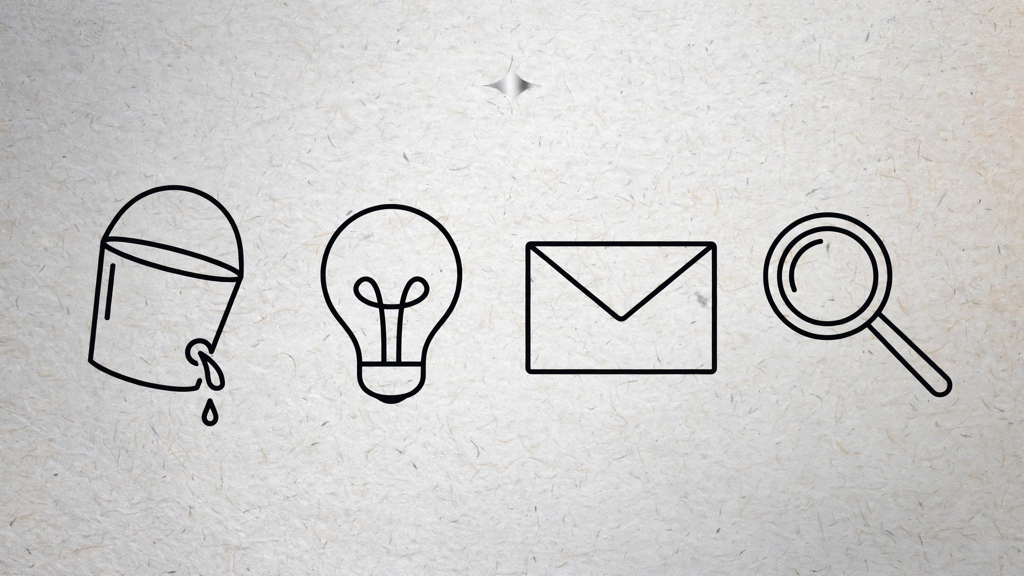
AIがイラストレーターになり、紙地の上に細い線で描く一貫したイラストセットを制作します。共通の線の太さ、アクセントカラーひとつ、紙の色調ひとつを統一し、記事や冊子全体が一人の手で描かれたように見える仕上がりにします。
こんな方におすすめ
編集者、ニュースレターのライター、コンテンツチームの皆さま
所要時間
~30分(一式のブリーフィング)
レベル
中級
3ステップでインストール
登録不要。CLIツールも不要です。お使いのAIを選んで、1行コピーして貼るだけです。
ご自分で入れたい場合は、スキルを購入($4.99)し、購入完了画面からZIPをダウンロードして、上のディレクトリに展開し、AIのセッションを再起動してください。結果は同じです。すでに購入済みの場合は、AIアシスタントにダウンロードしてもらうこともできます。
パックの内容
SKILL.md(手順書)1点とスターターテンプレート1点が入っています。プレビューはこちらです:
Paperline Content Illustrator
When to use
- An article, newsletter, or blog needs a set of spot illustrations that feel editorial, not stocky
- A magazine issue, report, or guide needs 5–20 illustrations that must look like one hand drew them all
- You have a content series and want a repeatable illustration system, not a one-off image
- A brand wants a warm, hand-drawn feel for explanatory content without full-color artwork
- You need illustrations that work in print and on screen, in color and in greyscale
Workflow
- Fix the system before drawing anything (input: publication + topics → output: style sheet)
Lock three decisions and write them on a one-page style sheet: line weight (one weight for outlines, one lighter weight for interior detail — no other weights), the palette (paper ground, ink, plus exactly one accent color), and the paper ground itself (warm off-white with a faint grain). Add the drawing rules: open, unfilled shapes; no drop shadows; no gradients; hands and faces simplified to a few strokes; backgrounds suggested with two or three lines, never fully drawn. Every illustration in the set is judged against this sheet — if a drawing breaks the sheet, it is redrawn, not excused. - Map the set (input: article list or outline → output: illustration briefs)
List every illustration the issue needs, one line each: what it shows, what idea it must carry, and where it sits (hero, section header, spot, closer). Assign each brief a type — scene, object, diagram, or portrait — and check the mix: a set of twelve identical object drawings is monotonous, so balance scenes against objects and give the hero the most complex composition. Write the idea each illustration carries in one clause ("the inbox as a leaky bucket"), because an illustration that decorates without saying anything is filler, and filler is the first thing a good editor cuts. - Draw in passes (input: briefs → output: illustration set)
Work in three passes across the whole set, not one illustration at a time: pass one, rough gesture sketches for all briefs to check the mix and compositions; pass two, clean linework on the approved roughs, all at the same line weights; pass three, the single accent color applied sparingly to the focal point of each drawing — one accent per illustration, never more. Drawing set-wide keeps the hand consistent; finishing one illustration before starting the next is how a set drifts into five different styles. Keep the paper ground identical across the set — same tone, same grain — so the illustrations sit together on any page. - Pair illustration with text (input: illustration set + copy → output: laid-out pages)
Place each illustration against its copy and check the relationship: the drawing should add something the words do not — a metaphor, a spatial idea, a joke — not restate the headline. Size by role: hero large, section headers medium, spots small and tucked into the text flow. Keep captions short and optional; a paperline illustration should not need a paragraph to explain itself. Check the spread as a whole: accent color should appear like punctuation across the page, not as a block, and no two adjacent illustrations should share the same composition shape. - Export and hand off (input: laid-out pages → output: production files)
Export each illustration twice: a vector or high-resolution master for print, and a web-sized file (compressed, sensible dimensions) for screen. Name files by role and topic (hero-leaky-inbox.svg), not by draft number. Deliver the style sheet with the set — the next illustrator or the next issue needs it to extend the set without guessing. Finally, check the set in greyscale: if the illustrations still read with the accent removed, the linework is doing its job and the accent is a bonus, not a crutch.
テンプレートのプレビュー
Paperline Content Illustrator — Template
One style sheet governs the whole set. Fill it in before drawing anything.
Style sheet
- Outline line weight: {e.g. 2.5pt}
- Detail line weight: {e.g. 1.25pt}
- Paper ground: {hex, warm off-white + faint grain}
- Ink: {hex}
- Accent (exactly one): {hex}
- Drawing rules: open, unfilled shapes · no drop shadows · no gradients · simplified faces/hands · backgrounds suggested with 2–3 lines, never fully drawn
Brief list (one line each)
Mix check: {scenes vs. objects balanced? hero most complex? no two adjacent compositions alike?}
Drawing passes
スキルパック本体(SKILL.md とテンプレート)は英語で書かれています。