AI Services Market › スキルファクトリー › Web › Confetti Marketing Landing
$4.99 · サインイン不要v1.0.0– 回表示
Confetti Marketing Landing
成果につながるお祝いのエネルギーです。パーティーの雰囲気と鋭い提案を両立します。
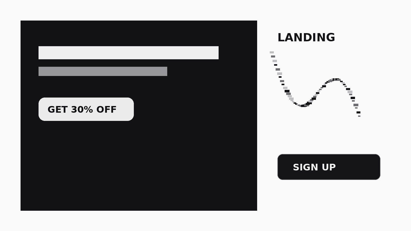
お祝いのエネルギーを登録、販売、ウェイティングリスト参加へと変える、紙吹雪のアクセントが効いた華やかなマーケティング用ランディングページをデザインします。
こんな方におすすめ
製品、プロモーション、季節キャンペーンを立ち上げるマーケターの方
所要時間
初稿まで約25分
レベル
初心者向け
3ステップでインストール
登録不要。CLIツールも不要です。お使いのAIを選んで、1行コピーして貼るだけです。
ご自分で入れたい場合は、スキルを購入($4.99)し、購入完了画面からZIPをダウンロードして、上のディレクトリに展開し、AIのセッションを再起動してください。結果は同じです。すでに購入済みの場合は、AIアシスタントにダウンロードしてもらうこともできます。
パックの内容
SKILL.md(手順書)1点とスターターテンプレート1点が入っています。プレビューはこちらです:
Confetti Marketing Landing
When to use
- You're launching a product, feature, or event and want the page to feel celebratory and urgent
- You're running a seasonal promotion, sale, or limited offer and need a page that sells the excitement
- Your current landing page converts poorly because it reads like a spec sheet — visitors bounce before the offer lands
- You need a waitlist or signup page for something fun: a party product, a game, a course, a community
- You have a launch deadline in days, not weeks, and need one focused page, not a full site
- Your offer has a deadline or a limited quantity — the page needs to make that felt, not just stated
Workflow
- Pin down the one offer (input: product + campaign details → output: offer statement)
Write the offer in one sentence with a verb, a benefit, and a deadline or limit: "Join the waitlist today and get 30% off launch week — 500 spots." If you can't write it in one sentence, the page will try to sell three things and convert on none. Every later section — headline, proof, FAQ — exists to support this single sentence. Cut any section that doesn't. - Write the headline stack (input: offer statement → output: headline + subhead + CTA)
The headline promises the outcome in the visitor's words ("Throw a party they'll actually remember"), the subhead names the product and the mechanism in one line ("Confetti kits with everything in the box — order by Friday for weekend delivery"), and the CTA button states the action and the payoff ("Get my kit — 30% off"). Write three headline options, pick the one a stranger understands in 3 seconds, and put the CTA button directly beneath it. No clever-but-unclear headlines on a landing page — clarity converts, wit doesn't. - Design the confetti system (input: headline stack + brand palette → output: confetti rules)
Define confetti as a conversion tool, not decoration: a burst behind the hero headline, a scatter trail leading the eye toward the CTA, and a celebratory burst on the confirmation state after signup. Set rules — 2–3 confetti colours drawn from the offer's mood, dense in the hero, sparse or absent in pricing and FAQ where numbers must be read cleanly. Confetti near the CTA should frame it, never cover it. - Build the persuasion sections (input: offer statement → output: page body)
In order: Hero (headline stack + one hero visual) → Proof strip (logos, count, or one-line stats) → Benefits (3–4, each one line: feature → outcome) → Social proof (2–4 short quotes or a rating) → Offer details (what's included, price, deadline) → FAQ (the 4–6 objections that actually block signups) → Final CTA (headline repeated, button repeated). Each section answers one visitor question: "What is it? Does it work? What's in it? What if…? What do I do?" If a section doesn't answer a question, cut it. - Make the offer mechanics visible (input: offer details → output: urgency + guarantee blocks)
If there's a deadline, show it — a countdown or a plain date line ("Offer ends Sunday, 11:59pm") near every CTA, not buried in the FAQ. If there's a guarantee or a risk-reverser (free returns, money-back, no card required for the waitlist), state it in one line directly under the primary button. Urgency without a real deadline is a lie that costs trust; if the offer genuinely has no deadline, say what's limited instead (spots, stock, early pricing). - Wire the conversion path (input: page body → output: working form + confirmation)
The form asks for the minimum: one field for a waitlist (email), two at most for an order (email + one more). The submit button repeats the payoff ("Claim 30% off"), and the confirmation state celebrates — confetti burst, clear "you're in" message, and the next step ("Check your inbox for the code"). Test the full path on a phone: form, submit, confirmation, and the email that arrives. A landing page that drops the confirmation email has converted a visitor into a frustrated one. - Check the page like a sceptic (input: working page → output: verified page)
Read the page as a visitor who doesn't trust you: is the price visible before the CTA? Is the deadline real and dated? Does every claim have proof nearby? Is the page fast on mobile (hero image compressed, confetti lightweight, no autoplay video)? Then do the 5-second test: show the page for 5 seconds and ask what the offer is. If the answer is wrong, the hero is wrong — fix the headline stack, not the decorations.
テンプレートのプレビュー
Confetti Marketing Landing — Starter Template
One page, one offer, one CTA repeated. Fill in every {placeholder}.
Offer
- Offer statement (verb + benefit + deadline/limit): {offer_statement}
- Price: {price} | Deadline: {deadline_date_time} | Limit: {limit_if_any}
- Guarantee / risk-reverser: {guarantee, e.g. "30-day money-back, no questions"}
Confetti rules
- Confetti colours: {colour_1}, {colour_2}, {colour_3}
- Hero: {burst_description} | CTA trail: {trail_description}
- Confirmation: {confirmation_burst}
- Pricing / FAQ: {sparse_or_none — keep numbers readable}
Hero
- Headline (option A): {headline_a}
- Headline (option B): {headline_b}
スキルパック本体(SKILL.md とテンプレート)は英語で書かれています。