AI Services Market › スキルファクトリー › Web › Colour Block Testimonials
$4.99 · サインイン不要v1.0.0– 回表示
Colour Block Testimonials
ブロックごとに大きな声を1つ——視覚的な迫力のあるお客様の声です。
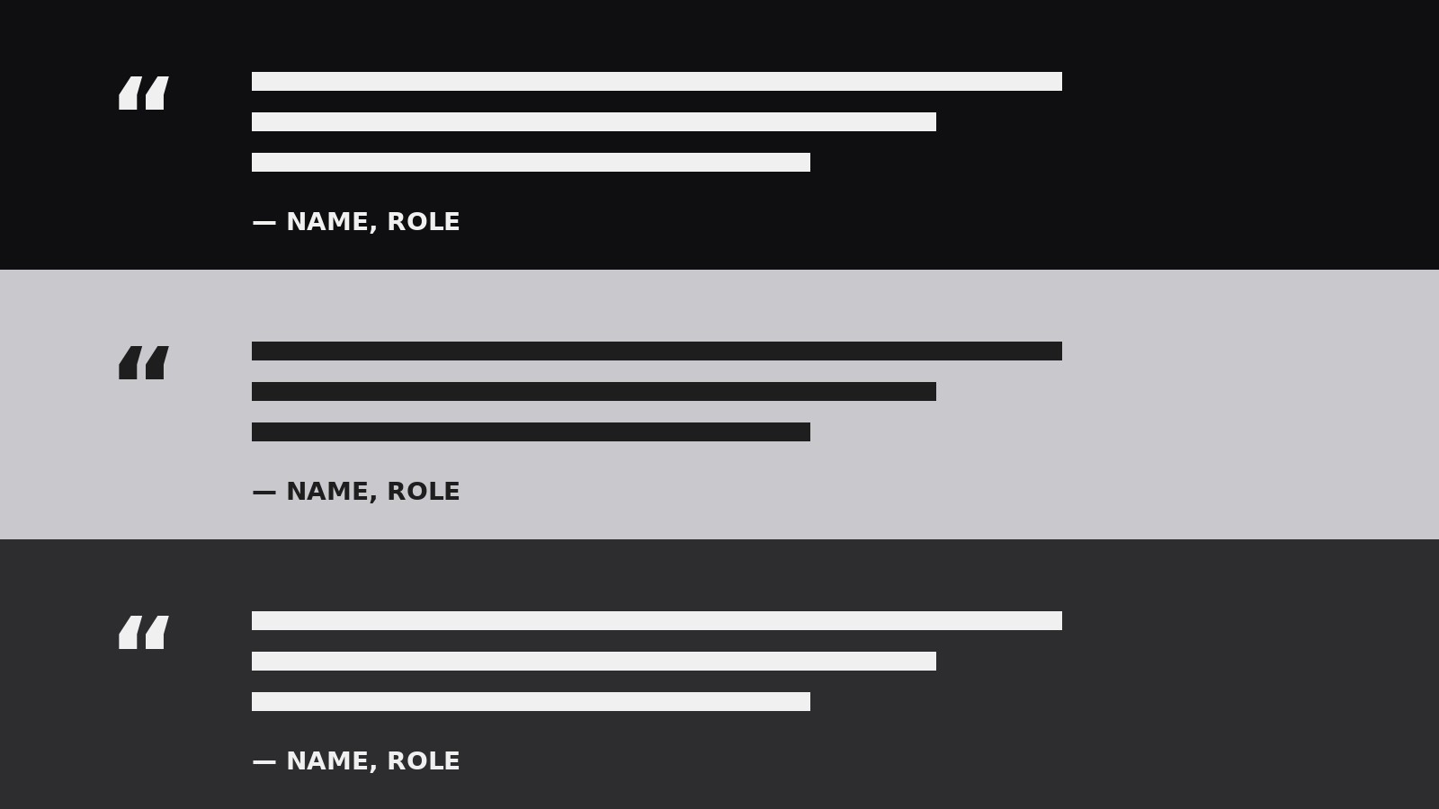
全幅のカラーブロックを1列に積み重ねた大胆な構成を作成します。ブロックごとに推薦文を1つ配置し、色と特大のタイポグラフィが構造を担います。
こんな方におすすめ
際立った引用をいくつか持つランディングページ所有者とマーケターの方
所要時間
初稿まで約20分
レベル
初心者向け
3ステップでインストール
登録不要。CLIツールも不要です。お使いのAIを選んで、1行コピーして貼るだけです。
ご自分で入れたい場合は、スキルを購入($4.99)し、購入完了画面からZIPをダウンロードして、上のディレクトリに展開し、AIのセッションを再起動してください。結果は同じです。すでに購入済みの場合は、AIアシスタントにダウンロードしてもらうこともできます。
パックの内容
SKILL.md(手順書)1点とスターターテンプレート1点が入っています。プレビューはこちらです:
Colour Block Testimonials
When to use
- Your landing page needs social proof that stops the scroll — a plain quote carousel is being ignored
- You have 3–6 strong testimonials and want each one to get full attention, not a thumbnail-sized slot
- Your brand already uses bold colour, and your testimonials should match that energy
- You're redesigning a sales page and the testimonial section is the weakest part
- You need a testimonial section that works as a full-page section on desktop and stacks cleanly on mobile
- Your quotes are long and specific — they need room to breathe, not a cramped card
Workflow
- Pick the voices (input: your testimonial pool → output: 3–6 chosen quotes)
Choose quotes that each prove a different thing: one on results, one on the experience of working with you, one on a specific objection overcome ("I worried it would be too expensive, but…"). Cut anything generic ("Great service, highly recommend!") — it reads as filler and weakens the real quotes next to it. Aim for 3–6 quotes, 25–60 words each. Fewer than 3 feels thin; more than 6 makes the stack drag. - Assign the colour logic (input: chosen quotes + brand palette → output: colour sequence)
Give each block a solid background colour from your palette, alternating between a dark and a light block so the rhythm is visible at a glance. The colour should follow the emotional arc: your strongest, most dramatic quote gets the boldest colour. Never put two identical colours adjacent, and never use more than 3 distinct block colours — the section should feel like a deliberate pattern, not a paint sample card. Check text contrast on every colour before building. - Set the type hierarchy (input: colour sequence → output: type rules)
Each block has exactly three typographic elements: the quote itself in large display type (at least 28px, ideally 32–44px), the speaker's name in small caps or bold, and one line of context (role, company, result). The quote is the star — it should fill 60–70% of the block's visual weight. Keep the quote to one typeface and one size per block; varying sizes inside a single quote breaks the block's solidity. - Design one block, then repeat (input: type rules + first quote → output: block template)
Build the first block to completion: full-width background, generous padding (at least 64px top and bottom on desktop), quote centred or left-aligned consistently, speaker line beneath, and one optional small element — a large quotation mark, a star row, or a small portrait. Then repeat the exact same structure for every block, changing only the colour and the content. Consistency is what makes colour blocks feel designed; if every block has a different layout, the colour stops being the structure. - Add the proof details (input: block template → output: completed blocks)
Strengthen each block with one verifiable detail: a number ("cut onboarding time by 40%"), a full name and role, or a recognisable company. Anonymous quotes ("— Marketing Director, SaaS") are weak; named quotes with a real result are the whole point of this format. If a client won't allow their name, use the most specific attribution they'll permit ("Head of Ops, 50-person logistics firm") rather than nothing. - Check the stack as a whole (input: completed blocks → output: verified section)
View all blocks stacked together: the colours should alternate cleanly, the quotes should vary in length (a long one, then a short punchy one), and no two adjacent blocks should start with the same word or structure. On mobile, each block should read as one self-contained panel — no orphaned single words, no speaker line separated from its quote. Fix rhythm problems by reordering blocks, not by redesigning them.
テンプレートのプレビュー
Colour Block Testimonials — Starter Template
One block per quote. Keep the structure identical across blocks — only the colour and the content change.
Colour sequence (max 3 colours, alternate dark / light)
- Block 1 colour: {colour_1} (text: {text_colour_1})
- Block 2 colour: {colour_2} (text: {text_colour_2})
- Block 3 colour: {colour_3} (text: {text_colour_3})
- (Repeat the sequence for blocks 4–6.)
Type rules
- Quote: {quote_font}, {quote_size, e.g. 36px}, {quote_alignment, e.g. left}
- Name: {name_style, e.g. small caps bold}
- Context line: {context_style, e.g. 14px regular}
- Block padding: {padding, e.g. 64px top/bottom desktop, 40px mobile}
Block 1
スキルパック本体(SKILL.md とテンプレート)は英語で書かれています。