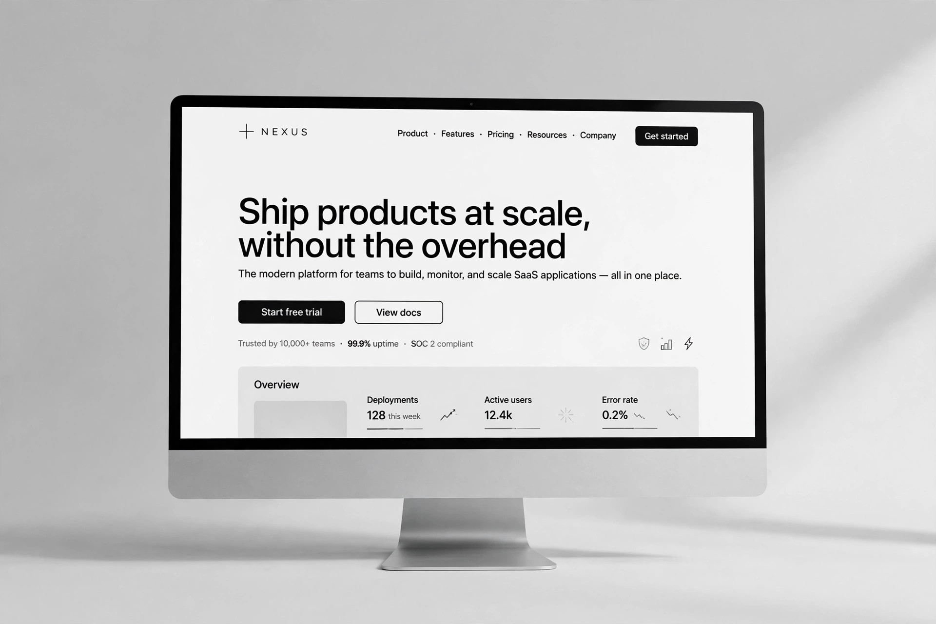
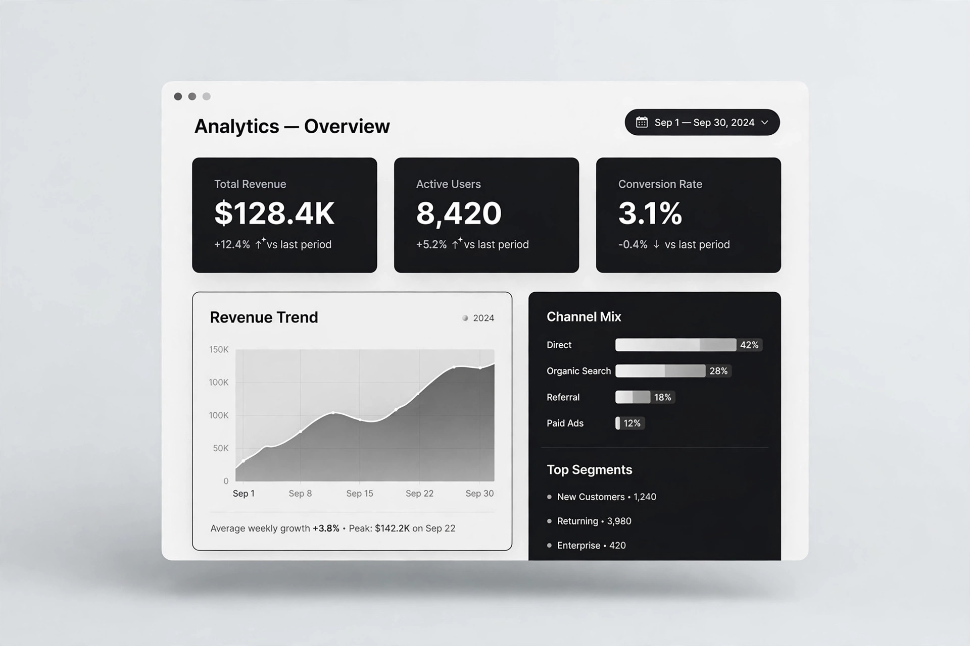
Editorial Studio SaaS
Un sito prodotto multipagina in cui le funzioni sono lavori da svolgere e la pagina prezzi dice la verità
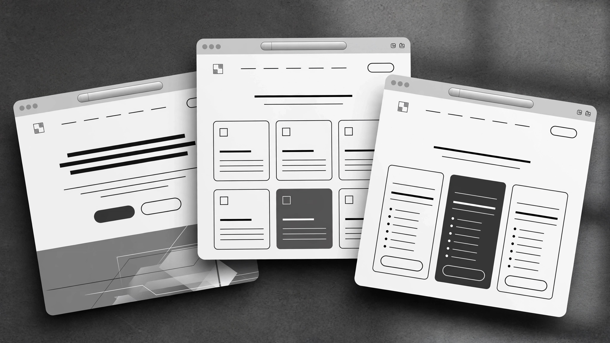
Mappa il percorso dell'acquirente in un sito di marketing SaaS coerente: home, pagine funzione scritte a partire dai lavori da svolgere, prezzi credibili e pagina chi siamo.
Installala in 3 passaggi
Nessuna registrazione. Nessuno strumento da riga di comando. Scegli la tua AI, copia una riga e incollala.
Preferisci fare da te? Acquista la skill ($4.99), scarica lo ZIP dalla conferma d'acquisto, decomprimilo nella cartella mostrata sopra e riavvia la sessione della tua AI — stesso risultato. L'hai già acquistata? Il tuo assistente AI può scaricarla per te.
Cosa contiene
Un file SKILL.md (la guida operativa) + un modello di partenza. Un'anteprima:
Editorial Studio SaaS
When to use
- A design studio (or small team) shipped a SaaS product and its site is one long homepage trying to do everything
- Your feature pages are spec lists — what the product does — with nothing about what the buyer is trying to get done
- Prospects keep asking the same pre-sales questions your site should already answer
- Your pricing page confuses people: too many tiers, unclear limits, or the "contact us" tier that hides the real price
- You're launching and need home, features, pricing, and about pages that read like one product, not four documents stapled together
Workflow
- Map the buyer journey (input: who buys + how they decide → output: journey map)
List the actual buyers (not "users" — the person who pays, the person who approves, the person who uses it daily are often three different people), then trace how each one goes from unaware to paying: what question are they asking at each step, and what page answers it? A site built from this map has a reason for every page; a site built from a template has a page for every template section. If a page doesn't answer a question a real buyer asks, it doesn't get built. - Design the information architecture (input: journey map → output: page list + purpose per page)
Typical shape: Home (the promise + the proof + the path), Features (organized by job, not by menu — see step 3), Pricing (one page, all tiers, honest limits), About (who built this and why it exists), plus one help or changelog page if the product is live. Every page gets a one-line purpose statement before it's written. Keep the count small — five strong pages beat twelve thin ones — and make the navigation reflect the buyer's questions, not your org chart. - Write feature pages from jobs to be done (input: feature list + user interviews or support questions → output: feature page drafts)
Group features by the job the buyer hires them for ("publish a release without waiting on engineering"), not by your internal modules. Each group gets: the job stated in the buyer's words, the outcome (what's different after using it), how it works in three steps or fewer, and one proof point (a real customer's result, a screenshot with a caption, or a plain limitation stated honestly). Lead with the job, never with the feature name — nobody wakes up wanting "advanced webhook configuration." - Write the pricing page to be believed (input: pricing model + limits → output: pricing page draft)
A pricing page earns trust by being complete: every tier's price, what changes between tiers (limits, seats, support), what happens at the boundary (overage behavior, upgrade path), and what the trial or refund terms actually are. State the thing buyers suspect you're hiding: if there's a setup fee, a per-seat jump, or a feature that only exists on the top tier, say it here, in the open. The comparison table should be scannable in thirty seconds — if it needs a legend, it's too clever. - Unify voice and launch-check the site (input: all page drafts → output: publishable site)
Read all pages in one sitting as a stranger: does the same product show up on every page, does the vocabulary stay consistent (one name per feature, used everywhere), and does every page end with a sensible next step? Then run the launch checklist: every price and limit matches the product, every link works, the signup path is walked end to end on a phone, and the legal basics (privacy, terms) exist and are accurate. A studio's site is its own portfolio piece — sloppy copy on your own product page is the worst possible advertisement.
Anteprima del modello
Editorial Studio SaaS — Template
Five strong pages beat twelve thin ones. Fill in order: journey first, pages second.
Buyer journey map
Page list (4–6 pages)
Feature pages — one block per job
Job: {stated in the buyer's words — e.g. "Publish a release without waiting on engineering"}
Outcome: {what's different after using it} How it works (≤3 steps):
- {step}
- {step}
- {step}
Proof or honest limitation: {real customer result / captioned screenshot / plain limitation}
(Repeat per job.)
Pricing page
At the boundary: {overage behavior, upgrade path — stated plainly} Trial: {length, card required?} | Refund / cancellation: {plain terms}
Il pacchetto della skill (SKILL.md + modello) è scritto in inglese.