Quartz SaaS Landing
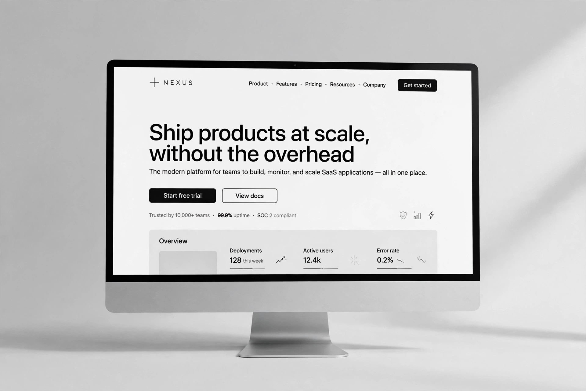
Une page d'accueil SaaS en quartz facetté, construite autour d'une seule promesse.
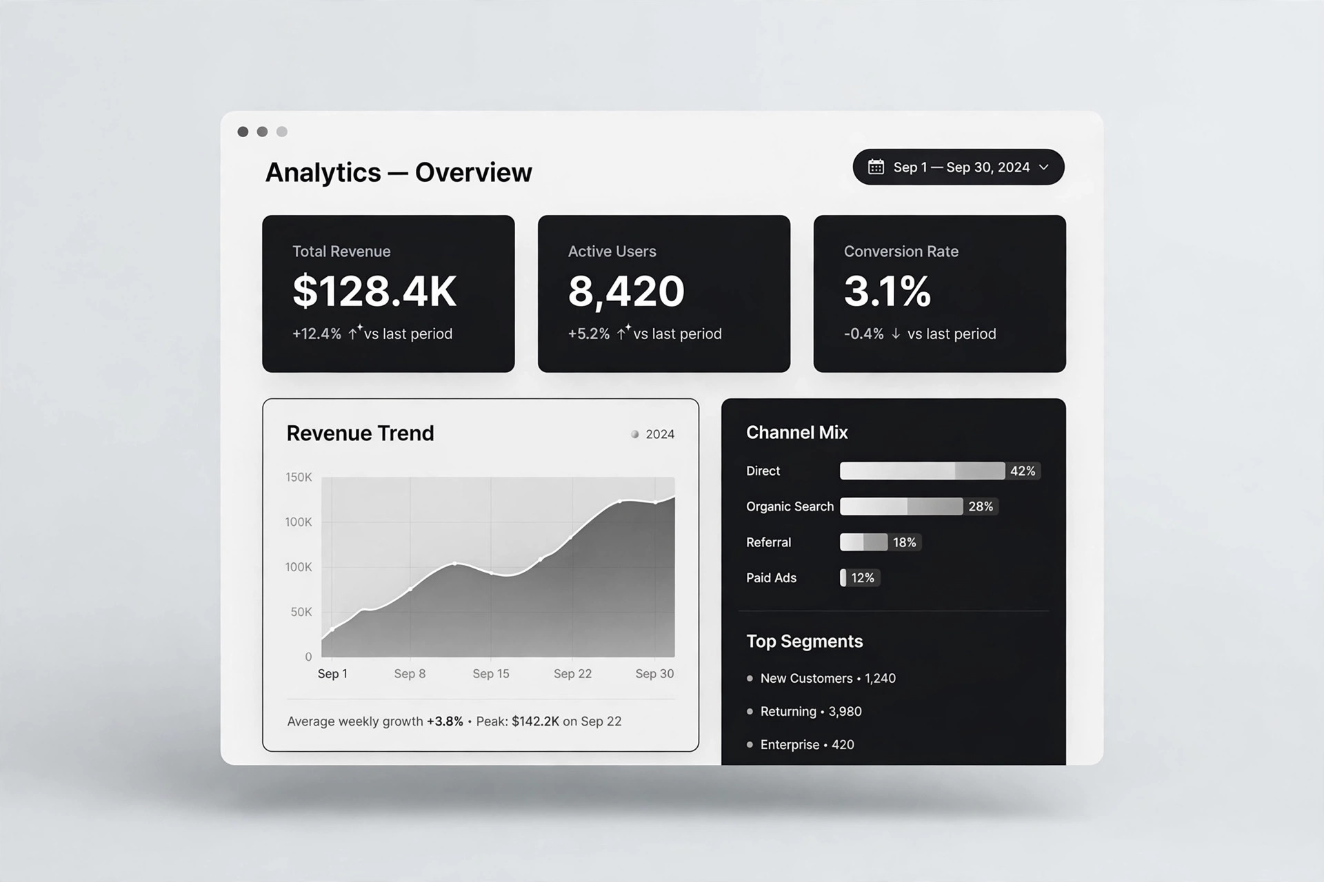
Transforme votre IA en designer de landing pages qui crée une page d'accueil SaaS dans un langage visuel quartz facetté — un hero qui réfracte la lumière, une grille de fonctionnalités nette et un aperçu tarifaire qui convertit sans crier.
Installez-la en 3 étapes
Sans inscription. Sans outils en ligne de commande. Choisissez votre IA, copiez une ligne, collez-la.
Vous préférez le faire vous-même ? Achetez la compétence ($4.99), téléchargez le ZIP depuis votre confirmation d'achat, décompressez-le dans le répertoire indiqué ci-dessus, redémarrez votre session IA — même résultat. Vous l'avez déjà achetée ? Votre assistant IA peut la télécharger pour vous.
Contenu du pack
Un fichier SKILL.md (le guide pratique) + un modèle de départ. Aperçu :
Quartz SaaS Landing
When to use
- You're launching a SaaS product and the homepage needs to look distinct from every gradient-and-blob template
- Your product is about clarity, precision, or structure — analytics, developer tools, finance, operations — and the design should say so
- You have a one-sentence value proposition and need a full page built around it, not a page that buries it
- Your current landing page is a wall of features with no hierarchy and visitors bounce before they find the point
- You need a page that works equally well for a cold visitor from search and a warm referral who already half-believes
Workflow
- Define the one promise (input: product facts → output: hero statement)
Before any layout, pin down the single thing the page must make a stranger believe in five seconds: who it's for, what it does, and why it's better than the status quo. Write it as one sentence of under 20 words, then a supporting line of under 12. Everything below the hero exists to prove that sentence — if a section doesn't, it gets cut. A page with one promise converts; a page with five promises confuses. - Set the quartz visual language (input: hero statement → output: style rules)
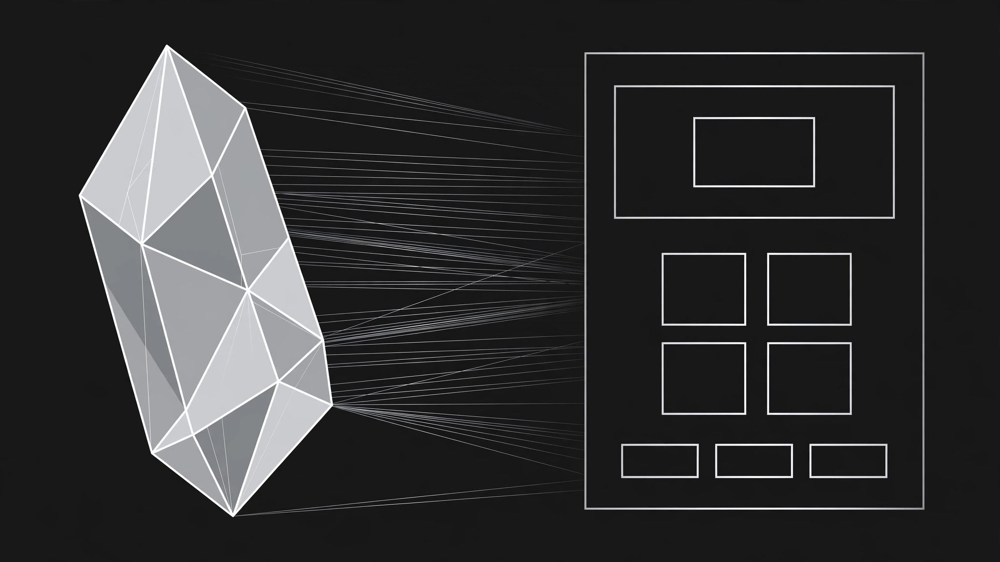
Quartz means facets, not glitter: flat polygonal shards, thin clean edges, subtle light refraction along facet seams, and a restrained palette — near-white or deep charcoal ground, one cool accent (a pale cyan or icy violet), and crisp dark text. Pick three facet shapes and reuse them: a large hero shard, a small divider shard, and a card-corner facet. No drop shadows, no gradients that smear, no stock-photo crystals. The page should feel cut from glass, not decorated with it. - Lay out the page top to bottom (input: style rules → output: full page structure)
Order: navigation (logo, two links, one call-to-action button) → hero (promise, supporting line, two buttons, one product screenshot framed inside a large facet) → trust strip (customer names or integration logos, in plain text or simple marks) → feature grid (four to six features, each with a facet icon, a three-word title, and two lines) → one deep-dive section (a second screenshot plus three proof points) → pricing teaser (three tiers, middle one highlighted, prices or "starting at") → FAQ (four to six real questions) → final call-to-action → footer. One action per screen; the primary button always says the same thing. - Write the feature grid (input: product capabilities → output: feature copy)
Each feature gets a facet icon drawn from the same three shapes, a title that names the outcome ("See every invoice at a glance", not "Dashboard"), and exactly two lines: what it does, and the result the user gets. Cut any feature that needs more than two lines to explain — it belongs in docs, not on the landing page. Order features by what a new visitor cares about first (their pain), not by what the team built first (your architecture). - Build the proof and pricing teaser (input: customer facts, pricing → output: proof + pricing sections)
Proof means specifics you can stand behind: named customers with permission, real numbers you measured, or integration names that are genuinely supported. Never invent logos, quotes, or user counts. The pricing teaser shows the three tiers with the real prices and the one-line difference between tiers; if pricing isn't final, say "Pricing available on request" rather than printing placeholder numbers that will be quoted back to you later. - Ship responsive and accessible (input: finished page → output: verified page)
Check the page at phone width, tablet width, and desktop width: the hero facet scales without cropping the screenshot, buttons stay thumb-sized, and the feature grid collapses to a single column in the same order. Verify contrast on every text-over-facet combination, give every image alt text, and make sure the page is fully usable with a keyboard. A landing page that breaks on mobile is a landing page that converts nobody.
Aperçu du modèle
Quartz SaaS Landing — Page Template
One promise, one page. Fill this in before building any section.
The one promise
Hero statement (≤20 words): {who it's for + what it does + why it's better}
Supporting line (≤12 words): {the payoff in one breath}
Primary call-to-action (one wording, used everywhere): {e.g. Start free}
Secondary call-to-action: {e.g. See how it works}
Quartz style rules
- Ground: {near-white #___ / deep charcoal #___}
- Accent: {one cool accent — pale cyan / icy violet — #___}
- Facet shapes (3, reused): ① large hero shard ② small divider shard ③ card-corner facet
- Type: {display face} for headlines / {body face} for text
Le pack de compétence lui-même (SKILL.md + modèle) est rédigé en anglais.