Minimal Product OG Image
Un produit. Une phrase. Rien d'autre.
Conçoit une image d'aperçu social avec une mise en page produit minimaliste : un produit, une phrase courte et beaucoup d'espace blanc, pour que la carte de partage se lise instantanément à toutes les tailles.
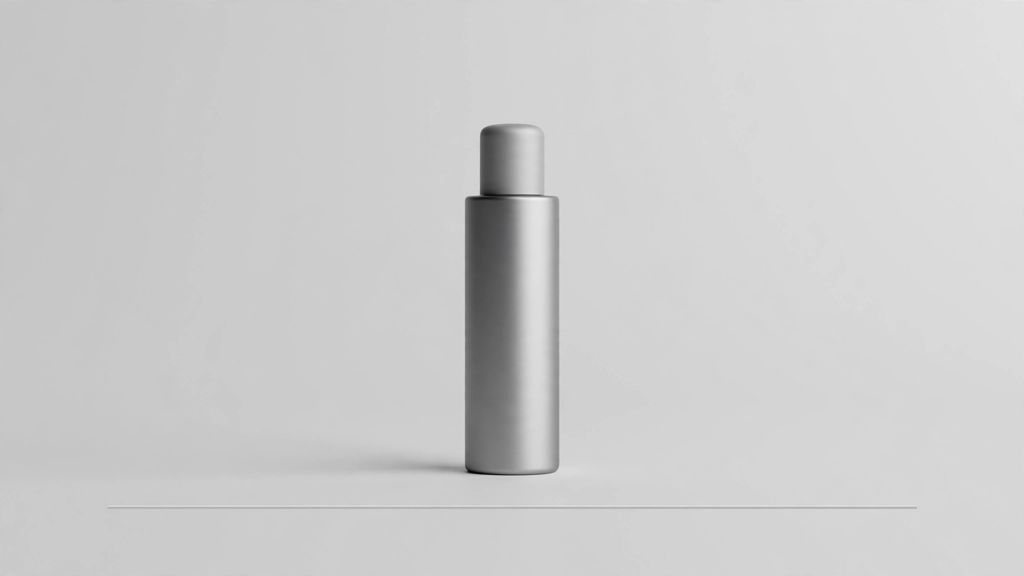
Installez-la en 3 étapes
Sans inscription. Sans outils en ligne de commande. Choisissez votre IA, copiez une ligne, collez-la.
Vous préférez le faire vous-même ? Achetez la compétence ($4.99), téléchargez le ZIP depuis votre confirmation d'achat, décompressez-le dans le répertoire indiqué ci-dessus, redémarrez votre session IA — même résultat. Vous l'avez déjà achetée ? Votre assistant IA peut la télécharger pour vous.
Contenu du pack
Un fichier SKILL.md (le guide pratique) + un modèle de départ. Aperçu :
Minimal Product OG Image
When to use
- You are launching or sharing a physical or digital product and the link preview is currently a busy screenshot or a blank box
- Your existing OG image is crowded — headline, subhead, badge, logo, URL — and at thumbnail size it reads as a grey smear
- The product itself is the selling point: one object, one shape, one color story, and you want the preview to get out of its way
- You need a share card that looks at home in a quiet, premium feed — a design-tool aesthetic, a skincare line, a single-app launch
- You want one image that works for a product page, a launch post, and a press link without redesigning it three times
Workflow
- Choose the one product (input: product range → output: single hero product)
Minimal means one. Pick the single product — or the single variant — that the link is about. If the page sells a range, pick the hero of the range; if it sells a set, show the set as one composed object, not five separate items. Everything else (other colors, accessories, bundles) belongs on the page, not in the preview. If you cannot pick one, the page's focus is the problem, not the image. - Shoot or render the shot (input: hero product → output: clean product shot)
Get one clean shot: the product centered or placed on a simple grid, straight-on or at a slight three-quarter angle, with soft even light and a real or seamless background. Remove distractions — stray props, reflections, busy surfaces, extra hands. The background should be one quiet tone (white, off-white, or the brand's lightest neutral) with no gradient drama. A product shot with one small imperfection (a crooked label, a harsh shadow) reads louder in a minimal layout than in a busy one, so retouch honestly: clean the shot, do not redesign the product. - Write the one line (input: product positioning → output: single line of copy)
Write one line of at most six words: the product name plus its plainest benefit, or the name alone if the name carries it. "Aria — the quiet desk lamp" works; "Aria: revolutionary illumination for the modern workspace, designed for focus" is four lines pretending to be one. Set the line in the brand's typeface at a size that survives the thumbnail test (readable at 400px wide), and place it where it has room — below the product, or to one side with generous margin. If the line needs explaining, it is the wrong line. - Compose with whitespace (input: shot + line → output: 1200×630 composition)
Lay out the 1200×630 canvas with whitespace as the main material: the product occupies roughly a third of the frame, the line sits with clear air around it, and nothing touches the edges. Keep all meaningful content inside the central 90% — chat apps crop unpredictably. Resist the urge to fill the empty space with a badge, a second line, or a pattern: the emptiness is what makes the product look confident. If the composition feels bare, the fix is a better product shot, not more elements. - Export and verify (input: composition → output: verified preview)
Export as JPG or PNG at exactly 1200×630, under 300KB if possible without visible artifacts. Then verify the way a stranger will see it: paste the URL into a chat app or a link-preview debugger and look at the actual thumbnail. Check three things: the product is recognizable, the line is readable, and the whitespace still reads as intentional rather than broken. Fix and re-test — a preview you never previewed is a guess, not a deliverable.
Aperçu du modèle
Minimal Product OG Image — Brief Template
Fill this in before any layout work. One product, one line, lots of air.
Product: {name} | Variant shown: {one variant only}
Page this links to: {URL}
The one product
Hero product: {name + variant}
Why this one: {it is the page's subject / the hero of the range}
Shot: {straight-on / slight three-quarter} — background: {one quiet tone — white / off-white / brand's lightest neutral}
Shot check: [ ] no stray props · [ ] no harsh reflections · [ ] label straight · [ ] actual product, actual color and shape
The one line
Line (≤6 words): {e.g. "Halo — the bottle that keeps up."}
Le pack de compétence lui-même (SKILL.md + modèle) est rédigé en anglais.
Vous aimerez aussi
 Images
Social Cover
Des couvertures de publication avec 3 recettes de composition — prêtes à l'emploi
 Images
Infographic
Transformez un paragraphe en une image — sans jamais inventer de données
 Images
Product Poster
Affiches e-commerce : arguments de vente, ancrage prix et appel à l'action en une fois