Mint Noir SaaS Site
Un sitio SaaS completo en menta sobre negro: un sistema, un pasillo hasta el registro.
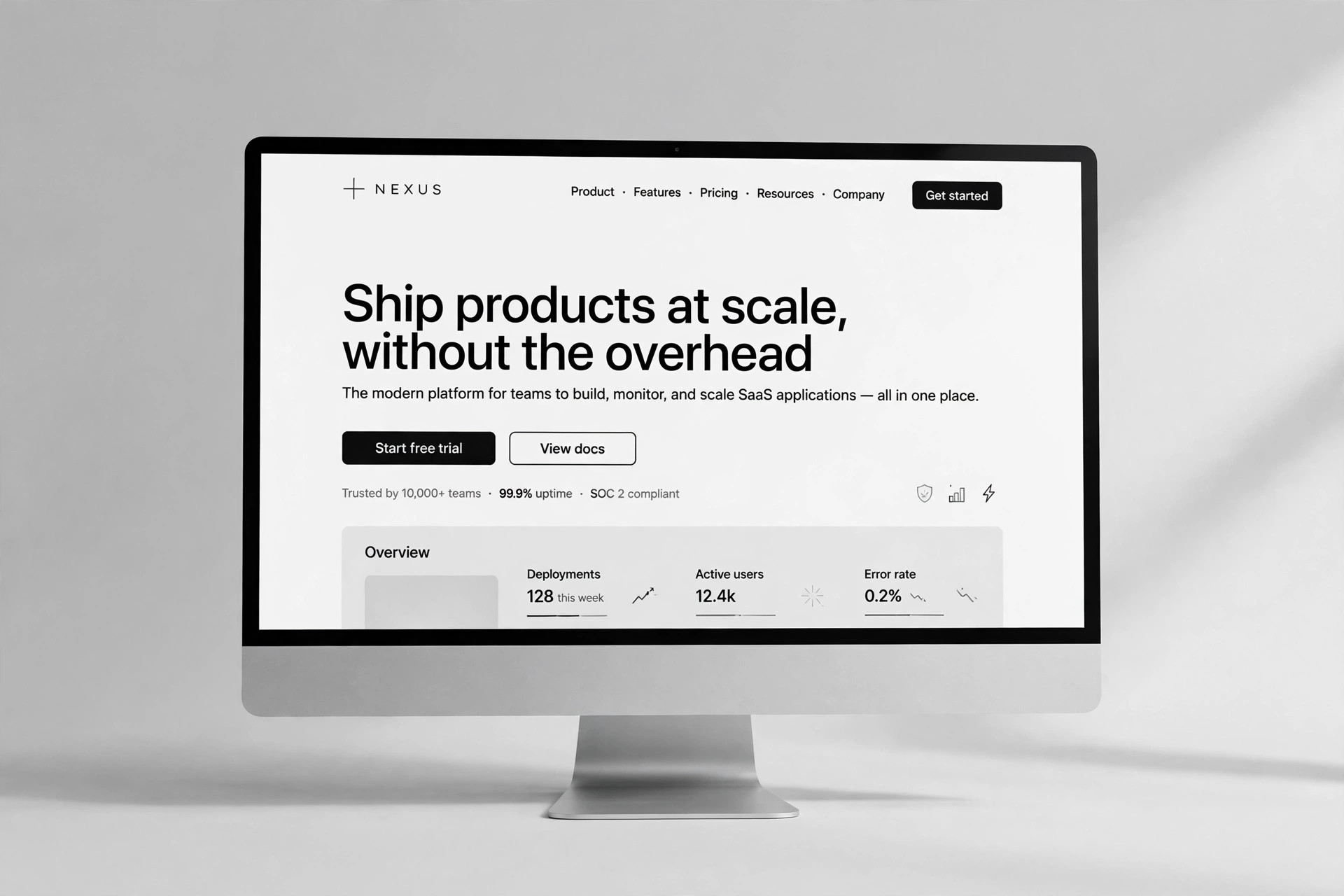
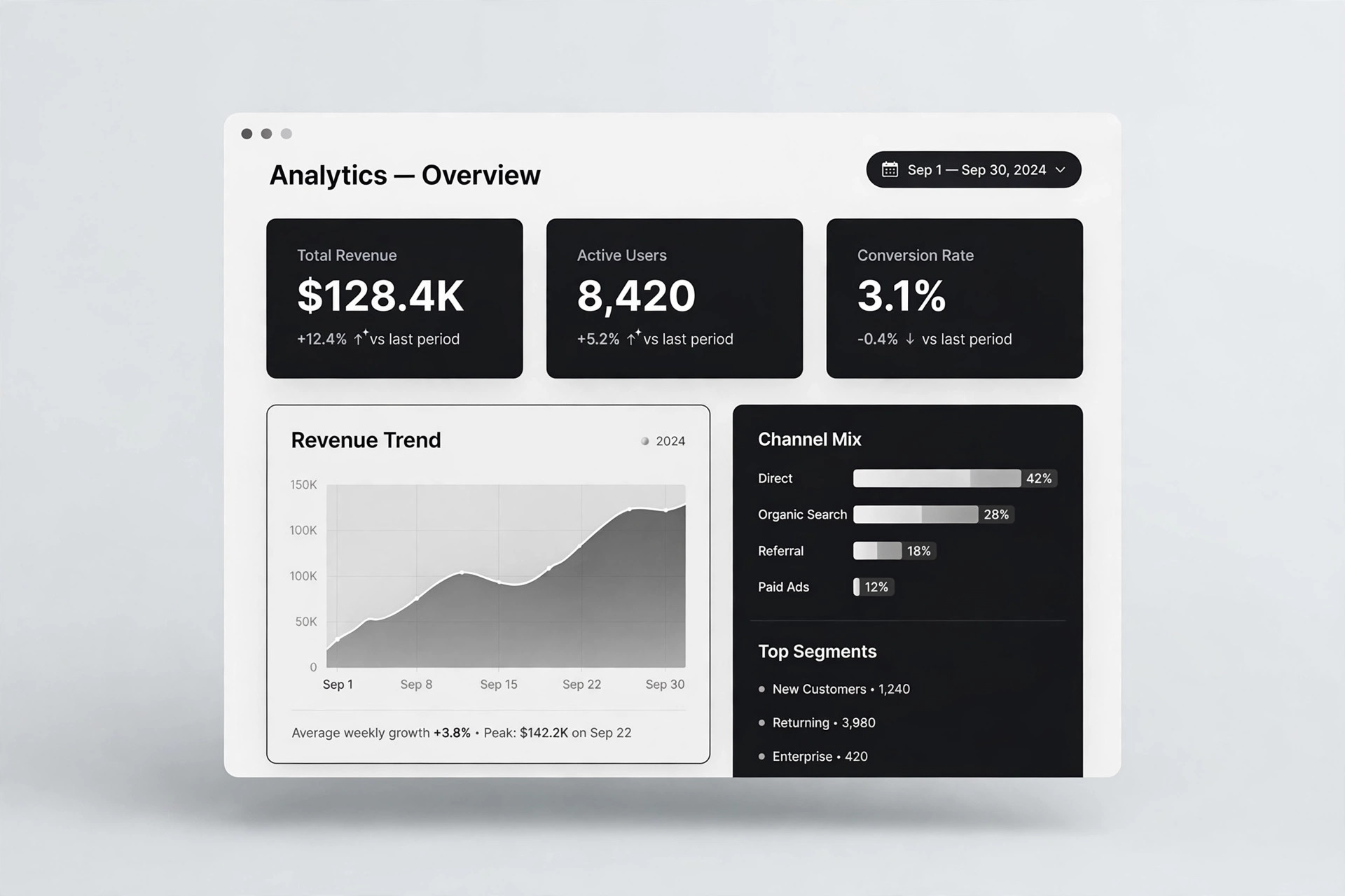
Convierte tu IA en un diseñador de sitios de marketing SaaS: crea un sitio de marketing completo de varias páginas con una paleta menta sobre negro: páginas casi negras, acentos menta frescos y secciones serenas que llevan a los visitantes del titular al registro.

Instálala en 3 pasos
Sin registro. Sin herramientas CLI. Elige tu IA, copia una línea y pégala.
¿Prefieres hacerlo tú mismo? Compra la habilidad ($4.99), descarga el ZIP desde la confirmación de compra, descomprímelo en el directorio que se muestra arriba y reinicia tu sesión de IA — el mismo resultado. ¿Ya la compraste? Tu asistente de IA puede descargarla por ti.
Qué incluye
Un SKILL.md (la guía paso a paso) + una plantilla inicial. Una vista previa:
Mint Noir SaaS Site
When to use
- Your SaaS product needs a full marketing site — home, product, pricing, and docs entry — not just a single landing page
- A light, generic template makes your product look like every other SaaS, and you want a distinctive dark identity with mint as the signature accent
- You are launching a developer- or data-oriented tool where a dark interface feels native to the audience
- Your current site grew page by page with no shared system, and you need a rebuild around one palette, one type scale, and one voice
- A rebrand has settled on mint + noir and you need every marketing page rebuilt in it
Workflow
- Map the site before designing it (input: your product and audience → output: a page map)
List the pages the site must have and the one job of each: Home (convince in ten seconds), Product or Features (show how it works), Pricing (make the choice easy), Docs or Guides entry (get people started), and About or Contact (prove there are real people behind it). Give each page one primary action and write it on the map. If two pages would do the same job, merge them — a five-page site where every page earns its place beats a twelve-page site where half the pages are filler. The map is the contract for the whole build. - Set the mint-noir system (input: page map → output: the design system)
Define the palette once: near-black backgrounds (not pure black — a soft charcoal that stays comfortable over long reads), off-white text, mint as the single accent for links, active states, key numbers, and the primary button, and one muted grey for secondary text and borders. Pick two typefaces — a confident sans for headlines, a readable sans for body — and one spacing rhythm used on every page. Every page, every section, every button uses this system; the mint accent is the signature, so it appears sparingly and always means the same thing: "this is interactive" or "this matters." - Build the home page as the corridor (input: design system → output: home page)
The home page moves a visitor from headline to signup in a fixed order: hero (outcome headline, one supporting line, primary action, one product visual), a proof strip (real customer names, or honest placeholders until you have them), how it works (three steps, each one line), feature sections (two or three, each with a visual and a concrete benefit), one testimonial or evidence block, pricing teaser (the shape of the plans, not the full table), FAQ (four to six real questions), and the final signup block. Every section ends pointing forward; nothing on the home page is a dead end. - Build the inner pages from the same blocks (input: design system + home page → output: product, pricing, docs, about pages)
Reuse the home page's blocks instead of inventing new ones per page: the Product page expands the three feature sections into full sections with screenshots; the Pricing page shows the plans in one comparable table with one recommended plan marked in mint, plain-language terms, and the same reassurance beside the signup button; the Docs entry page is a clean index of guides with a search field and a visible "first step"; the About page names the team and the story in a few honest paragraphs. Same palette, same type, same spacing — a visitor should feel they never left the same site. - Check the whole journey (input: finished pages → output: a verified site)
Walk the site as a first-time visitor on a phone: from the home hero to signup, from pricing to signup, from docs to signup — every path ends at the action, and no page strands the visitor. Check the mint-on-noir contrast on real screens (mint text must be bright enough to read on charcoal, and body text must be off-white, never mid-grey on near-black). Check load time: dark sites hide heavy images badly, so compress visuals and lazy-load anything below the fold. Fix broken links, placeholder text, and invented testimonials before launch — a site with one honest "we're new" line is more trustworthy than a site with fabricated logos.
Vista previa de la plantilla
Mint Noir SaaS Site — Site Template
A complete marketing site in mint on noir. Same system on every page; mint means "interactive / this matters."
Page map (one job + one action per page)
Design system (set once, use everywhere)
- Background: near-black charcoal {hex} — not pure black
- Text: off-white {hex}
- Accent (mint): {hex} — primary button, links, active states, one key number per section
- Secondary: muted grey {hex} — secondary text and borders
- Headline typeface: {one confident sans}
- Body typeface: {one readable sans}
- Spacing rhythm: {e.g. 8 px base, section padding 96 px desktop / 56 px mobile}
El paquete de la habilidad (SKILL.md + plantilla) está escrito en inglés.